Analyzing Journeys' Overview
A step-by-step guide to analyzing the collective impact of all your Journeys
Journey Overview should be your go-to section for analyzing and comparing the channel-wise impact of all your Journeys against key performance indicators like Users Engaged, Conversions and Revenue. It has been divided into four sections to give you a comprehensive view of all your user engagement efforts:
- Overall Performance
- Channel Overview
- Channel Comparison
- Engagement Trends
- Control Group report
Conditional ReportControl Group report is Visible only when you have created a Universal Control Group or Custom Control Group. Click here to learn how to create one.
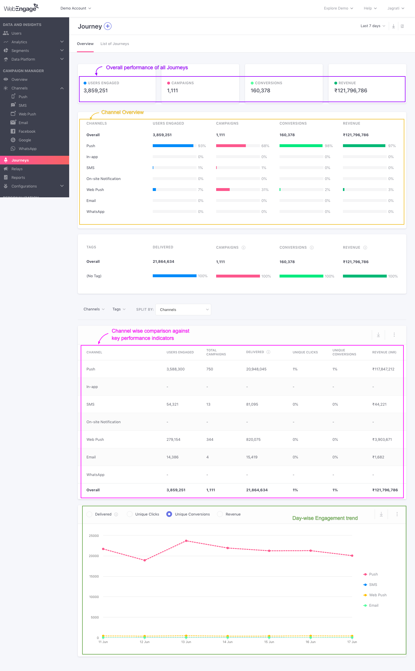
Click to enlarge
So without much ado, let's dig in!
How to Analyze
Must ReadPlease ensure that you have a robust understanding of Journeys and Journey campaigns before proceeding. Doing so will enable you to understand the workings of this section better.
Let's warm you up to all the data shown here with a short use-case:
Analyzing Journeys for a Fashion Retailer (E-commerce)Let's take the example of an O2O fashion retailer that enables users to avail great deals through their app, website, and stores. One of the top priorities for its marketers is to provide a consistent online-to-offline experience while engaging users through highly targeted campaigns.
Thus, the marketing team identified several user journeys that traversed platforms, channels and decided to optimize the experience by providing the right support/motivation at various milestones.
They created a Journey dedicated to each path users follow to interact with their brand and closely monitored their impact on driving user engagement, conversions, and revenue.
Here's what they found on analyzing Journeys' Overview for the Last 7 days:
1.Overall Performance reveals the collective impact of all Journeys on Conversions and Revenue

Click to enlarge
As highlighted above:
- A total of 1111 campaigns were sent through all the Journeys over the Last 7 days, that engaged over 3.7M users.
- Out of all the users engaged, 4.3% (163,606) of users converted, generating $1.9M in revenue!
- This means that on an average, each Journey campaign contributed $1736 - an impressive ROI for 1 week.
Derived predictions: It's safe to assume that if the trend continues, then all the Journeys will contribute roughly $7.7M to the Fashion Retailer's topline and engage over 15M users within a month!
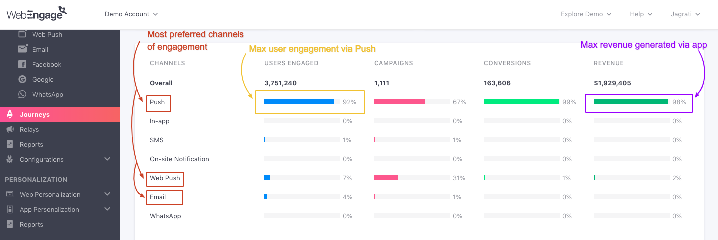
2. Channel Overview reveals the most effective channels of engagement -Push and Web Push.
Click to enlarge
As highlighted above:
-
Push, Web Push, and Email seem to be the most preferred channels of engagement, with the highest number of Journey campaigns (67%%) being sent through Push.
-
As a result, the maximum number of users (99%) converted after receiving a Push Notification, contributing 98% of the total Revenue!
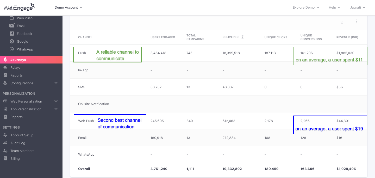
3.Channel Comparison reveals the underdog - Web Push, and seemingly the most effective channel of engagement - Push.
Click to enlarge
As shown above:
- On comparing the Average Revenue Per User (ARPU) for all channels, you'll notice that even though Web Push is low on volumes, it converted the highest paying users with an APRU of $19!
- That's substantially higher than Push (ARPU of $11) - the highest contributor to the total Revenue.
Key Takeaways:
-
Given the wide range of user behaviors Marketers of the Fashion Retailer cater to, Push seems to be the most effective channel of engagement.
-
Even though low on volumes, Web Push seems to be an extremely effective channel for driving conversions. (Maybe marketers of the Fashion Retailer could try engaging users more frequently with SMS Journey campaigns to see if it can be as effective as Push and Email in generating Revenue.)
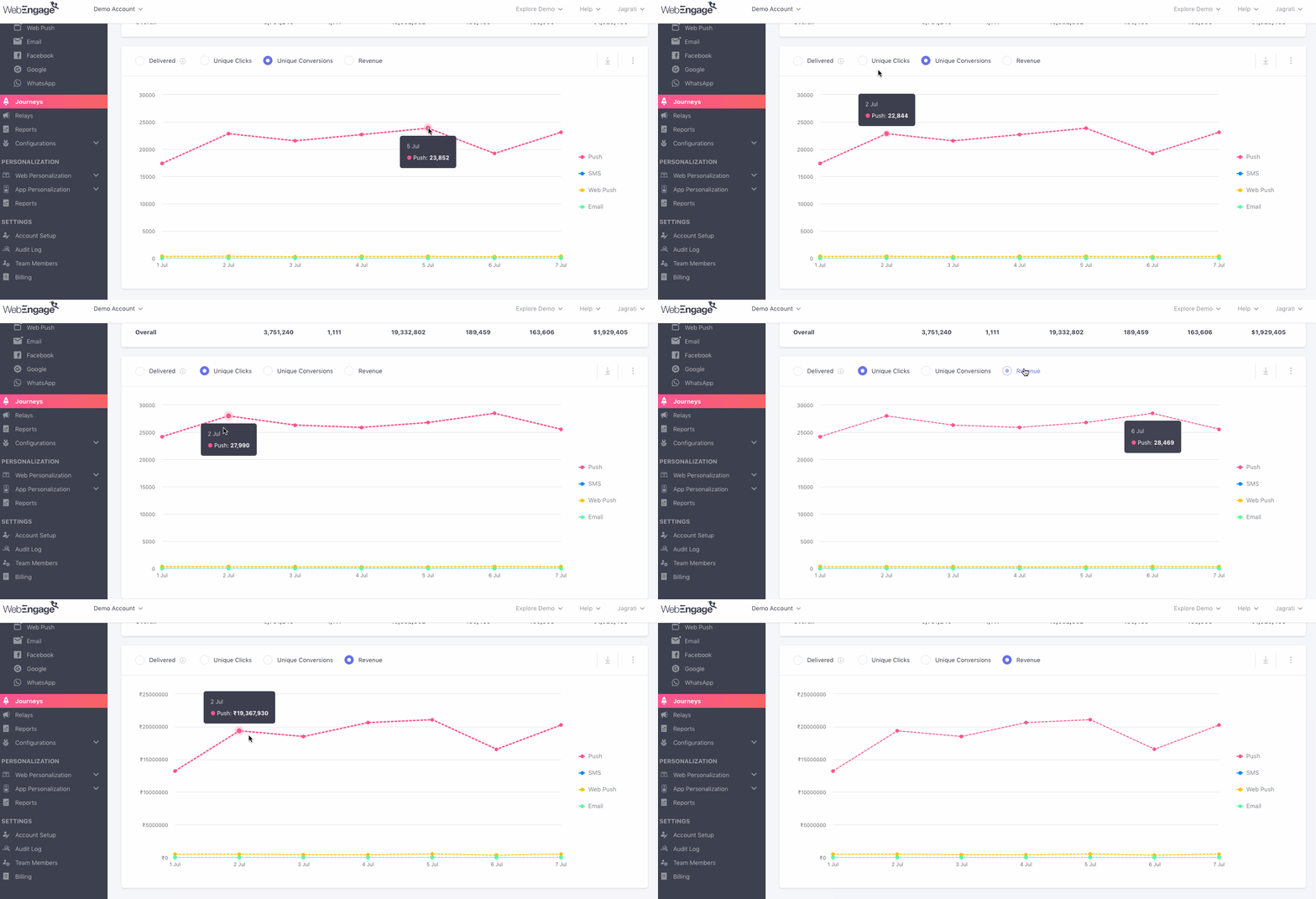
4.Engagement Trends reveals a detailed account of Conversion and Revenue generation trends for Push and Email
Click to enlarge
Till now we know that Push and Email have been the largest contributors to the Unique Conversions and Total Revenue analyzed for the Last 7 Days for the O2O Fashion Retailer. On analyzing engagement trends for the two channels, we find that:
-
The highest number of Unique Conversions occurred on July 5, followed by July 7.
-
However the highest number of Unique Clicks occurred on July 6.
-
And the highest amount of Revenue was generated on July 2, followed by July 7.
Isn't it exciting to have so much data in one place?
Now, let's show you how you can gain maximum insights into the performance of all yourJourneys:
Select a Time Frame

Click to enlarge
The first step is to define the time frame of analysis by selecting a time period through the filter highlighted above. You can choose to analyze the collective performance of all your Journeys within the following periods:
- Yesterday
- Last 7 Days
- Last 30 Days
Overall Performance

Click to enlarge
As highlighted above, the first section provides an overview of the collective performance of all your Journeys, for the selected time frame. Let's walk you through each card:
Users Engaged
Indicates a sum of unique users who have received at least one message through a Journey campaign attached to any of your Journeys, within the selected time frame. (detailed read)
Campaigns
Indicates the total number of Journey campaigns that have been sent through all your Journeys within the selected time frame.
Conversions
Indicates a sum of unique users who have performed the Conversion Event defined for a Journey at least once within the selected time frame.
How Conversions are calculated for all JourneysLet's assume that over the Last 7 days, the following unique conversions were tracked for 4 Journeys created by a fintech app:
Journey 1: 500
Journey 2: 1,000
Journey 3: 2,000
Journey 4: 1,500This means, that all the Journeys resulted in a total of 5,000 Conversions within the Last 7 days.
Revenue
Indicates the amount of revenue generated through the Total Conversions tracked for all your Journeys within the selected time frame. Revenue_numbers are always shown in the currency set by you while setting upRevenue Mapping._
Related ReadsList of all the Performance Indicators tracked for a Journey and its campaigns
How Conversions are attributed to a Journey and its campaigns
Channel Overview
This sub-section has been specially designed to give you a comprehensive Channel-wise overview of the performance of all your Journey Campaigns, for the selected time frame.
How is the Channel-wise breakdown calculated?As you are aware, Journeys help you guide users across their lifecycle with contextually personalized messages, delivered at the right moment through their preferred channels of engagement. This is achieved through the various Journey campaigns attached to a Journey experience designed by you.
Thus, the channel-wise breakdown is calculated on the basis of the performance of the Journey campaigns being sent through the channel.
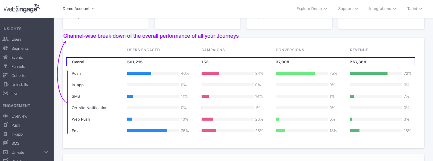
Click to enlarge
As shown above, Channel Overview presents key insights into user-channel interactions against broad metrics - Users Engaged, Campaigns, Conversions, Revenue. Each metric can be analyzed in two ways, Overall (number) and Channel (percentage). Let's go over how these are calculated:
Users Engaged
Indicates unique users who have received at least one Journey campaign within the selected time frame.
Overall: The number is a union of the users engaged through all the channels listed below. This means that if a user was sent multiple Journey campaigns, then they will be counted towards Overall Users Engaged only once to avoid double counting.
Channel: Indicates the percentage of users that have received at least one Journey campaign through the channel listed on the left, calculated against the Overall number.
Campaigns
Indicates the total number of Journey campaigns that have been sent through all your Journeys within the selected time frame.
Overall: Indicates a sum of all the Journey campaigns sent through all the channels listed below.
Channel: Indicates the total number of Journey campaigns sent through the channel listed on the left.
Conversions
Indicates the unique number of users who have performed a Journey's Conversion Event within the specified Conversion Deadline and the selected time frame.
Overall: Indicates a sum of the Unique Conversions that have been attributed to Journey campaigns sent through all the channels listed below.
Channel: Indicates percentage value of Unique Conversions that have been attributed to Journey campaigns sent through the channel listed on the left, calculated against the Overall number.
Related ReadHow Conversions are attributed to a Journey and its campaigns
Revenue
Indicates the total revenue generated through all the Conversions that have occurred within the selected time frame. Revenue_numbers are always shown in the currency set by you while setting upRevenue Mapping._
Overall: Indicates a sum of the Revenue_generated through all the _Conversions that have been attributed to Journey campaigns sent through all the channels listed below.
Channel: Indicates the Revenue generated through the Conversions attributed to Journey campaigns that have been sent through the channel listed on the left.
Related Read
Channel Comparison
Here you will find a detailed view of all the data shown under Channel Overview, helping you dig deeper into the channel-wise impact of all your Journeys against key performance indicators. As highlighted below, this section can be analyzed in two ways - Channel-wise and Overall.
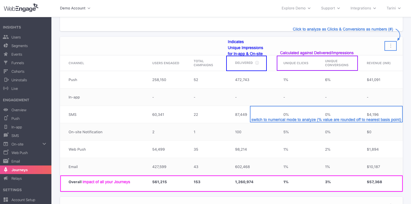
Click to enlarge
Here's how all the performance indicators are calculated:
Delivered
Overall: Indicates the total number of messages that have been delivered to users through all the Journey campaigns, attached to all your Journeys, within the selected time frame.
Channel: Indicates the total number of messages delivered through all the Journey campaigns sent through the channel listed on the left.
Unique Impressions (and not message deliveries) are shown for Journey In-app Campaigns and Journey On-site Notifications under the column, Delivered.
Unique Clicks
Overall: Indicates a sum of Unique Clicks tracked for all the Journey campaigns sent through all the channels listed in the table.
Channel: Indicates a sum of Unique Clicks tracked for all the Journey campaigns sent through the channel listed on the left.
Please NoteThe following metrics are calculated in the same way as discussed under Channel Overview:
Select Data Format (Optional)
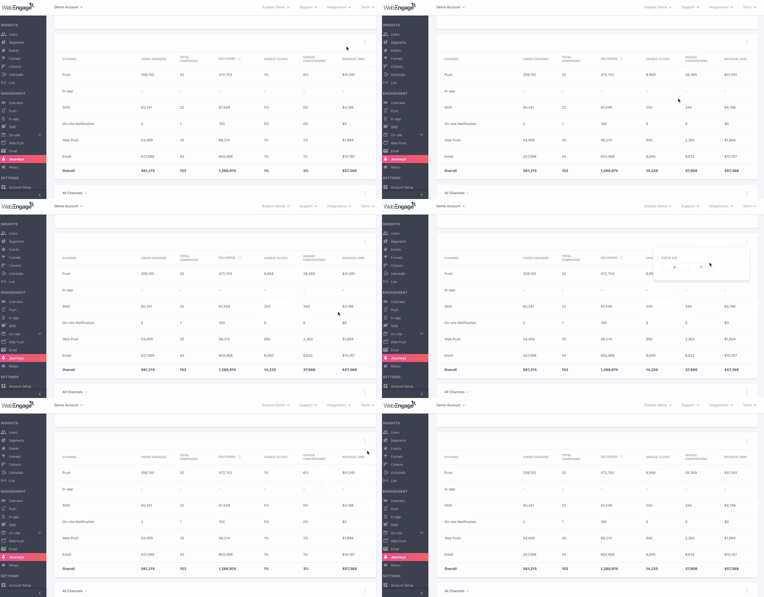
Click to enlarge
As shown above, using the overflow menu placed on the top right, you can choose to view Unique Clicks and Unique Conversions as a numerical value (#) or a percentage value (%).
Control Group report
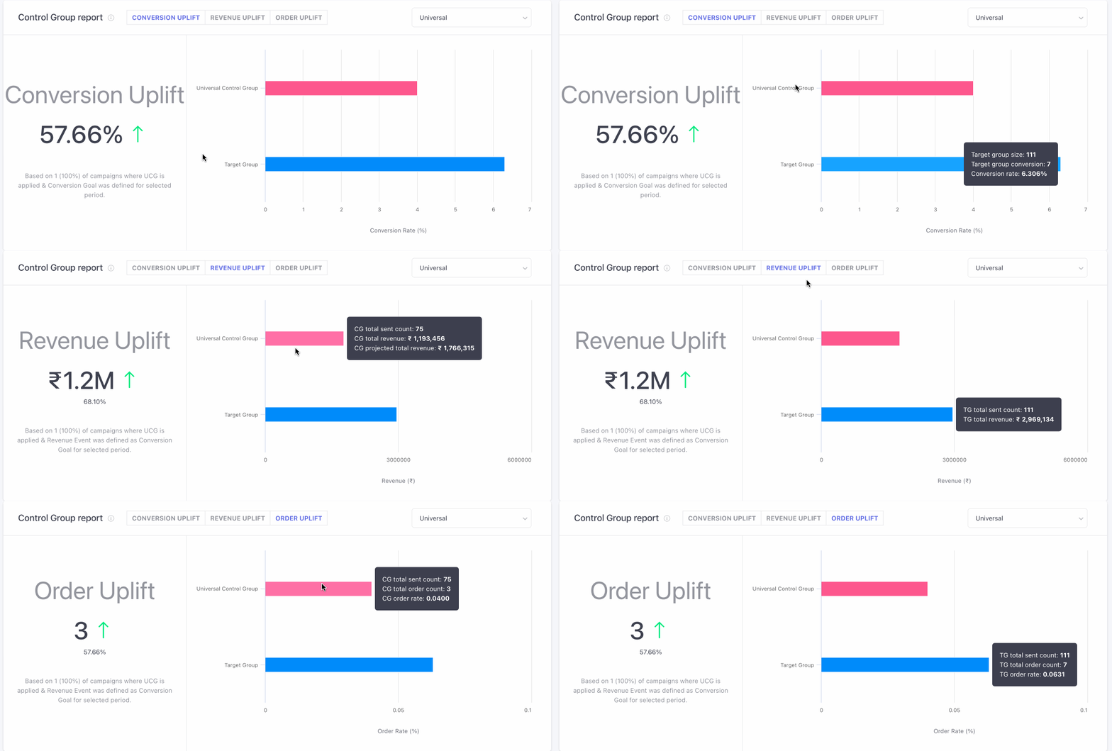
This section indicates overall journey's performance v/s control groups for the journey's where either Universal or Custom control groups have been added.
Based on the 'Conversions' in your Target Group (users who were not part of the CG) and the selected Control Group, you will be able to see the overall Uplift (or downlift) that your campaigns are having. Conversion Uplift is calculated using this formula:
Conversion Uplift =[(Unique Conversion Rate of TG/ Unique Conversion Rate of CG) x 100] - 100
In addition to conversion uplift, you can also calculate the revenue increment through Revenue and Order Uplift.
Formula to calculate Revenue Uplift :
- CG projected total revenue = CG(Total Revenue / Total Sent Count) X TG Total Sent Count
- Revenue Uplift (absolute value) = [TG Revenue - CG Revenue (Projected to TG Volume)]
- Revenue Uplift %= [TG Revenue / CG Revenue (Projected to TG Volume) X 100] - 100
Formula to calculate Order Uplift
- Order Uplift (absolute value)= (TG Order Rate - CG Order Rate) X TG Total Sent Count
- Order Uplift % = (TG Order Rate / CG Order Rate X 100) - 100
Please Note
Control Group report is Visible only when you have created a Universal Control Group or Custom Control Group. Click here to learn how to create one.
- Campaigns in which a conversion event is added and selected control group is attached along are only taken into consideration for this analysis.
Engagement Trends
This sub-section has been specially designed to help you analyze the trends of Journey engagement split by Channels and Days against the following metrics:
- Delivered/Impressions (How it's calculated)
- (Unique) Clicks (How it's calculated)
- (Unique) Conversions (How it's calculated)
- Revenue (How it's calculated)
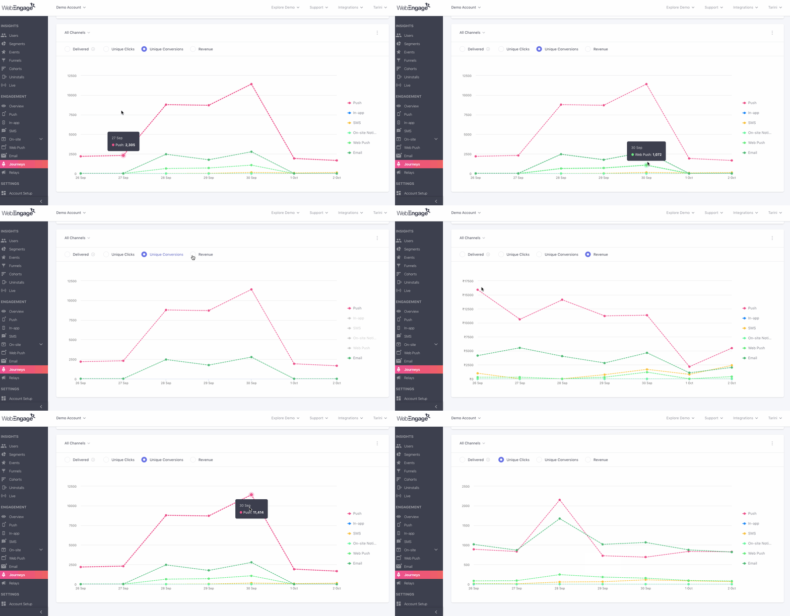
Click to enlarge
While the default view shows you engagement trends for All Channels (Push, In-app, SMS, On-site, Web Push, Email), you can change the view by selecting a Channel and a Format of Visualization, as shown above. You can also deselect metrics to analyze user behavior against a specific performance indicator.
Let's quickly go over how this section can be customized as per your analytical needs:
Step 1: Select a Channel
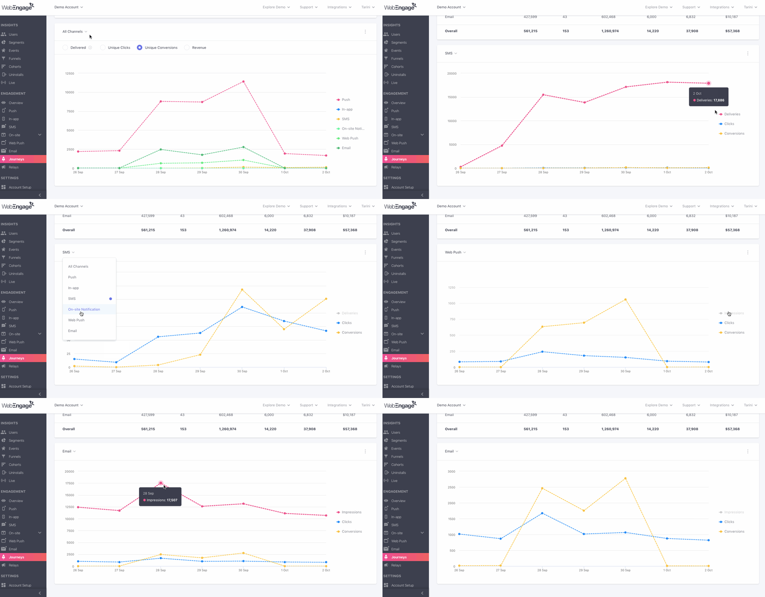
Click to enlarge
As shown above, using the drop-down placed on the top left, you can analyze Journey Deliveries/Impressions, Clicks and Conversions for a specific channel.
Step 2: Select a Format of Visualization
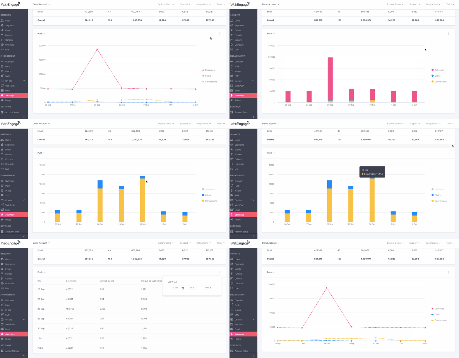
Click to enlarge
While the default format of visualization is a Line Graph, as shown above, using the overflow menu placed on the top right, you can change this to a Bar Graph or a Table, as per your analytical needs.
We hope this has equipped you with a robust understanding of how you can leverage all these insights to optimize your Journeys. Please feel free to drop in a few lines at [email protected] in case you have any related queries or feedback. We're always just an email away!
Updated 6 months ago