Engagement Overview
A walkthrough of how you can compare the performance of all the channels of engagement in your dashboard
Must ReadBefore we proceed, please ensure that you have a broad understanding of all the concepts related to Campaigns and the Performance Indicators tracked for each channel. Doing so will help you understand the workings of this section, better.
First Impression
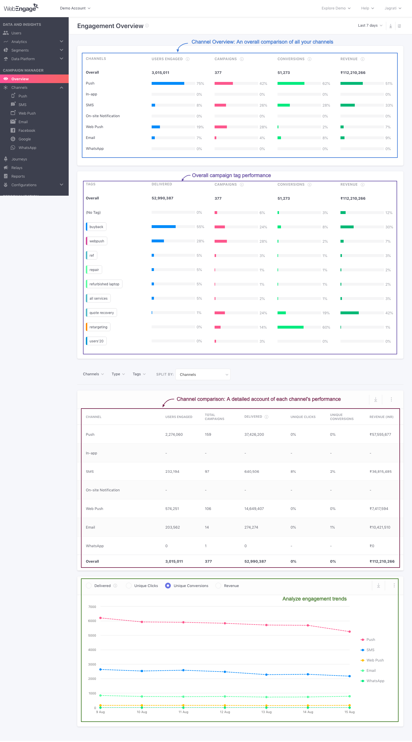
Engagement Overview should be your go-to section for analyzing and comparing the performance of all your channels. It has been divided into four subsections to give you a wholesome view of all your marketing and engagement efforts:
- Channel Overview
- Channel Comparison
- Engagement Trends
- Control Group report
Conditional ReportControl Group report is Visible only when you have created a Universal Control Group or Custom Control Group. Click here to learn how to create one.
Click to enlarge
So without much ado, let's dig in!
Define the Scope of Analysis
By default, Engagement Overview shows you an overall comparison of all the channels based on the campaigns sent through each, over the last 7 days.
You can alter this by selecting a time frame, data view and campaign type as per your analytical needs.
Here's how you can go about it:
Select a Time Frame

Click to enlarge
As shown above, using the filter placed on the top right, you can choose to analyze the performance of all your channels within a specific time frame.
The following time periods can be selected here:
Yesterday
Last 7 Days
Last 30 Days
Impact: Shows data tracked only within the selected period.
Apply the Campaign and Channel Filter
You can synthesis your data by selecting the preferred channel from the drop-down. As discussed under Channel & Channel reachability, the WebEngage dashboard comes with various channels for user targeting, namely: Push, Email, In-app, SMS, On-site, Web Push, WhatsApp, and Facebook Retargeting.
As discussed under Campaigns and Its Types, messages sent through the various channels of engagement are called campaigns and can be of the following types: One-Time, Triggered, Recurring and Journey.

Click to enlarge
Using the navigation bar highlighted above, you can choose to compare the performance of all channels for a specific campaign type, to understand what works best for your users.
The following options can be selected here:
All: Helps you compare the overall impact of your channels by presenting a sum of the data collected for all campaign types sent through each channel.
One-time: Helps you compare the collective impact of all one-time campaigns sent through each channel.
Triggered: Helps you compare the collective impact of all triggered campaigns sent through each channel.
Recurring: Helps you compare the collective impact of all recurring campaigns sent through each channel.
Journey: Helps you compare the collective impact of all journey campaigns sent through each channel.
Summing It Up
A combination of the time frame and campaign type selected by you help define the scope of analysis under:
- Channel Overview
- Channel Comparison
- Engagement Trends
How to Analyze
Let's warm you up to all the data shown here with a short use-case:
Comparing Channel Performance for an Ed-tech platform for Journey CampaignsLet's take the example of an ed-tech platform that offers multiple courses through its app and website. The marketing team decided to analyze their engagement strategy for the previous month to:
Identify channels that created the maximum impact
Identify patterns that they can replicate in the future to create better user experiences
Here's how they decided to go about their analysis:
Time Frame: Last 30 Days
Data View: Events (Will help them analyze data tracked over the last 7 days even if the campaigns were sent before the selected period. This is great for gauging the overall impact of your engagement efforts.)
So, what did they learn?
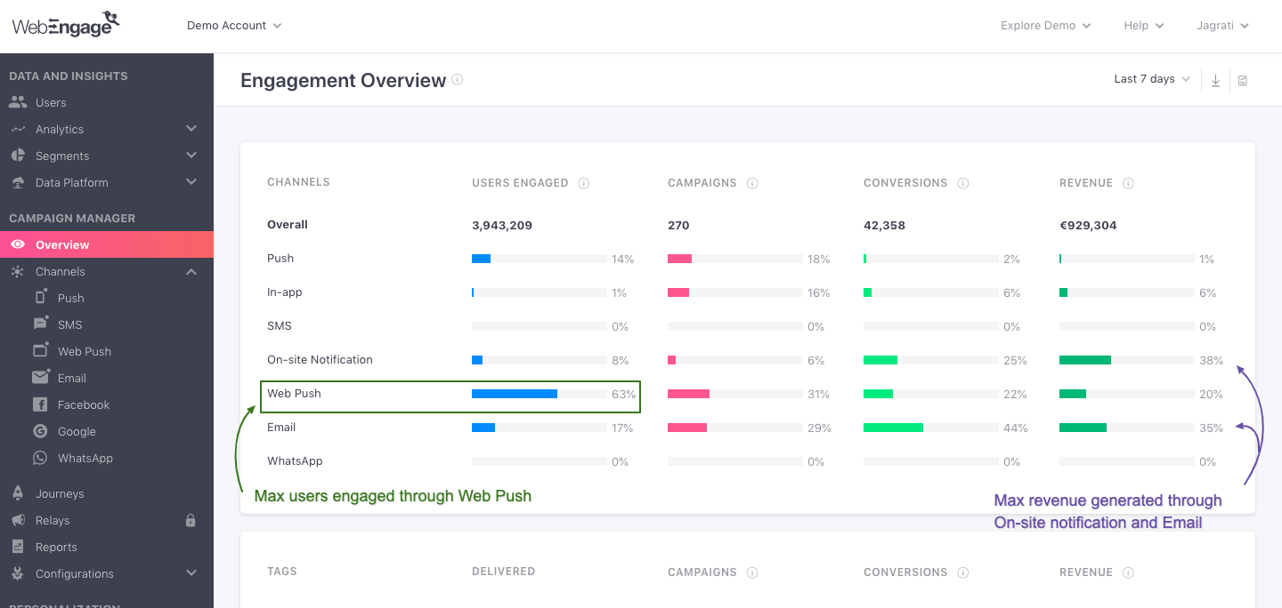
1. Channel Overview reveals high performing channels -On-site, Email, and Web Push
Click to enlarge
-
As highlighted in the visual above, maximum revenue was generated via the ed-tech platform's app as a result of On-site and Email campaigns.
-
Even though a high percentage of users were engaged via Web Push, it resulted in poor conversions and revenue, compared to On-site and Email. This is a worrisome insight as it indicates a gap between their email marketing strategy and users' expectations. This could be easily bridged by experimenting with various formats, subject lines, email copies, and so on.
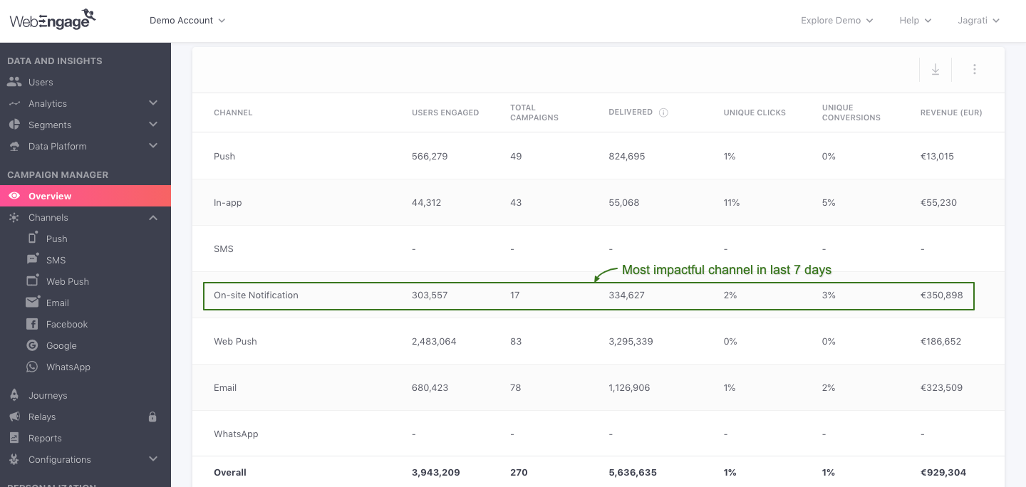
2. Channel Comparison reveals the most impactful channel of the month -On- site Notification
Click to enlarge
- As highlighted in the visual above, 17 on-site notification campaigns contributed the same amount of revenue as 78 email campaigns! (unbelievable right? we wonder what the campaign was about...)
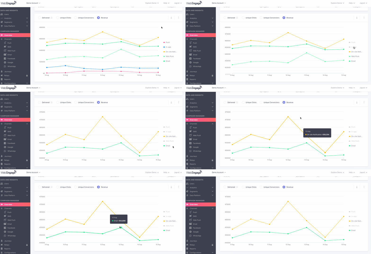
3. Engagement Trends reveal a detailed account ofOn-site and Email performance
Click to enlarge
-
Till now we have learned that On-site and Email contributed the highest amount of revenue in the last 7 days. Hence, here we'll compare the engagement trends for both channels, against Revenue, split by days.
-
As highlighted in the visual above, there's a clear spike in revenue contributed by both channels on Aug 12 and Aug 13.
-
So, now that we've figured out the channel and days that contributed maximum revenue, the next step is to get a detailed picture of all the factors that contributed to the spike. This can be achieved by analyzing the In-app journey campaign's Overview section, for the same time frame :)
Isn't it exciting to have so much data in one place?
Now, let's deep dive into each subsection to show you how you can gain maximum insights into your users and campaigns:
Channel Overview
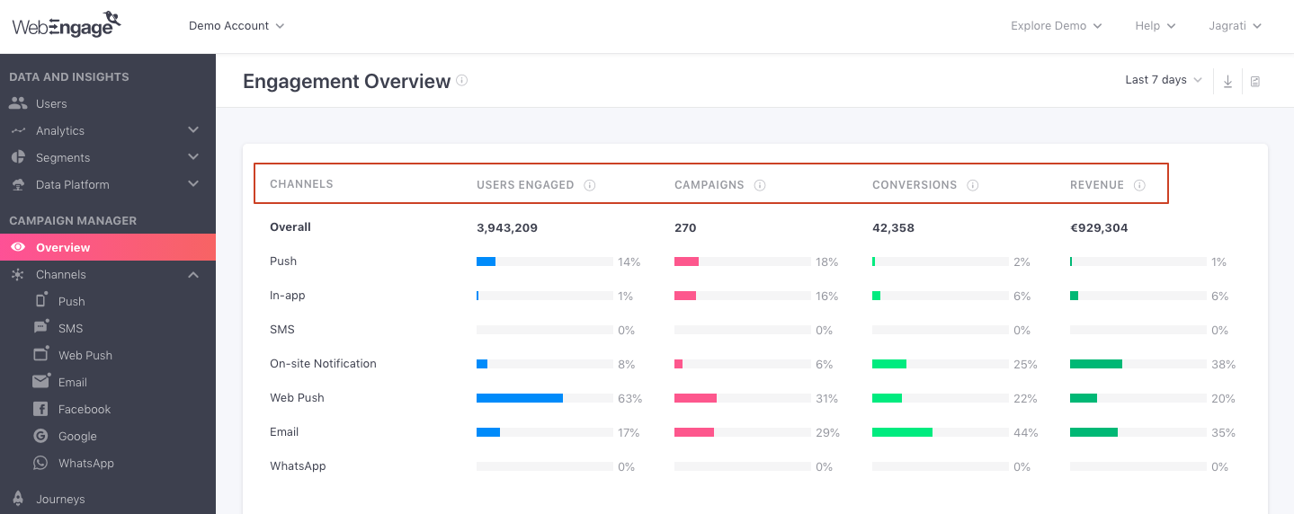
This sub-section has been specially designed to give you a comprehensive overview of all your channels, as per the time frame, data view, and campaign type selected by you.
Click to enlarge
As shown above, Channel Overview presents key insights into user-channel interactions against broad metrics - Users Engaged, Campaigns, Conversions, Revenue. Each metric can be analyzed in two ways, Overall (number) and Channel (percentage). Let's go over how these are calculated:
Users Engaged
Indicates unique users who have received at least one campaign, within the selected time frame, for the chosen campaign type and data view.
-
Overall: The number is a union of the users engaged through all the channels listed below. This means that if a user was sent multiple campaigns, then they will be counted towards Overall Users Engaged only once to avoid double counting.
-
Channel: Indicates the percentage of users that have received at least one campaign through the channel listed on the left, calculated against the Overall number.
- Users who have received a campaign through multiple channels are counted towards this metric for all the respective channels. For the same reason, a sum of the percentage values shown against each Channel may be higher than 100.
Campaigns
This metric indicates the total number of campaigns sent within the selected time frame, for the chosen campaign type and data view.
-
Overall: Indicates a sum of all the campaigns sent through all the channels listed below.
-
Channel: Percentage of campaigns sent through the channel listed on the left, calculated against the Overall number.
Conversions
Indicates the unique number of users who have performed the Conversion Event within the campaigns' Conversion Deadline and the selected time frame, for the chosen campaign type and data view.
-
Overall: Indicates a sum of unique conversions resulted by campaigns sent through all the channels listed below.
-
Channel: Percentage of unique conversions contributed by each channel listed on the left, calculated against the Overall number.
Revenue
Indicates the total revenue generated through all the conversions that occurred within the selected time frame, for the selected campaign type and data view. Revenue numbers are always shown in the currency set by you while setting up Revenue Mapping.
-
Overall: Total amount of revenue contributed by all the conversions, resulted by campaigns sent through all the channels listed below.
-
Channel: Percentage of revenue contributed by all the conversions, resulted by campaigns sent through the channel listed on the left. The percentage is calculated against the Overall number.
Related Reads
Please refer to Conversion Tracking for a detailed read on how conversions are tracked and attributed in your dashboard.
Please refer to Revenue tracking for an in-depth understanding of how revenue is tracked for the Conversion Event set for a campaign and journey.
Please refer to Campaign and Channel Performance Indicators for a detailed understanding of all the metrics tracked for your campaigns and how they are calculated for a channel.
Channel Comparison
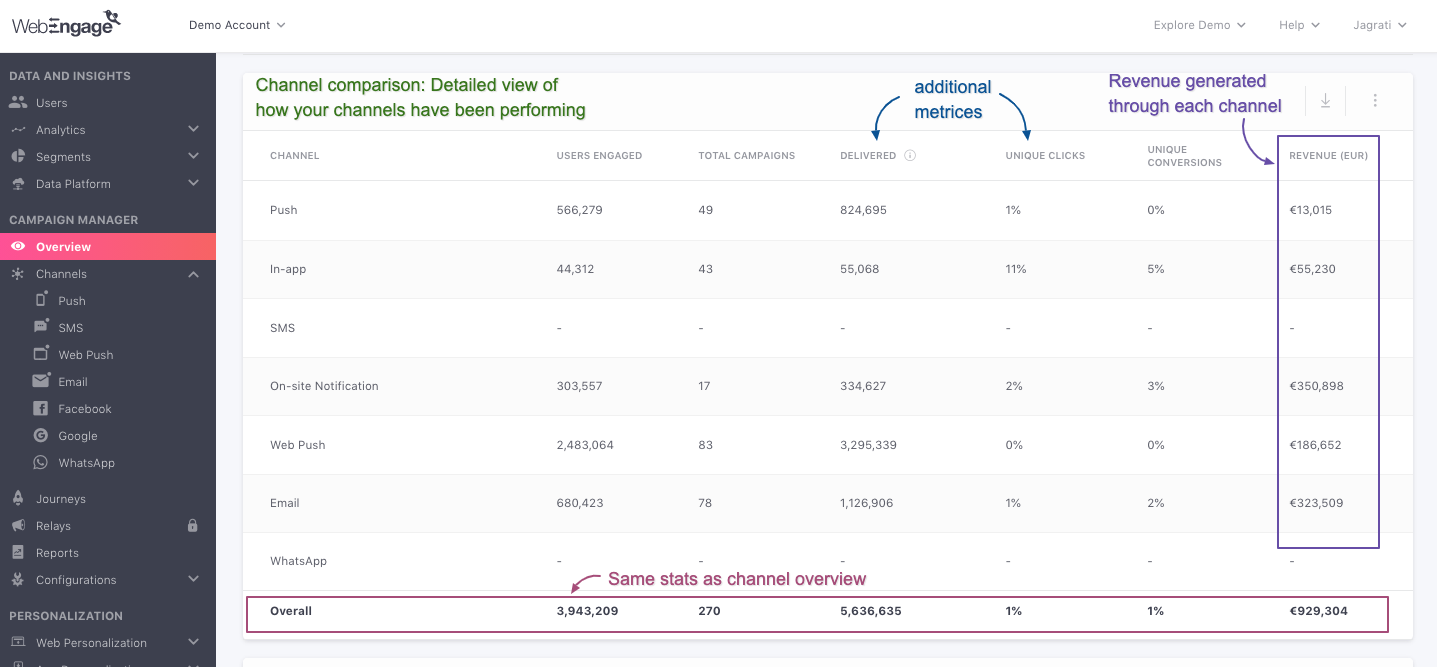
Moving on, here you will find a detailed view of all the data shown under Channel Overview, helping you dig deeper into the performance of all your channels.
Click to enlarge
As highlighted above, this section includes two additional metrics - Delivered, Unique Clicks and can also be analyzed in two ways - Channel and Overall, for the time frame, data view and campaign type selected by you.
Please NoteUsers Engaged, Total Campaigns, Unique Conversions and Revenue are calculated in the same way as discussed under Channel Overview.
Here's how the additional metrics are calculated:
Delivered
Indicates the total number of campaigns delivered within the selected time frame for the chosen campaign type and data view.
-
Overall: Total number of campaigns delivered through all the channels listed in the table.
-
Channel: Total number of campaigns delivered through the channel listed on the left.
Please NoteUnique impressions (and not deliveries) are shown for campaigns sent through In-app and On-site (Notifications, Surveys) under this column.
Unique Clicks
Indicates the unique number of users who have clicked once on a campaign within the selected time frame, for the chosen campaign type and data view.
-
Overall: Total number of unique clicks tracked for campaigns sent through all the channels listed in the table.
-
Channel: Total number of unique clicks tracked for campaigns sent through each channel listed on the left.
Select Data Format (Optional)
Click to enlarge
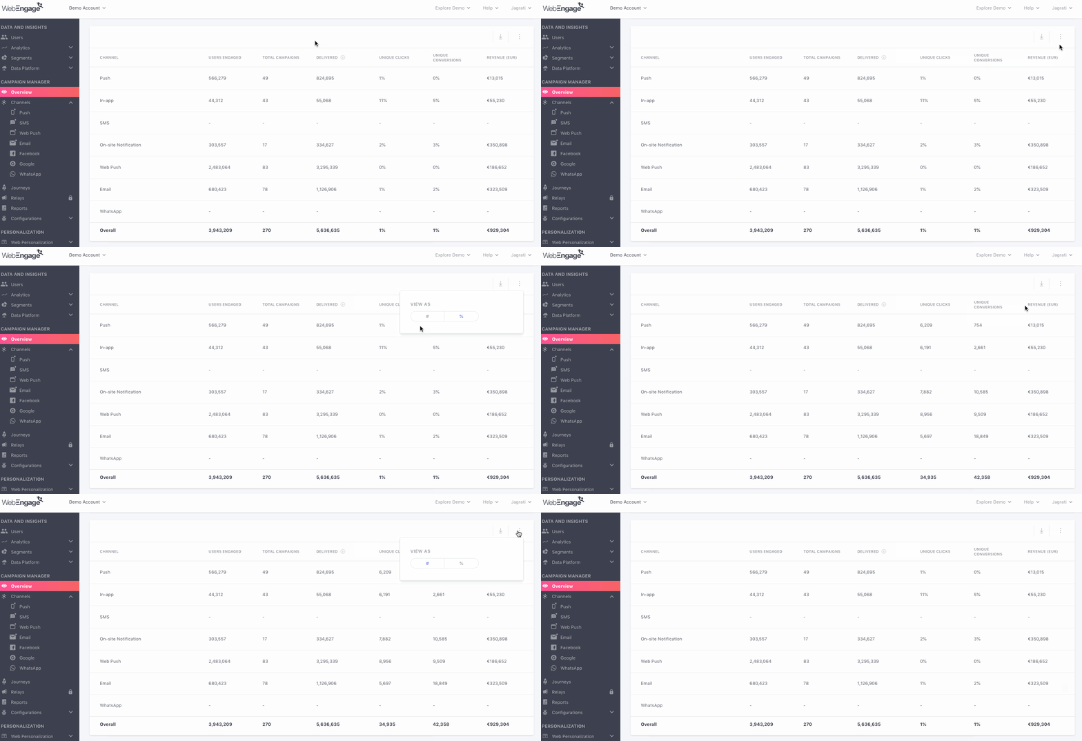
While the default view shows you numbers (#) under all columns - as shown above, using the overflow menu on the top left, you can choose to view Unique Clicks and Unique Conversions as a percentage value (%).
The percentage values under both columns are calculated against:
- Total number of Delivered messages for Push, SMS, Web Push, Email
- Unique Impressions (shown under the column, Delivered) for In-app and On-site Notifications
Control Group report
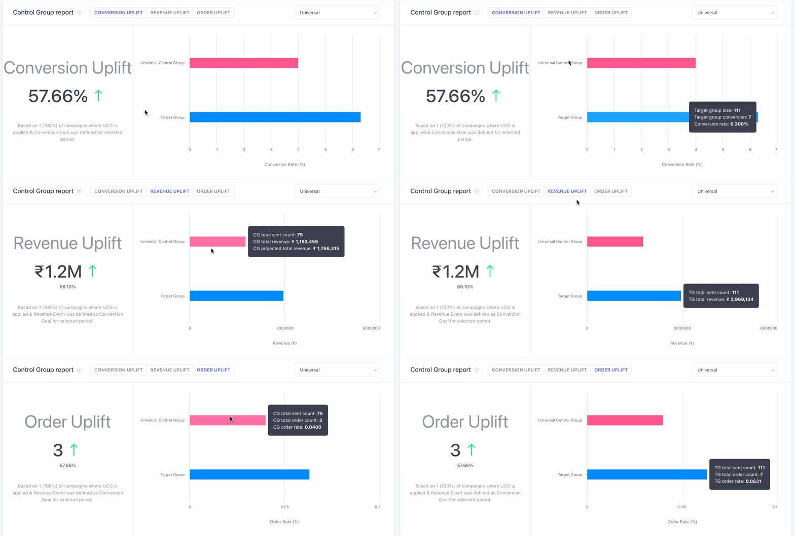
This section indicates overall campaign performance v/s control groups for the campaigns where either Universal or Custom control groups have been added.
Based on the 'Conversions' in your Target Group (users who were not part of the CG) and the selected Control Group, you will be able to see the overall Uplift (or downlift) that your campaigns are having. Conversion Uplift is calculated using this formula:
Conversion Uplift =[(Unique Conversion Rate of TG/ Unique Conversion Rate of CG) x 100] - 100
In addition to conversion uplift, you can also calculate the revenue increment through Revenue and Order Uplift.
Formula to calculate Revenue Uplift :
- CG projected total revenue = CG(Total Revenue / Total Sent Count) X TG Total Sent Count
- Revenue Uplift (absolute value) = [TG Revenue - CG Revenue (Projected to TG Volume)]
- Revenue Uplift %= [TG Revenue / CG Revenue (Projected to TG Volume) X 100] - 100
Formula to calculate Order Uplift
- Order Uplift (absolute value)= (TG Order Rate - CG Order Rate) X TG Total Sent Count
- Order Uplift % = (TG Order Rate / CG Order Rate X 100) - 100
click to enlarge
Please Note
Control Group report is Visible only when you have created a Universal Control Group or Custom Control Group. Click here to learn how to create one.
Campaigns in which a conversion event is added and selected control group is attached along are only taken into consideration for this analysis.
Engagement Trends
This sub-section has been specially designed to help you understand the trends of user engagement for all your channels, split by Days. The following metrics can be analysed here as per the time frame, campaign type and data view selected by you:
- Delivered/Impressions (How it's calculated)
- (Unique) Clicks (How it's calculated)
- (Unique) Conversions (How it's calculated)
- Revenue (How it's calculated)
While the default view shows you engagement trends for All Channels (Push, In-app, SMS, On-site, Web Push, Email) over the last 7 days, you can choose to change the view by selecting a channel and a format of visualization, as shown below. You can also deselect metrics to analyze user behavior against a specific performance indicator.
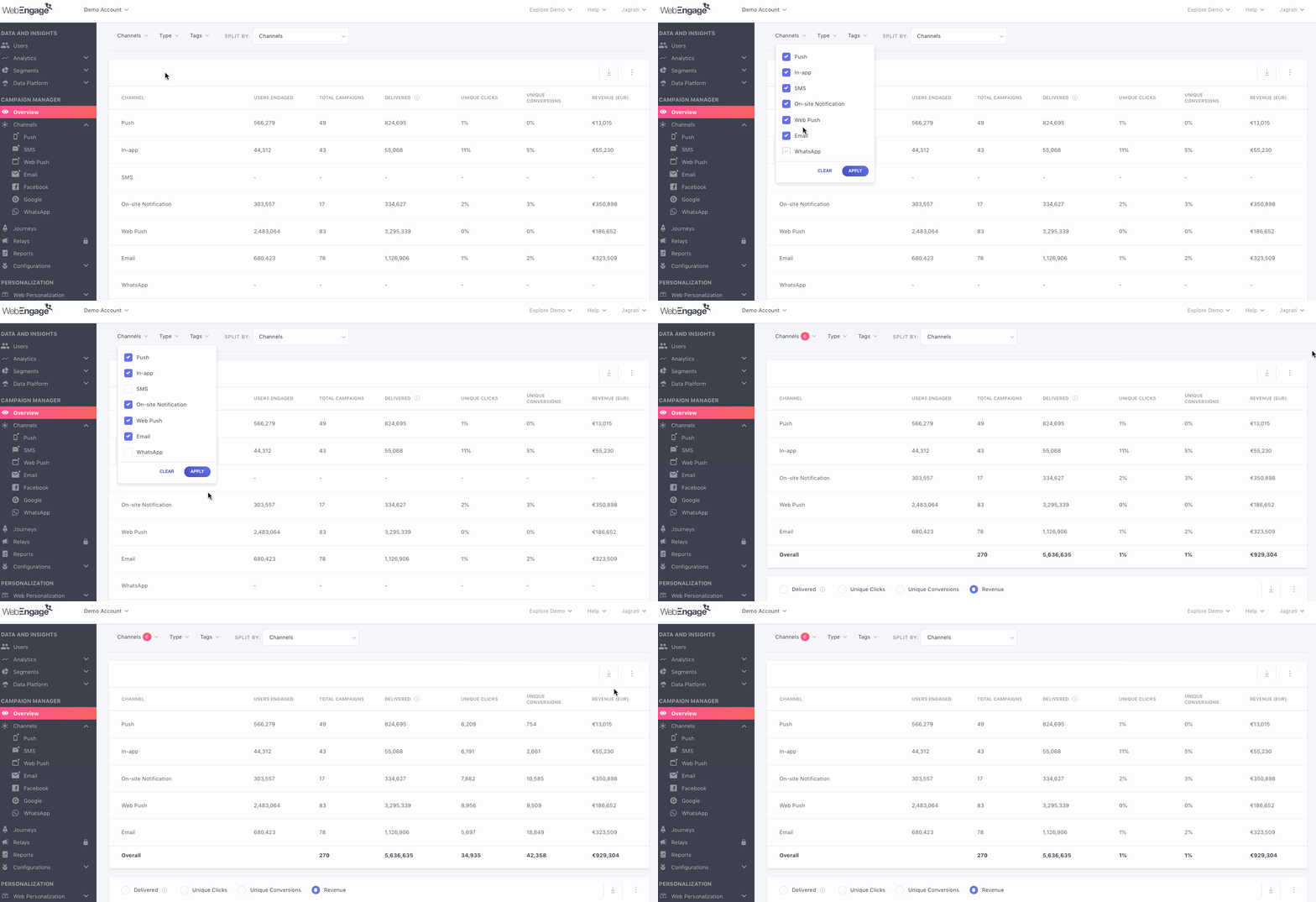
Click to enlarge
Let's quickly go over how this section can be customized as per your analytical needs:
Step 1: Select a Channel
As shown above, using the drop-down placed on the top left, you can choose to view engagement trends specifically for a channel. By default, all channels are selected.
The following options can be selected here:
All: Presents a sum of the data collected for campaigns sent through all the channels listed below against each metric.
Push
In-app
SMS
On-site Notification
Web Push
Step 2: Select the Format of Visualisation
While the default format of visualization is a line graph, as shown above, using the overflow menu placed on the top right, you can change this to a Bar Graph or a Table, as per your analytical needs.
We hope this has equipped you with a robust understanding of how you can leverage all the insights shown under Engagement Overview to analyze the impact of all your channels, in real-time. Please feel free to drop in a few lines at [email protected] in case you have any related queries or feedback. We're always just an email away!
Updated 6 months ago