Push Layouts: Image & Text Guidelines
Make the most of our ready-to-use Layouts to create powerful Push Notifications
Please Note
This document only covers image and text specifications for the Push Notification Layouts listed in your dashboard. Please navigate to the respective guides to start building your campaign from scratch:
Creating Push Campaigns (One-time/ Triggered/ Recurring)
Visual specs apply to all images that are:
Uploaded directly to the dashboard.
Added through a link.
Personalized to a user by adding a User Attribute/Event Attribute to the respective fields.
(Regarding the last two scenarios, please host the pictures on your server/cloud account in the aspect ratios specified below.)
Text
A basic layout that enables you to create textual Push Notifications with great ease. Simply add your message, CTA and you're good to go! (How to customize)
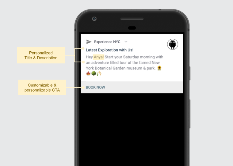
Click to enlarge
| Field | Max Recommended Length |
|---|---|
| Title | 36 characters |
| Message | 180 characters |
| Button Label (CTA text for Android) | 12 characters |
-
You can choose to add up to 2 CTAs to the Text-style Push Notification for Android users through the Advanced (Android) section while creating the campaign.
-
The Button Label cannot be customized for iOS. Please choose an option from the predefined list of buttons nested under Advanced (iOS), while creating the message.
-
Here's how you can personalize the Title and Message to engage one-on-one with all your users.
Banner
A single-fold media template that allows you to create visually personalized notifications. Simply add your message, CTA, image and you're good to go! (How to customize)
Please NoteWebEngage allows you to upload GIFs for Banner Layouts where the target device is iOS and Android.
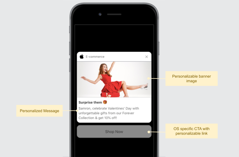
Click to enlarge
Text Specifications
| Field | Max Recommended Length |
|---|---|
| Title | 36 characters |
| Message | 36 characters |
| Button Label (CTA text for Android) | 12 characters |
-
The Button Label cannot be customized for iOS. Please choose an option from the predefined list of buttons nested under Advanced (iOS), while creating the message.
-
Here's how you can personalize the Title and Message to engage one-on-one with all your users.
Banner Image Specifications
Size & Aspect Ratio (w:h) | File Type & Size |
|---|---|
1080px by 540px (2:1) |
|
Pro Tip: Avoid portrait-oriented images at all times!
You can easily personalize the Banner Image to each user's preferences and behavioral history to deliver highly contextual experiences. This could be anything like appealing differently to different types of members (Gold, Silver), highlighting products added to Wishlist/Cart, recommending products based on previous purchases, nudging users to watch the latest episode of a show they're watching and so on!
Adding Text to Banner Image
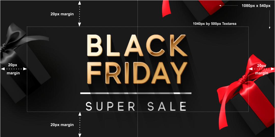
Click to enlarge
As highlight above, please ensure that:
- The Textarea doesn't exceed 1040px by 500px.
- A minimum margin of 20px is maintained on all sides of the content block. Doing so will prevent the text from getting cropped on small screen Android/ iOS devices.
Following these specifications will help you ensure that the banner image looks like the preview shown below, for all your Android and iOS users.
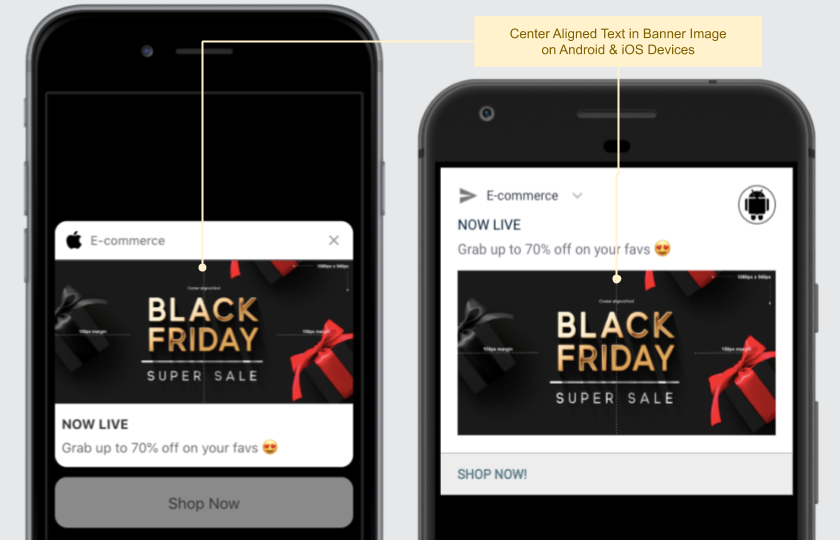
Click to enlarge
Carousel
A multi-fold rich media template that enables you to fight push blindness and create highly engaging app experiences. Simply add your message, images, CTA and you're good to go! (How to customize)
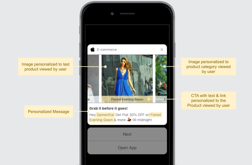
Click to enlarge
Text Specifications
| Field | Max Length Recommended |
|---|---|
| Title | 36 characters |
| Message | 36 characters |
| Image Label (displayed as a button under each image) | 24 characters |
Here's how you can personalize the Title & Message to engage one-on-one with all your users.
Image Specifications
You can choose between two modes while configuring the image style, Landscape and Portrait. Irresepective of the style you select, please add a minimum of 3 images to ensure that the images aren't repeated when a user interacts with the Carousel Notification.
| Carousel Image Style | Size & Aspect Ratio (w:h) | File Type & Size |
|---|---|---|
| Landscape | 1080px by 540px (2:1) | JPG, JPEG, PNG (less than 1MB) |
| Portrait | 540px by 540px (1:1) | JPG, JPEG, PNG (less than 1MB) |
Here's how you can personalize the Carousel's Images to each user's preferences and behavioral history.
Adding Text toLandscape-style Image
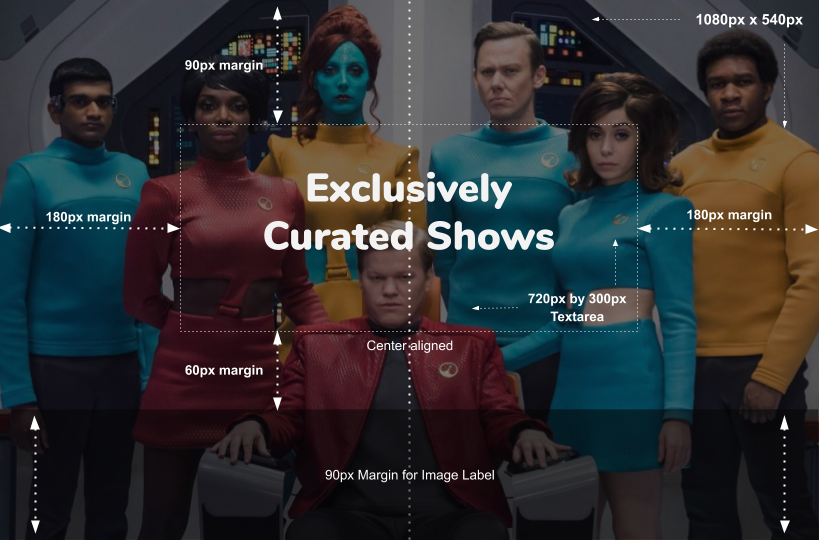
Click to enlarge
As highlight above, please ensure that:
- The text block is center aligned. (Max Textarea = 720px by 300px | 12:5 aspect ratio)
- A minimum margin of 180 px is maintained on the content block's left and right side.
- A minimum margin of 90px is maintained on the content block's top.
- A minimum margin of 120px is maintained on the content block's bottom.
- 90px margin for the Image Label. (CTA on the Carousel Image that allows you to contextually direct users to related sections of your app.)
- 60px margin between the Image Label and Textarea.
Following these specifications will help you prevent the text from getting cropped on small screen Android/ iOS devices. These images will look like the preview shown below.
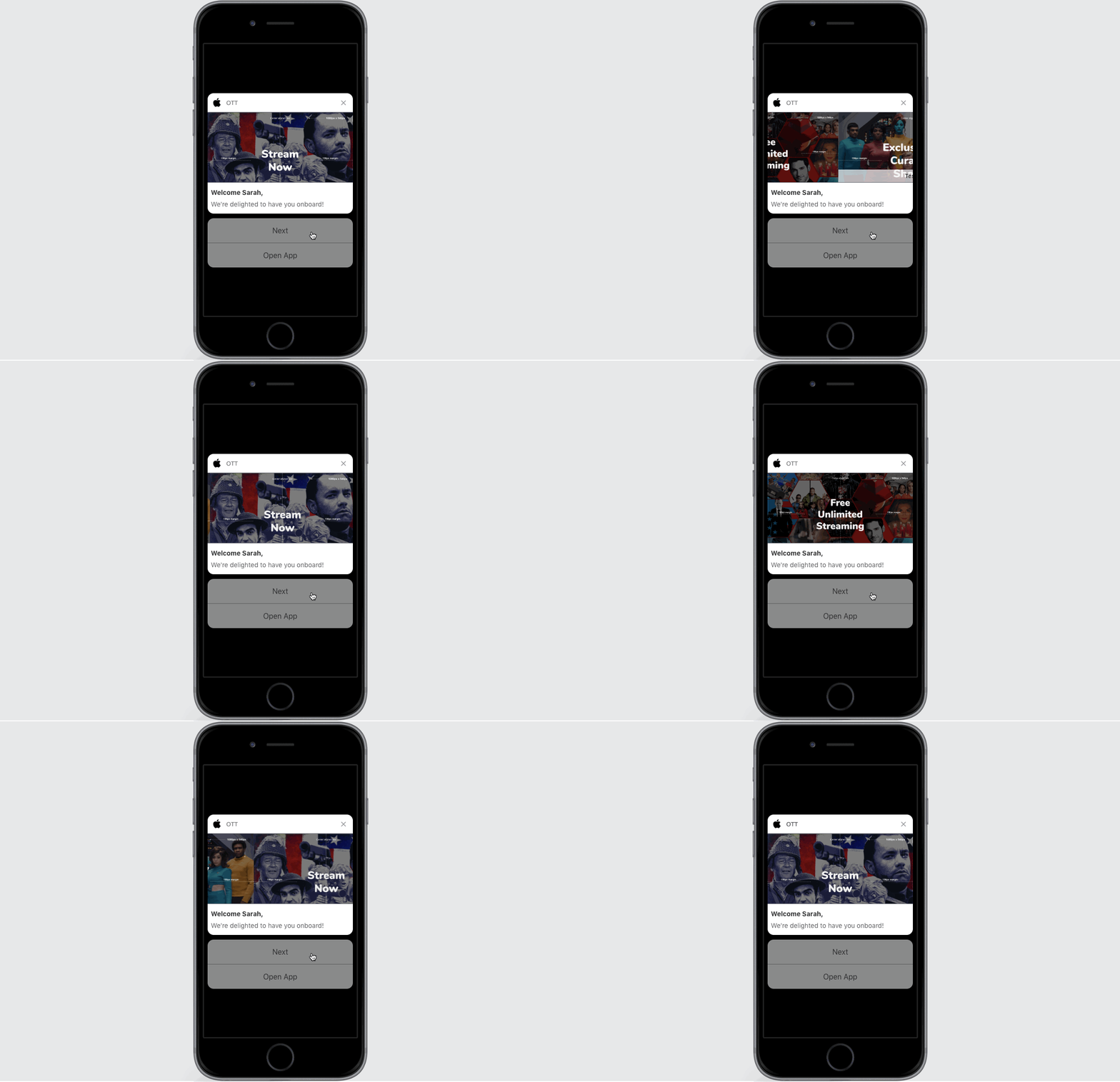
Click to enlarge
Adding Text toPortrait-style Image
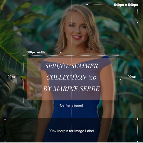
Click to enlarge
As highlight above, please ensure that:
- The text block is center aligned. (Max Textarea = 360px by 450px)
- A minimum margin of 90 px is maintained on the content block's left and right side. Doing so will prevent the text from getting cropped on small screen Android/ iOS devices.
- A minimum margin of 90px is maintained in the bottom so that you can add the Image Label while creating the campaign. (Image Label is a CTA on the Carousel Image that allows you to contextually direct users to related sections of your app.)
Rating
A clean, UX friendly template that allows you to collect product and service feedback with great ease. Simply add your message, image/background color and you're good to go! (How to customize)
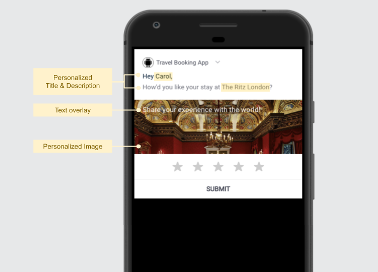
Click to enlarge
Text Specifications
You can choose to add text under the following sections, depending on where you want to place the message in the notification:
-
Basic: The Title and Message are shown above the Background Image/Color added by you.
-
Rating: The Title and Description are displayed as an overlay on the Background Image/Color added by you.
| Field | Max Length Recommended |
|---|---|
| Basic (Title) | 36 characters |
| Basic (Message) | 36 characters |
| Rating (Title) | 50 characters |
| Rating (Description) | 150 characters |
You can easily personalize the Basic (Title & Message) and overlay text added under Rating (Title & Message) to deliver highly contextual experiences. This could be anything like addressing the user by their first name, highlighting the latest product/service purchased by them, highlighting the latest hotel/flight booked by them and so on.
Background Image Specifications
| Size & Aspect Ratio (w:h) | File Type & Size |
|---|---|
| 1080px by 360px (3:1) | JPG, JPEG, PNG (less than 1MB) |
-
If you plan on adding text as an overlay on the background image (Rating Title/Description), then we recommend that you place the character (person/object) on the extreme left/right/top/bottom to accommodate it.
-
Here's how you can personalize the Background Image to engage one-on-one with all your users.
Pro Tip: Avoid portrait-oriented images at all times!
Things to Keep In Mind
-
The actual dimensions and format in which the Push Notification is seen by a user depend on the device's OS (Android/iOS) and screen size.
-
If you have added personalization variables to the text like User Attributes/ Events/ Journey Events/ API Call Data/ Transactional personalization tokens, then we recommend that you gauge its actual length through User Preview or Personalized Preview (for Transactional campaigns).
- Similarly, if you have personalized the image to a Custom User Attribute/ Custom Event, then you can view the actual image that a user will see by previewing the notification for their User ID through User Preview. (How Image Personalization works)
-
If you have added a link under the field, Image then:
- Its URL must begin with HTTPS.
- The responsiveness of the server on which the image is hosted may affect image rendering.
-
Audio & Video files are currently not supported for iOS Push Notifications sent through WebEngage. The feature may be made available in the future. (Android doesn’t support these formats yet).
How it Works on Android
-
Rich Push Notifications or notifications containing images are supported only on Android v4.1 & above.
- This means that if a user is currently on a lower version, then they will receive only the Title & Message of the Push Notification.
- Hence, please ensure that the copy conveys the entire context of the notification so that users on lower OS versions still understand your message.
-
If there are too many notifications in the tray, then the banner image of your Push Notification may not be shown at first. Users will need to expand the notification to see the image and description.
- We use the BigPicture mode for Android notifications. In this format, only one line of the message is shown when the notification is expanded.
How it works on iOS
-
Images & GIFs are supported on devices using iOS v10 & above and Android.
- This means that if a user is currently on a lower version, then they will receive only the Title & Message of the Push Notification.
- Hence, please ensure that the copy conveys the entire context of the notification so that users on lower OS versions still understand your message.
-
Images in iOS v12 & above will be displayed in two ratios (width:height), 1:1 or 3:2.
- If the dimensions of an image don't fit either aspect ratios, then the image will be cropped from the center to match the aspect ratio that helps preserve the most pixels.
Please feel free to drop in a few lines at [email protected] in case you have any further queries or feedback. We're always just an email away!
Updated 6 months ago
Continue creating your Push Notification...