Analyzing a Journey
A Step-by-step guide to analyzing the performance of a Journey & navigating its Live View
Once you have launched a Journey,you can analyze the collective impact of all its Journey campaigns on driving key business goals and shaping user experience through Overview and Live View.
How to Access
Let's quickly show you how you can access Journey Overview & Live View through the various sections of your dashboard:
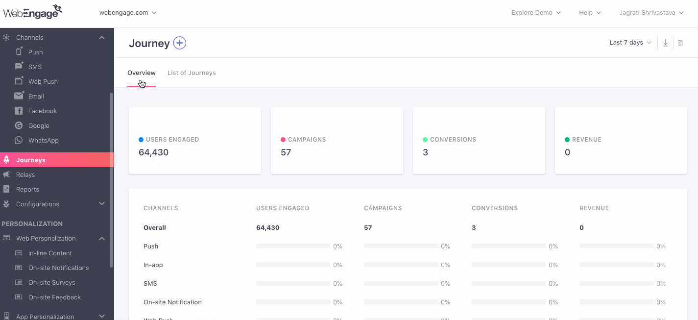
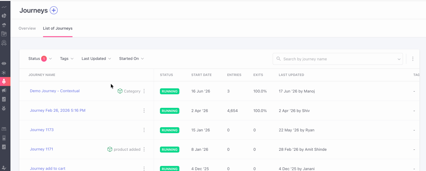
Access Journey Overview through List of Journeys
Access Live View through Journey Campaign's Overview
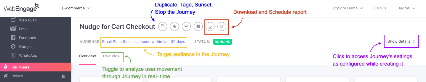
As shown below, you can access a Journey's Live View through an attached Journey Campaign's Overview section. This is a great way to analyze the campaign's performance in the context of the Conditions and Flow Controls that precede it in the flow and determine the exact moment in which a user is engaged through the campaign.
Analyzing Journey Overview
Before we dive into analysis, let's get you acquainted with the top panel.
Understanding Top Panel
As highlighted above, the top panel indicates key details like:
-
(Target) Audience: The target segment of the Journey, as specified while creating it.
-
Status: Indicates the current status of the Journey which can be any of - Draft, Running, Sunset, Stopped. (detailed read)
Now let's get you acquainted with its features:
1. See Journey Details
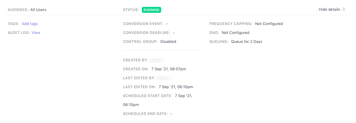
Click Show Details to access a snapshot of the Journey's settings, as specified while creating it. It can be minimized by clicking Hide Details.
Let's walk you through all the details shown here:
- Tags: Tags is a handy feature that helps you categorize your Journeys as per their purpose, target audience, or any other parameter that makes them easier to search for.
If a Journey is tagged: All the tags added to the Journey will be shown here. You can click on a hyperlinked tag to add more tags or remove existing ones.
If no tags have been added:Click on Add Tags to create new tags for the Journey and add existing ones to it.
- Conversion Event: Indicates the action users are expected to perform on your app/website after receiving a campaign through the Journey, as specified under the section, Conversion Tracking while creating it.
If you have not set up Conversion Tracking for the Journey, then the same will be indicated by the status Disabled, here.
- Conversion Deadline: Indicates the duration till which the Conversion Event will be tracked after a Journey campaign is delivered to a user. The same must be specified under the section Conversion Tracking while creating the Journey.
If you have not set up Conversion Tracking for the Journey, then the same will be indicated by the status Disabled, here.
-
Control Group: Indicates whether or not a Control Group was set up to measure the Journey's effectiveness against organic user behavior (under Conversion Tracking while creating it). The same is indicated by:
- Enabled
- Disabled
-
Frequency Capping: Indicates whether or not Frequency Capping was enabled for the Journey while creating it. The same is indicated by:
- Follow
- Ignore
-
DND: Indicates whether or not DND Hours were enabled for the Journey while creating it. The same is indicated by:
- Follow
- Ignore
-
Queueing: Indicated the duration for which Journey campaigns (attached to the Journey) will be queued for delayed delivery if we are unable to deliver them immediately to a user. The same can be specified under the section Frequency Capping & DND while creating the Journey.
- All Journey campaigns are queued for 2 days by default. However, if you have disabled the settings, it's indicated by the status - Disabled.
-
Created By: Indicates the name of the account admin who created the Journey.
-
Created On: Indicates the date the account admin started creating the Journey.
-
Last Edited By: Indicates the name of the account admin who has made the most recent edit to the Journey.
-
Last Edited on: Indicates the date and time the most recent edit was made to the Journey.
-
Scheduled Start Date: Indicates the time and date when the Journey would get published, if configured explicitly at the time of publishing the Journey.
-
Scheduled End Date: Indicates the time and date when the Journey would be stopped, if configured.
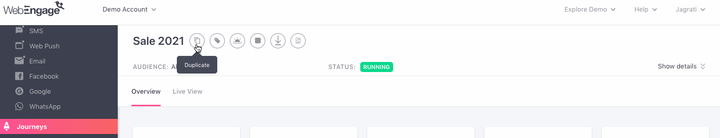
2. Modify Journey
As shown below, using the icons placed next to the Journey's Title, you can choose to Duplicate, Tag, Sunset or Stop the Journey. You can also Download or Schedule the *Report.
Now, let's dig into each section, starting with Overall Performance.
Overall Performance
This section helps you analyze the performance of your Journey and its impact on driving Conversions and Revenue for your brand. Let's go over each card:
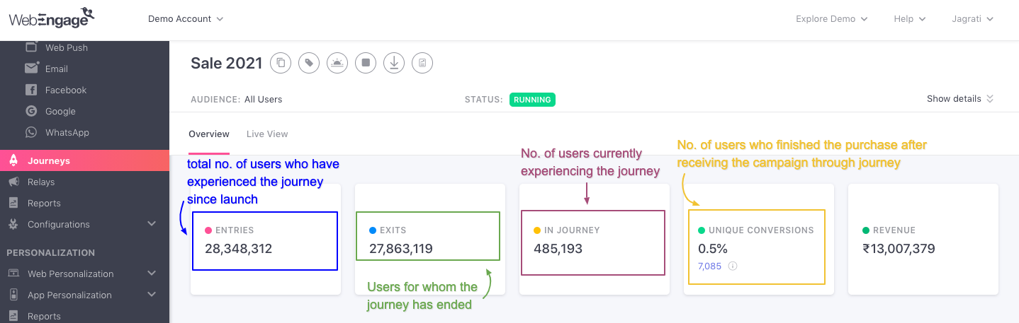
Entries
Indicates the total number of users that have entered the Journey over its entire lifetime (from launch date till present day).
- Users can go on a Journey designed by you only if their actions or preferences match the Trigger criteria defined while creating it.
- Each time a user enters a Journey, it's counted as a Trip. And over the entire lifetime of a user, they can go on multiple Trips through a Journey designed by you. Thus, Entries does not indicate the unique number of users who have experienced the Journey, it merely indicates the total number of users that have entered it.
Exits
Indicates the total number of users that have exited the Journey, over its entire lifetime (from launch date till present day).
- Once a user enters a Journey, there are several ways in which they could exit it like:
- User's actions or preferences did not match the Condition criteria of a particular flow in the Journey.
- User's actions or preferences matched the Exit Trigger defined while creating it, promoting us to remove them immediately.
- User reached an End block or a dead end in the Journey and thus, automatically exited it.
In Journey
Indicates the total number of users that are currently experiencing the Journey designed by you.
- Once a user enters a Journey, they are bound to experience it as per the rules defined while creating it. Thus, Users In Journey generally refers to the users who are currently waiting to proceed to the next block in the Journey.
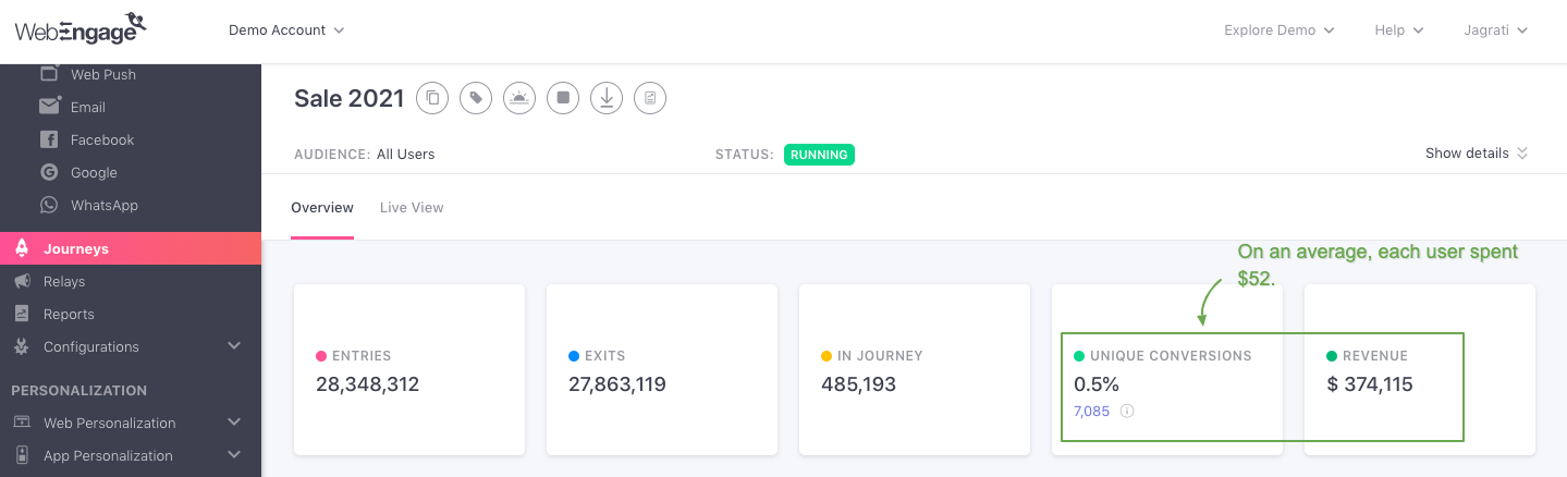
Unique Conversions
Unique Conversion rate: Indicates the share of users that have performed the Journey'sConversion Event at least once after receiving a Journey campaign, since the Journey's launch date till the present day.
Unique Conversions in journey are calculated as, total number of conversions attributed to journey campaigns (based on conversion event performed).
Conversion Rate of journey is calculated as ratio of Unique Conversions to total number of trips where,
- at least one message was delivered to user (for messaging channels like Email, SMS, WhatsApp etc.)
- at least one campaign was viewed by user (for in session channels like On-Site Notifications, App Personalization etc.)
The card also indicates the number of users converted through the Journey, giving you a fair idea of the Average Revenue Per User (ARPU). For example, in the visual below, we can see that the ARPU of the Journey is currently $52. (That's an impressive ROI for a sale campaign!)
Comparing Unique Conversions Against Control Group: If a Control Group was added to the Journey while creating it, then you will be able to compare its conversion rate against the Control Group's organic conversion rate - helping you understand its true impact.
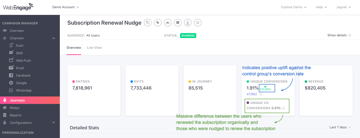
Analyzing Conversion Uplift of a Recommendation Journey for a Video Streaming PlatformFor example, in the above visual we have analyzed a Show Recommendation Journey created by a Music Streaming Platform (app + web).
The Journey's end goal was to drive platform engagement by nudging the users to renew their subscriptions.
This was their first attempt at engaging users with recommendations as they had previously relied on their app and website's organic content discovery model. Thus, marketers of the platform added a Control Group while creating the Journey to analyze its actual impact on influencing platform engagement.
Journey's Overview reveals that:
Unique Conversion Rate of Journey: 1.91%
Unique Conversion Rate of CG: 0.31%
Conversion Uplift: 517.84%
Clearly, the Journey made less difference, and users chose to act upon their organic will and renew the subscription, hence increasing the engagement.
Now let's walk you through the stats shown here:
-
Unique CG Conversions: Indicates the share of users that performed the Journey'sConversion Event at least once, out of their own organic will as they never experienced the Journey.
- Calculated against the total number of users included in the Control Group (CG), since the Journey's launch date till the present day.
-
Conversion Uplift: Indicates the percentage increase or decrease in the Unique Conversion rate achieved by the Journey, calculated against Unique CG Conversions.
- It's shown beside the Journey's Unique Conversion rate, in Green for positive uplift, in Red for negative uplift, and in Grey for no uplift.
Fact CheckConversion Uplift =[(Unique Conversion Rate of Campaign/ Unique Conversion Rate of CG) x 100] - 100
In addition to conversion uplift, you can also calculate the revenue increment through Revenue and Order Uplift.
Revenue and Order Uplift CalculationFormula to calculate Revenue Uplift :
- CG projected total revenue = CG(Total Revenue / Total Sent Count) X TG Total Sent Count
- Revenue Uplift (absolute value) = [TG Revenue - CG Revenue (Projected to TG Volume)]
- Revenue Uplift %= [TG Revenue / CG Revenue (Projected to TG Volume) X 100] - 100
Formula to calculate Order Uplift
- Order Uplift (absolute value)= (TG Order Rate - CG Order Rate) X TG Total Sent Count
- Order Uplift % = (TG Order Rate / CG Order Rate X 100) - 100
where CG: Control group; TG: Targeted group.
How Unique Conversion Rate Is Calculated for a Journey
It's calculated against the number of users that have been engaged through at least one message sent through a Journey campaign attached to the Journey, in an on-going Trip.
Fact Check:Unique Conversion Rate of Journey = (Users Who Performed Conversion Event /Users Engaged) x 100
This is slightly different compared to Journey campaigns, where the Conversion Rate is calculated against the total number of messages Delivered or total Impressions.
Here's Why:
As discussed under Conversion Tracking, the end goal or Conversion Event of a Journey is tracked through each Journey campaign that is tied to it.
As you are aware, a user can be engaged through multiple Journey campaigns throughout their Trip while experiencing a Journey. But Conversion is attributed to only one Journey campaign as per the Deepest-Latest Conversion Attribution Model.
Thus, calculating the Conversion Rate of a Journey against the total number of messages Delivered or total Impressions will lead to a highly deflated Conversion Rate - skewing your insights. For the same reason, an average of the Unique Conversion Rate indicated against each Journey campaign, (under Campaign Comparison) will not match the Unique Conversion Rate shown here.
For example, in the visual below, we can see that Journey's Unique Conversion Rate is 0.7%. This can be verified against the number of 'users engaged', revealed by hovering over the tooltip.
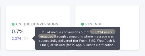
Hence, Unique Conversion Rate = (2,374 / 333,334) x 100 = 0.71%
Understanding 'Users Engaged'
The term, Users Engaged, indicates the unique number of users who have received or viewed at least one message sent through a Journey campaign attached to the Journey. Thus, if a user receives/views multiple messages while experiencing a Journey in an on-going Trip, then they will be counted towards the number of Users Engaged only once to avoid double counting.
- Here, 'received' is equivalent to Delivered (for Push, SMS, Web Push, Email) and 'viewed' is equivalent to Impressions (for In-app and On-site).
Fact CheckUsers Engaged = Entries - (Users in Journey + Unreachable & Ineligible Users)
Unreachable & Ineligible users are autodetected by us in real-time.
Users are deemed ineligible to proceed if their actions/preferences don't match the Conditions applied to the Journey while creating it.
Revenue
Indicates the amount of Revenue generated through the Total Conversions that have been attributed to all the Journey campaigns over the entire lifetime of the Journey (since launch date till the present day).
- Revenue_numbers are always shown in the currency selected while setting upRevenue Mapping._
Campaign Comparison
This section helps you analyze the consolidated performance of all the Journey campaigns on the basis of the channels they're being sent through. It's a great way to identify the most effective channels of engagement for achieving your Journey's end goal.
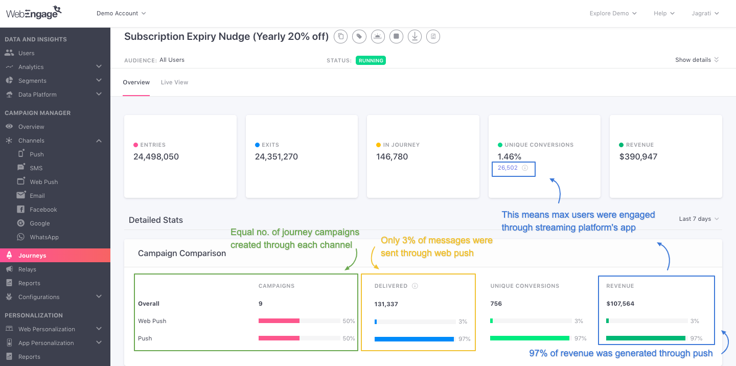
Comapring Campaigns of a Subscription Renewal JourneyFor example, in the above visual, we have analyzed the performance of a Subscription Renewal Journey created by a Video Streaming Platform (app + web).
We can clearly see that an equal number of campaigns are sent through Push and Web Push. But Push Journey Campaigns have collectively contributed 97% of the Overall Revenue.
On closer inspection, we see that only 3% of the total number of messages were delivered through Web Push.
Why? We will need to dig deeper into the performance of each Journey campaign through the section, Campaigns and the channel preferences of Users to determine the reasons.
Our hypothesis - maximum users of the video streaming platform prefer to interact with the app.
Now, let's walk you through all the stats shown here:
Campaigns
Overall: Indicates the total number of Journey campaigns being sent to users through the Journey.
Channel: Percentage of Journey campaigns being sent through the channel listed on the left, calculated against the Overall number.
Delivered
Overall: Indicates the total number of messages that have been delivered to users through all the Journey campaigns sent through the Journey.
Channel: Percentage of messages that have been delivered through the Journey campaigns sent through the channel listed on the left, calculated against the Overall number.
Unique Conversions
Overall: Indicates a sum of the unique users that have been converted through all the Journey campaigns sent through the Journey.
Channel: Percentage of Unique Conversions that have been attributed to the Journey campaigns sent through the channel listed on the left, calculated against the Overall number.
Revenue
Overall: Indicates the total Revenue that has been generated through all the Journey campaigns sent through the Journey.
Channel: Percentage of Revenue that has been generated through the Journey campaigns sent through the channel listed on the left, calculated against the Overall number.
- Revenue_numbers are always shown in the currency selected while setting upRevenue Mapping._
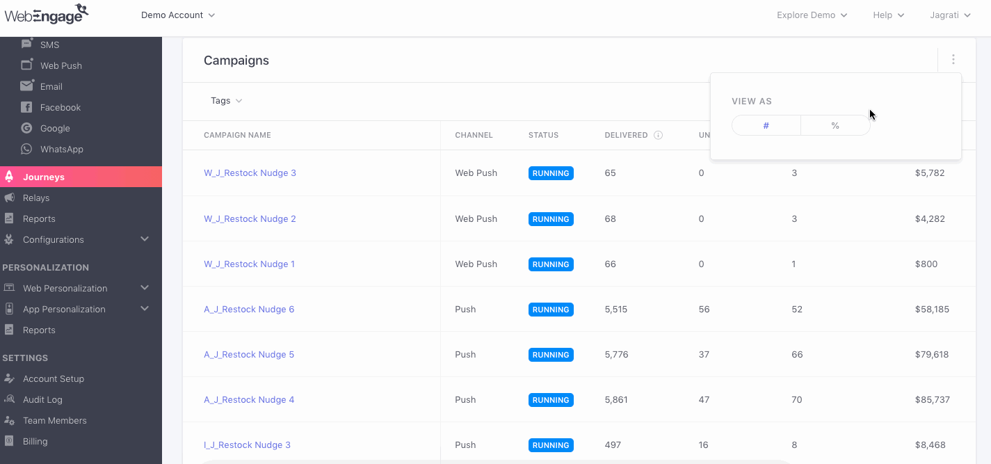
Campaigns
This section empowers you to analyze the performance of each campaign sent through the Journey against key performance indicators like Deliveries/Impressions, Unique Clicks, Unique Conversions, and Revenue. You can further analyze each campaign in greater detail by accessing its Overview section.
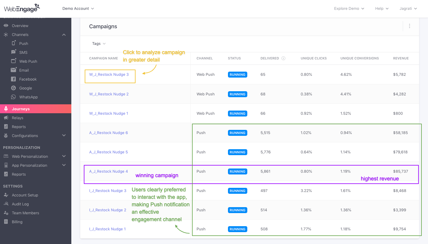
Analyzing Campaigns of a Product Restock NudgeFor example, in the above visual we have analyzed the Journey campaigns of a Product Restock Journey created by an E-commerce platform (app + web). Its end goal is to drive Product checkout renewals by offering a discount of 20%.
It reveals the following insights:
-
The maximum number of messages were delivered through the 6 Push campaigns created through the Journey. This implies that most users of the platform prefer to interact with the app, compared to the website.
-
Interestingly, on comparing the Revenue generated through each Journey campaign, you will notice that the maximum Revenue was contributed by A_J Restock Nudge 4, followed by W_J Restock Nudge 3.
- This indicates that it took 4 Push Notification to persuade the app users to Restock the Product and it took 3 Web Push Notifications to persuade web users to do the same.
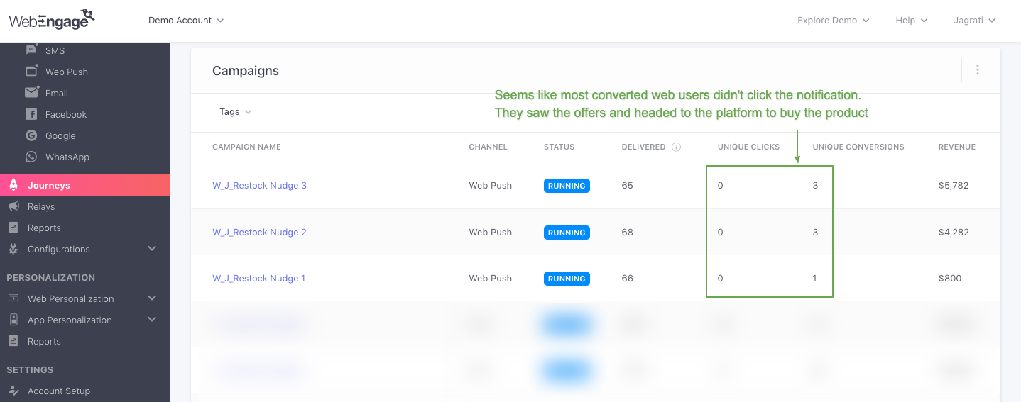
- Further, as highlighted above, most converted web users didn't actually click on the Web Push Notification.
- Our hypothesis - they saw the message, copied the discount code, and made the purchase right away.
- This can further be confirmed by digging into each Web Push campaign's Overview and analyzing the Impression-Click-Conversion ratio.
Now let's walk you through all the details shown here:
Campaign Name
Indicates the name of the Journey campaign and is hyperlinked to its Overview section, allowing you to analyze its impact on user engagement, conversions, and revenue in greater depth.
Channel
Indicates the channel (Push, In-app, SMS, On-site, Web Push, Email) through which the campaign listed on the left is sent.
- Channels of engagement can be added through Action Blocks while creating the Journey.
Status
A Journey campaign can have any of the following statuses - Draft, Running, Stopped or Sunset, depending on the status of the Journey.
Delivered (or Impressions)
Indicates the total number of messages that have been delivered to users through the Push/ SMS/ Web Push/ Email Journey campaign listed on the left, over the entire lifetime of the Journey.
- Indicates unique Impressions (users who have viewed a notification at least once) for the In-app/ Onsite Journey campaign listed on the left, since the Journey's launch date till the present day.
Unique Clicks
Indicates the percentage of users who have clicked on the campaign listed on the left at least once after receiving/viewing it, over the entire lifetime of the Journey.
- Calculated against the number of messages Delivered for Push, SMS, Web Push, Email campaigns and the number of Impressions for In-app and On-site campaigns.
Unique Conversions
Indicates the percentage of users that have performed the Journey'sConversion Event at least once after receiving/viewing the Journey campaign listed on the left, over the entire lifetime of the Journey.
- Calculated against the number of messages Delivered for Push, SMS, Web Push, Email campaigns and the number of Impressions for In-app and On-site campaigns.
Revenue
Indicates the total amount of Revenue that has been generated through the Journey campaign listed on the left, since the Journey's launch date till the present day.
- Revenue numbers are always shown in the currency selected while setting up Revenue Mapping.
Lastly, as shown below, you can choose to analyze Unique Clicks and Unique Conversions as a number (#) or a percentage value (%) as per your analytical needs.
Campaign Trends
This section has been specially designed to help you compare the day-wise performance of the various Journey campaigns/ the channels they're sent through against key Performance Indicators.
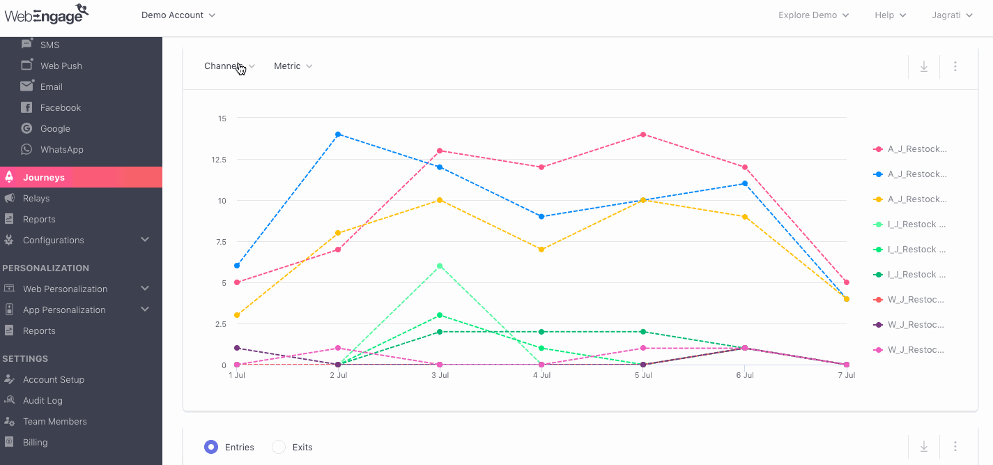
While the default view shows you Delivery/Impression trends over the Last 7 Days for Journey campaigns sent through All Channels (Push, In-app, SMS, On-site, Web Push, Email), you can easily customize the stats as per your analytical needs. Here's how you can go about it:
Step 1: Select a Channel
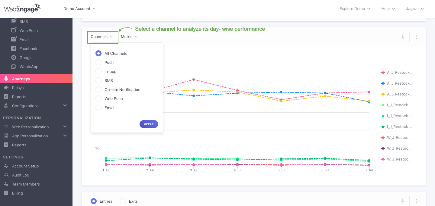
As shown above, using the drop-down placed on the left, you can analyze the collective impact of Journey campaigns sent through a particular channel against performance indicators like Deliveries/Impressions, Unique Clicks, Unique Conversions, and Revenue.
The following options can be selected here:
All: Helps you compare the performance of all the Journey campaigns being sent through the Journey.
Push
In-app
SMS
On-site Notification
Web Push
Step 2: Select a Time Frame
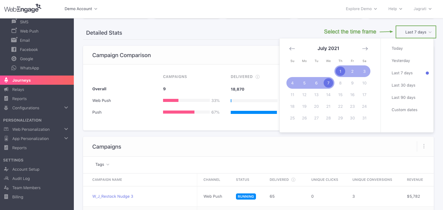
As shown above, using the drop-down placed on the top right where you can see the Detailed Stats, you can compare the performance of Journey campaigns sent through the selected channel for a custom time frame.
The following time periods can be selected here:
Today
Yesterday
Last 30 Days
Last 60 Days
Last 90 Days
Custom Dates (as selected by you)
Step 3: Select a Format of Visualization
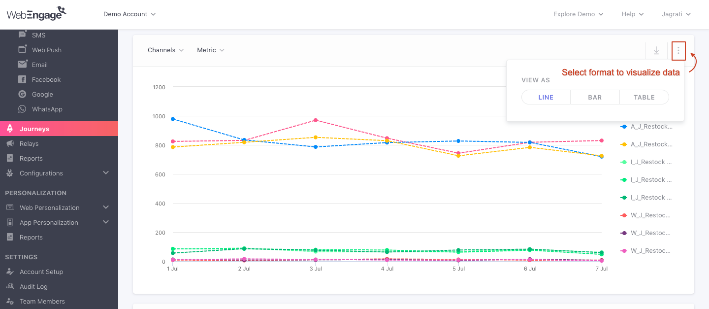
While the default format of visualization is a Line Graph, using the overflow menu highlighted above you can change this to a_Bar Graph or a _Table,* as per your analytical needs.
Journey Entry/ Exit Trends
This section has been specially designed to help you understand the Entry and Exit trend of users who are eligible to experience the Journey. It's a great way to analyze the day-wise impact of your Journey on shaping your brand's user experience.
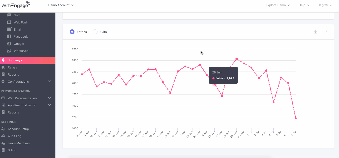
Analyzing Entry-Exits for a Subscription Renewal JourneyFor example, in the above visual we have analyzed user entry-exit trends for a Product Restock Journey created by an E-commerce Platform (app + web). We can clearly see an influx in Entries and Exits on June 29.
Why did so many users experience theJourney on this day? We'll need to dig into the following aspects to find our answers:
- Analyze the repeat purchase behavior of users who have purchased products to understand if a majority of them did so on the specified dates in the past.
- This will help us understand whether the influx is a result of a cohort of users coming back to make a purchase or has been caused by some other factors.
- Did marketers of the platform re-engage users, who have received at least one campaign through the Journey, with ads on social media platforms on these specific days?
- It could have prompted some users to perform the Conversion Event within the Conversion Deadline of the Journey, resulting in the conversion being attributed to a journey campaign.
- Further, if the Conversion Event was defined as the Journey's Exit trigger, then it would explain the Exits on these days too.
Now let's show you how you can customize this section as per your analytical needs:
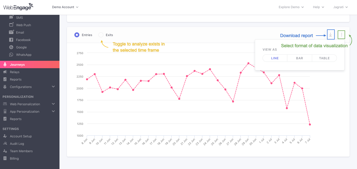
As highlighted above:
-
Clicking the radio button on the top left, you can toggle between the Entry/ Exit trends.
-
Using the overflow menu placed on the top right, you can choose to analyze the trends as a Line Graph, Bar Graph or a Table as per your analytical needs.
-
Clicking on the download button will Download the Campaign Report.
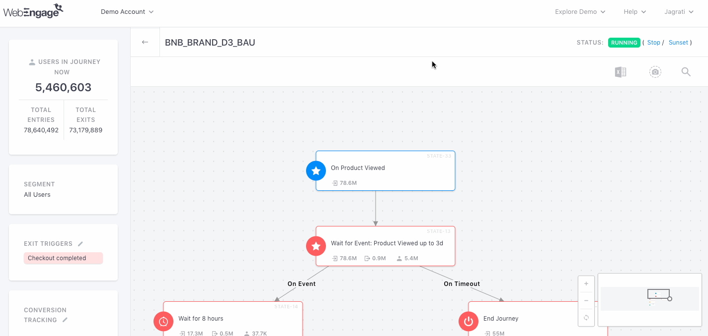
Analyzing Journey Live View
Live View is a real-time depiction of user engagement across the entire Journey designed by you. It annotates all the points that shape user experience, helping you analyze movement through its multiple flows and blocks.
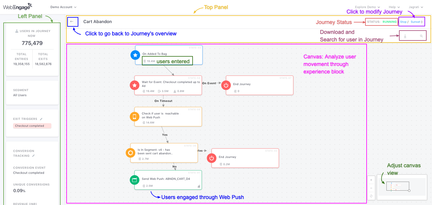
As highlighted above, Live View is divided into three sections - Top Panel, Canvas, and Left Panel.
- Top Panel: Allows you to modify the Journey, download a custom report, save the journey as an image, and search for a user's journey using their User ID.
- Canvas: Depicts the Journey as it was created, indicating user movement through each block in real time.
- Left Panel: Displays key Journey statistics such as Entries, Exits, and Users in Journey, along with a summary of the Journey configuration. To maximize the available canvas space, the Left Panel is collapsed by default when you open Live View. You can expand or collapse it at any time using the panel toggle.
Top Panel
The top panel allows you to modify the Journey, search for a user in the Journey, download a user engagement report and navigate back to the Journey's Overview section, as highlighted above. Let's walk you through its features:
1. Download a Report
You can easily download a custom report for your Journey, highlighting each user's movement through it and their interactions with its various Journey campaigns. Here's how you can go about it:
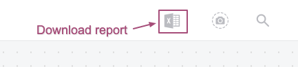
Step 1: Click the Excel Sheet icon.
- In doing so, a Download Report button will appear.
Step 2: Click on the dropdown to select a time frame as per your analytical needs.
The following time periods can be selected here:
Yesterday
Last 7 days
Last 30 days
Last 90 days
Custom dates (as defined by you)
Step 3: Click the Download Report button.
- In doing so, a .csv file will be downloaded on your device shortly.
- However, do keep in mind that the report has an upper limit of 10,000 Trips. This means that it'll include stats only for the latest 10KEntries into the Journey for the selected time frame. If the total number of Trips exceeds the upper limit, then the report's stats will be appended.
The following details are included in a Journey report:
User ID: Indicates the User ID of a user that has entered the Journey within the selected time frame.
Entry Date-time: Indicates the date and time at which a particular user Entered the Journey.
Exit Date-time: Indicates the date and time at which the Journey experience ended for a particular user.
Exit Reason: Indicates the reason due to which the Journey experience ended for a user, as a result of which they Exited it.
Current State (of the user, in theJourney): If a user is currently experiencing the Journey, then their current state or the block that they're currently experiencing is indicated against this field.
Performance Indicators of the various campaigns being sent through each Action Block added to the Journey: For each Action Block or channel of engagement added to the Journey, key performance indicators like Views, Clicks, Dismisses are indicated against each User ID, helping you analyze interactions at the user-level.
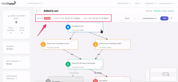
2. Search for a User Trip
This is a great way to analyze a user's experience by tracing back their movement through the various blocks of the Journey. The best part - if a user has experienced multiple Trips through the Journey then you can analyze each one separately! All Trips of the last 30 days would be shown in the results.
As shown above, enter the User ID in the search box and click on the Find button to find their latest trip.
Analyze user's experience in multiple Trips.
Using the dropdown placed towards the left of the field, User ID, you can select the Trip, for which you'd like to analyze the user's movement through the Journey. You can also see the trip status, user’s entry, and exit time on the top panel.

By clicking on the Info icon of the Event entry trigger block or the Call an API block, you can see the value of the event attributes when the user entered the journey and the output of the API call for that user.
3. Modify Journey Status
As shown above, the right side of the Top Panel indicates the Journey's status and allows you to Stop or Sunset a Running Journey.
4. Save an image of the Journey canvas
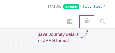
WebEngage allows you to save the journey you have designed in image (.JPEG) format. Just click on the Camera icon on the top panel, and it will allow you to save your journey.
Canvas
The canvas presents a real-time preview of the Journey and annotates user movement through each block, helping you analyzing how users have been experiencing it.
Let's go over a short use-case to help you get acquainted with the Live View:
Analyzing Live View of a Purchase Journey for an E-commerce AppLet's take the example of an e-commerce app that exclusively deals in fashion wear. They're a one of the most profitable e-coomerce websites and have a loyal customer base.
However, recently, marketers of the app noticed a drop in conversions. On digging into the numbers, they found that app engagement was growing at a steady rate, but it wasn't leading to the desired number of purchases. Customers would add the product to the cart but will not purchase it. Hence, they decided to send a web push notification for cart abandonment to all the users who have products in their cart.
Here's how they planned theJourney experience:
The Problem Statement: App engagement has increased over the last month, the conversion rate has dropped.
The Target Audience: All users with web push notification enabled.
The Plan: Motivating users to make a purchase after they have abandoned the cart.
The End Goal: Purchase
The Strategy: Target users who have viewed at least one product in their cart.
How? - Observe their purchase behavior. If they don't make a purchase within the next 3 days then send them a web push notification reminding them of the product(s) in their cart.
Where? - Web Push Notifications.
Pre-requisites: Web Push Notification enabled.
Each time a user add the product in their cart, it is tracked as Custom Event, Product - Added to Cart
Purchase is tracked as the Custom Event, Checkout Completed
Here's what the Purchase Journey looked like over the last 2 weeks:
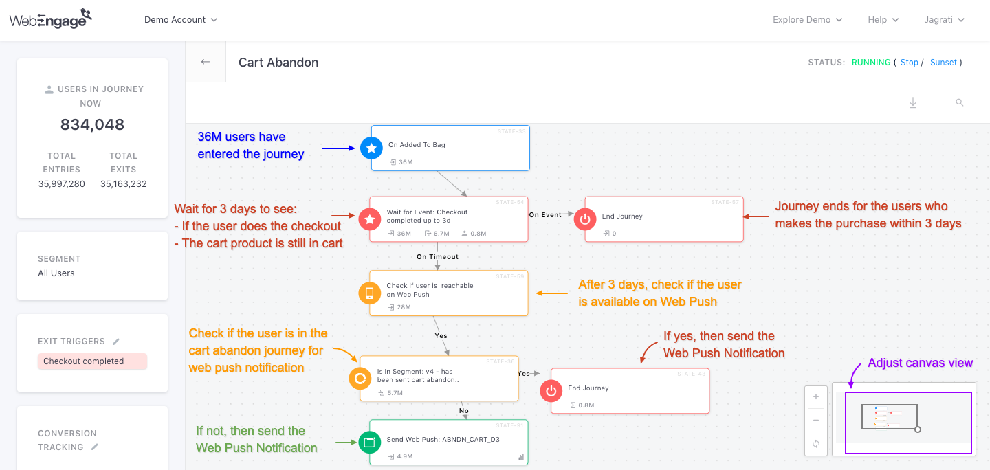
Key takeaways:
-
Over the last 2 weeks, 36M users entered the Journey as they added the product to the bag.
-
Their purchase behavior was analyzed by checking if they've performed the event, Checkout Completed.
- 0 users made a purchase organically and thus, the Journey experience ended for them.
-
For the remaining 36M users, we decided to wait for three days to observe if they return to the app and perform the event, Added to Cart, OR perform the Exit Trigger, Checkout Completed.
- If they make a purchase within 3 days, then then the Journey experience ends immediately.
- If not, then we'll engage them in either of the following ways:
- We check if the user is available for the Web Push notification. (Within the last two weeks, 28M users were available for_Web Push Notification)._
- Further, we check if the user is part of the segment for Cart Abandonment Notification. (5.7M users are in the segment). The users in the segment are sent the notification and their journey ends.
- If the users are not part of the segment then they are sent a separate Web Push Notification reminding them of the product in their cart. (4.9M users were sent the web push notification).
-
Out of all the users that received the Web Push Notification, 1.2% made a purchase, generating $138,950 in revenue! And just like that, the app's conversion rates were back on track :)
Now let's walk you through the stats shown under the various blocks that you used to design the Journey experience:
1. Analyzing Trigger Blocks (Blue)
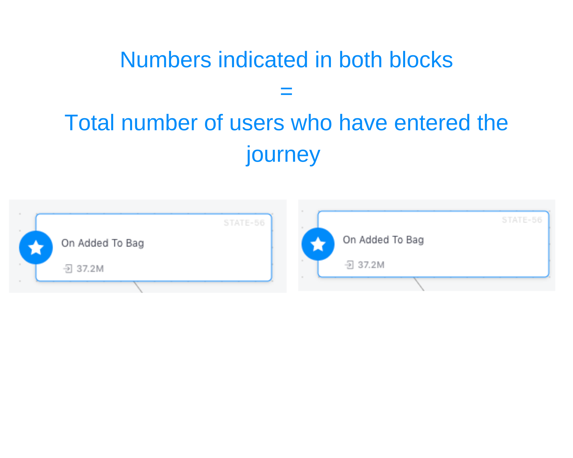
In the above visual, you will notice a number in the bottom-left of the Trigger Blocks. It indicates the total number of users that have entered the Journey through the block, over its entire lifetime.
- Number of users indicated here is counted toward Total Entries.
2. Analyzing Action Blocks (Green)
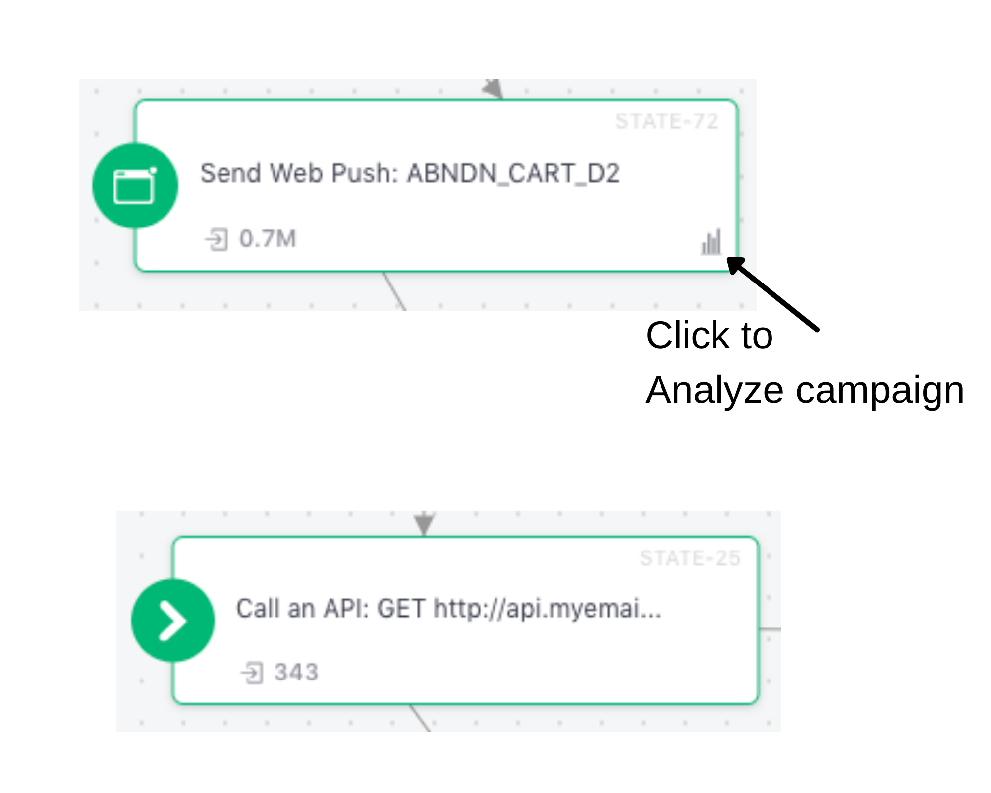
In the above visual, you will notice a number in the bottom-left of each Action Block and a stats icon in the bottom-right of the first block. Here's what they mean:
For Action Blocks that Send a Campaign
-
In the above visual, number in the bottom-left of the first block indicates total users to whom the campaign has been Sent over the entire lifetime of the Journey.
-
The stats icon in the bottom-right allows you to analyze the campaign being sent through the Action Block. Simply click the icon to access the campaign's Overview and start analyzing its impact on driving user engagement, conversions and revenue!
For Action Blocks that Call an API
In the above visual, the number in the bottom-left of the second block indicates total users for whom the API call was triggered, over the entire lifetime of the Journey.
3. Analyzing Condition Blocks (Orange)
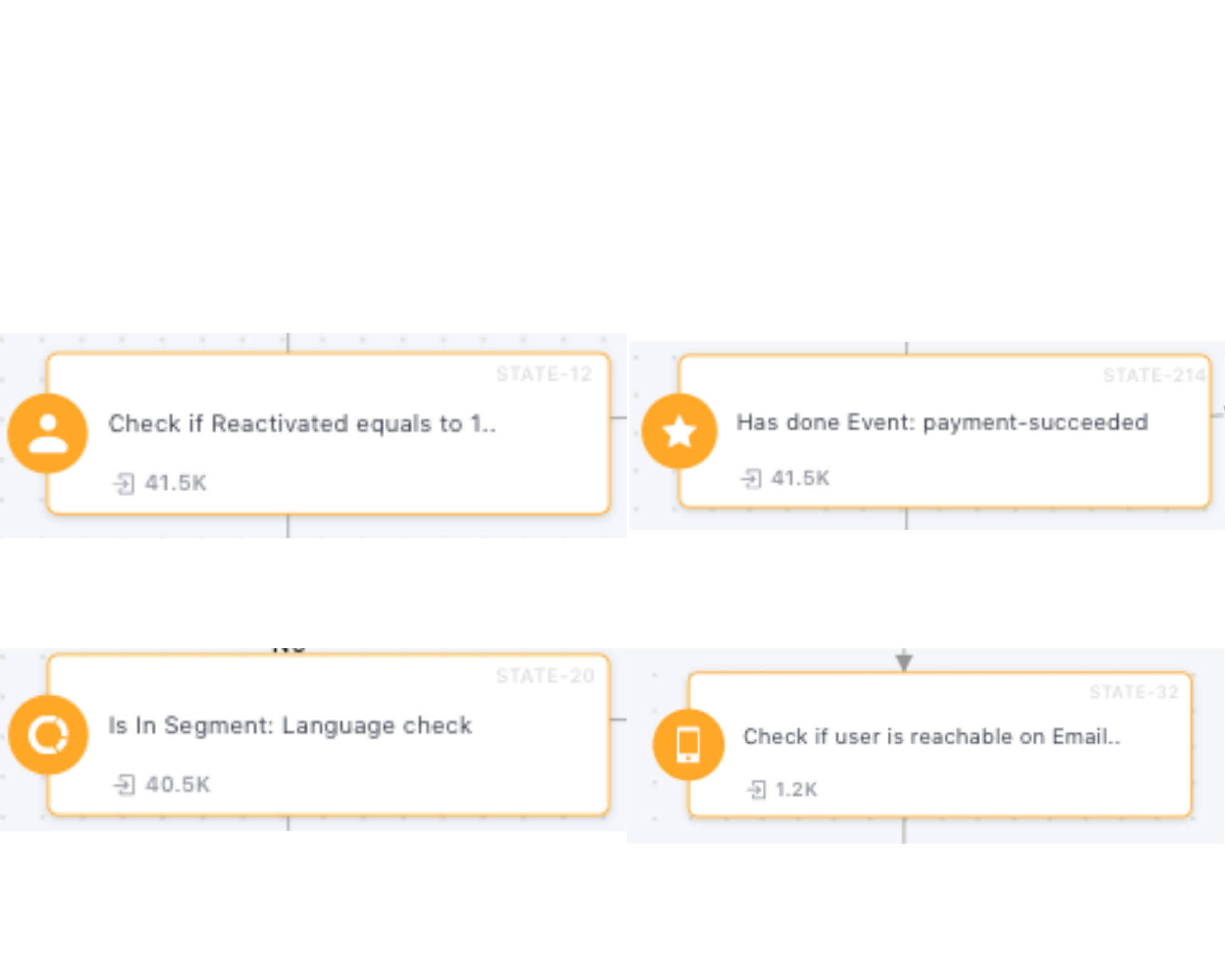
In the above visual, you will notice a number in the bottom-left of each Condition Block. The number indicates total users that have entered the block over the entire lifetime of the Journey.
- If you don't see a number in a Condition Block for a Running Journey, then it indicates that no users have entered it yet.
4. Analyzing Flow Control Blocks (Red)
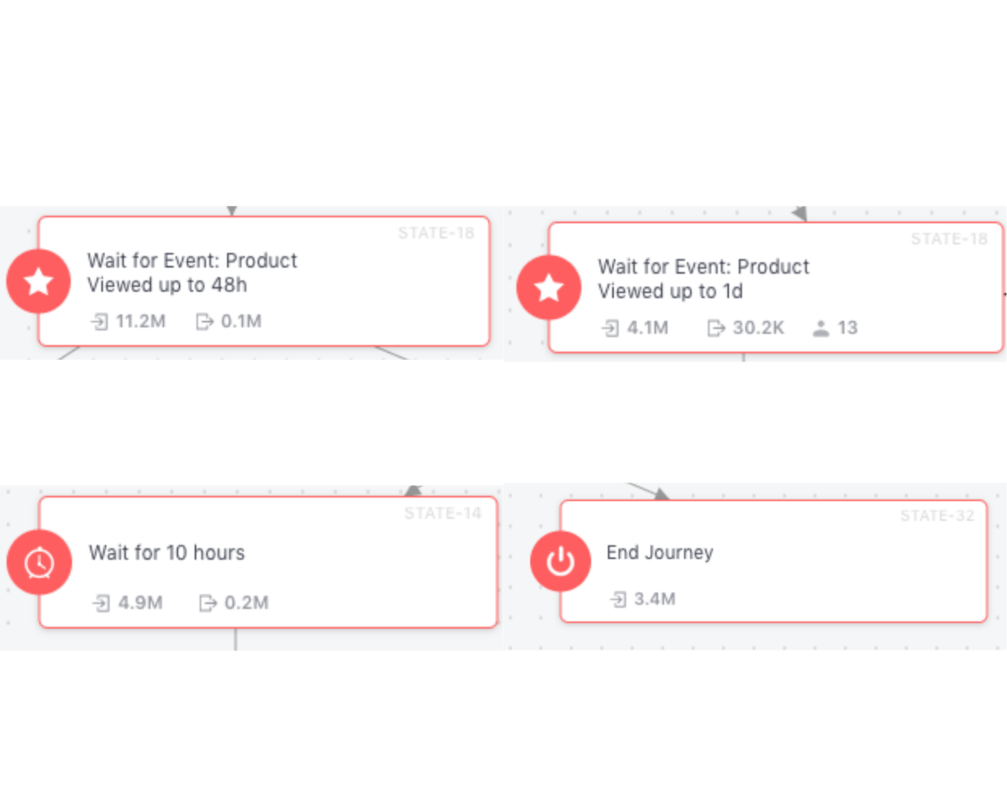
In the above visual, you will notice that the various Flow Controls indicate stats in the bottom-left, bottom-center and bottom-right. Here's what they mean:
Bottom-left Number
Indicates total users that have entered the block over the entire lifetime of the Journey.
- For example, in the above visual, we can see that 3.4M users have entered the End Journey Block. This means that the Journey experience has ended for 3.4 million users that entered a particular Flow.
Bottom-center Number
Indicates total users for whom the Journey experience ended while waiting to proceed further as per the wait duration/ time slot specified in the Flow Control Block over the entire lifetime of the Journey.
-
This is usually caused by the fact that the user's actions or preferences matched the Event or User Attribute change defined as the Journey's Exit Trigger.
-
For example, in the above visual, we can see that 0.1M users were removed from the block, Wait for Event: Product Viewed up to 48 hrs. (Since these users performed theExit trigger, a Custom Event,
Product Viewed,while there were waiting to proceed further.) -
Number of users indicated here is counted towards Total Exits.
Bottom-right Number
Indicates total users that are currently waiting to proceed in their Journey as per the wait duration/ time slot specified in the Flow Control Block.
- For example, in the above visual, we can see that 13 users are currently waiting to proceed further in their Journey, in the block, Wait for Event: Product Viewed up to 1d.
- As soon as the wait duration ends or the time slot specified in the block occurs for a user, they will be removed from the count shown here.
Left Panel
The Left Panel provides a quick summary of your Journey, including key metrics such as Entries, Exits, Users in Journey, and the Journey configuration.
To provide a larger viewing area for analyzing active Journeys, the Left Panel is collapsed by default when you open Live View.
Use the panel toggle to expand or collapse the panel at any time. The Journey canvas automatically resizes based on the panel state, allowing you to switch between a wider canvas for analysis and the statistics panel without disrupting the layout.
The Left Panel highlights key details related to the Journey. For the sake of analysis, we have divided it into three sub-sections - Journey Stats, Conversion Tracking and Journey Settings.
1. Journey Stats
The first block, it provides a snapshot of the users who are currently experiencing the Journey and the total number of times users have experienced it, since its launch.
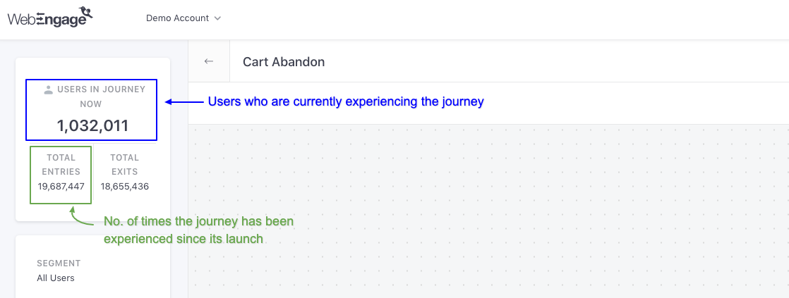
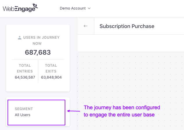
Users In Journey Now
Indicates the total number of users that are currently experiencing the Journey designed by you.
- Once a user enters a Journey, they are bound to experience it as per the rules defined while creating it. Thus, Users In Journey generally refers to the users who are currently waiting to proceed to the next block in the Journey.
Total Entries
Indicates the total number of users that have entered the Journey over its entire lifetime (from launch date till present day).
-
Users can go on a Journey designed by you only if their actions or preferences match the Trigger criteria defined while creating it.
-
Each time a user enters a Journey, it's counted as a Trip. And over the entire lifetime of a user, they can go on multiple Trips through a Journey. Thus, Entries does not indicate the unique number of users who have experienced the Journey. It merely indicates the total number of users that have entered it or the total number of Trips that have occurred since it's launch.
Total Exits
Indicates the total number of users that have exited the Journey over its entire lifetime or the total number of Trips that have ended since it's launch.
- Once a user enters a Journey, there are several ways in which they could exit it, like:
- User's actions or preferences did not match the Condition criteria of a particular flow in the Journey.
- User's actions or preferences matched the Exit Trigger defined while creating it, promoting us to remove them immediately.
- User reached an End block or a dead end in the Journey and thus, automatically exited it.
2. Conversion Tracking
If you have configured Conversion Tracking for the Journey while creating it, then you will be able to analyze its impact on achieving the end goal through the Conversion Tracking block highlighted below.
Let's walk you through all the details shown here:
Conversion Event: Indicates the end goal of the Journey, as defined under the section, Conversion Tracking while creating it.
Unique Conversions: Indicates the share of users that have performed the Journey'sConversion Event at least once after receiving a Journey campaign, since the Journey's launch date till the present day. (detailed read on how it's calculated)
Revenue: Indicates the total amount of Revenue that has been generated through all the campaigns attached to the Journey since it's launch.
- Revenue numbers are always shown in the currency selected while setting up Revenue Mapping.
Analyzing Conversion Uplift When Control Group is Enabled
If you have added a Control Group to the Journey while creating it, then you will be able to compare its real-time impact on driving Conversions against organic user behavior through Conversion Uplift.
Let's go over a short use-case to show you how it works:
Analyzing Conversion Uplift of a Content Recommendation Journey for Video Streaming PlatformIn the below visual we have analyzed a Show Recommendation Journey created by a Video Streaming Platform (app + web).
The Plan: Engage users who have just finished streaming a show, with recommendations from the same genre.
This was their first attempt at engaging users with recommendations as they had previously relied on their app and website's organic content discovery model. Thus, marketers of the platform added a Control Group while creating the Journey to analyze its actual impact on influencing platform engagement.
As you can see above, the Journey's Conversion Uplift is negative, -46.02%!
It's a big red flag as it indicates that users were more likely to watch any of the recommended shows through organic platform discovery. This insight immediately prompted them to Stop the Journey, allowing organic user behavior to prevail.
Here's what the stats indicated above denote:
Unique CG Conversions: Indicates the share of users that performed the Journey's Conversion Event at least once, out of their own organic will as they never experienced the Journey.
- Calculated against the total number of users included in the Control Group (CG), since the Journey's launch date till the present day.
Lift: Indicates the percentage increase or decrease in the Unique Conversion rateof the Journey, calculated against Unique CG Conversions.
Fact CheckLift = [(Unique Conversion Rate of Campaign/ Unique Conversion Rate of CG) x 100]- 100
3. Journey Settings
Each block presents a recap of a Journey setting, as configured while creating it. Let's walk you through each:
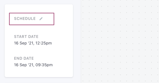
Schedule
You will see the Schedule card when your Journey is in either Upcoming, Running, or Sunset state.
Schedule indicates the start and end date and time of the Journey. This allows you to configure the user journey as per your needs. You can also change the schedule by clicking on the Edit icon next to Schedule.
Exit Triggers
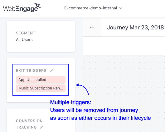
As shown above, this block indicates the Exit Triggers that were defined while creating the Journey.
- This setting allows us to immediately end the Journey experience for users who perform a certain Event or encounter a change in their User Attribute that have been specified as the Exit Triggers. (How to define Exit trigger)
FC, DND & Queueing
You can configure Frequency Capping, DND Hours and Queueing for a Journey while creating it. These settings allow you to manage the frequency and timing of message delivery for each user, helping you create a consistent experience. (How to configure)
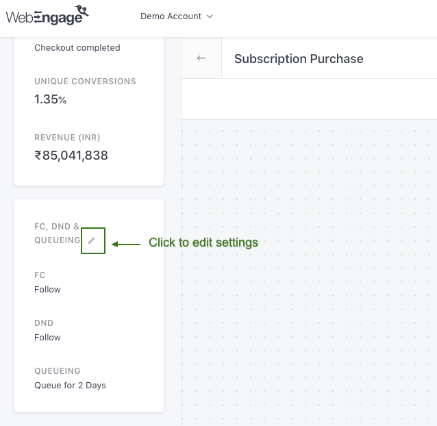
FC: Indicates whether or not Frequency Capping was enabled for the Journey while creating it, through the status:
- Follow
- Ignore
DND: Indicates whether or not DND Hours were enabled for the Journey while creating it, through the status:
- Follow
- Ignore
Queueing: Indicated the duration for which campaigns attached to the Journey will be queued for delayed delivery if we are unable to deliver them immediately to a user. The same can be specified under Frequency Capping & DND while creating the Journey.
- All Journey campaigns are queued for 2 days by default. However, if you have disabled the settings, it's indicated by the status - Disabled.
Segment
Indicates the target segment of the Journey, as defined while creating it. As shown below, you can click the edit icon to access a preview of the rules of segmentation applied to the selected Segment. However, this cannot be changed for a Running Journey.
We hope this has equipped you with a robust understanding of you can analyze a Journey to gain maximum insights into its impact on user engagement, conversions, and your revenue. Please feel free to drop in a few lines at [email protected] in case you have any queries or related feedback. We're always just an email away! :)
Updated 16 days ago