Analyzing Cohorts
A step-by-step guide on analyzing cohorts in your dashboard
Must ReadPlease ensure that you have a robust understanding of, Events and Event Attributes before proceeding as events are the build blocks of cohorts.
First Impression
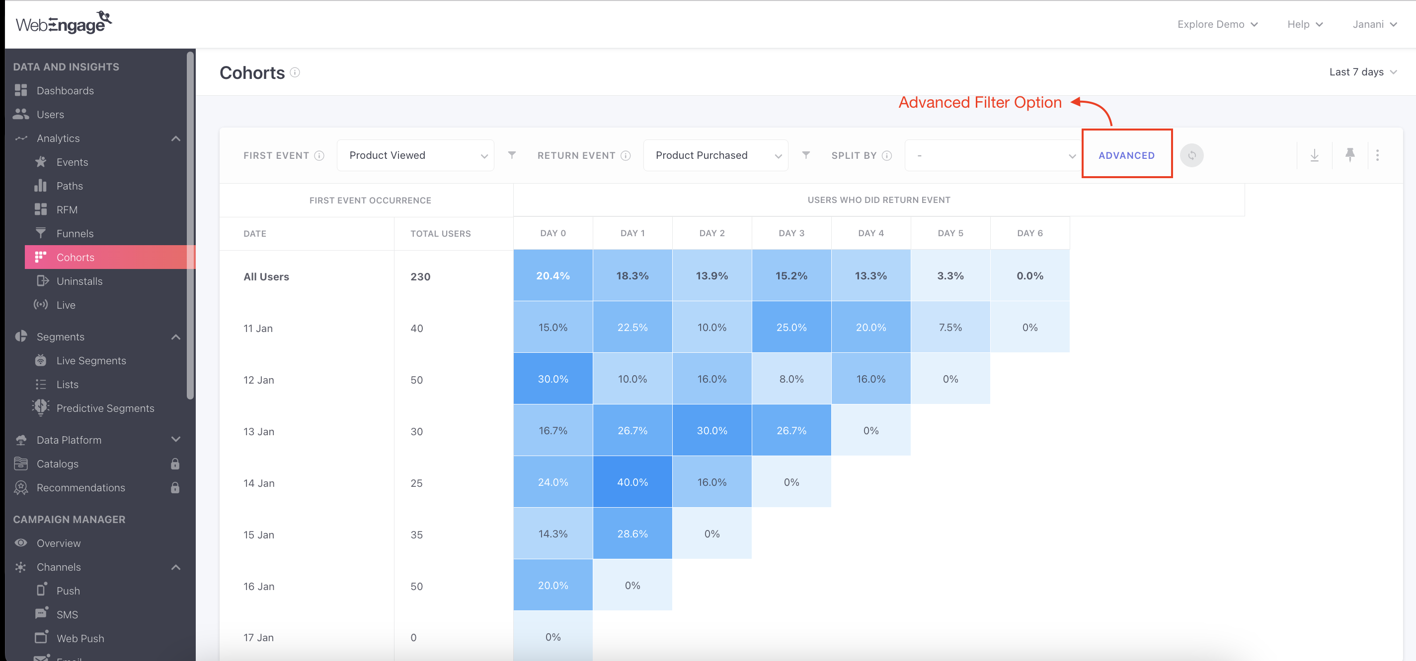
The default view has been designed to give you a quick overview of how many users returned to your app and/or website over the previous week. It’s a simple analysis of users who have performed any event more than once and is a good indicator of how sticky your product is!

Click to enlarge
You can start your analysis by adding values to the fields of the query bar.
A Hands-on Demonstration
But before we break down each actionable feature on this page for you, let's warm you up with a quick demonstration.
Use-case: Understanding time taken to convert from Product Viewed to PurchaseLet’s say that you are a marketer at an e-commerce app and would like to do a simple analysis to find out how many users, who browse through the details of a product, end up purchasing it - and how long do they take to decide.
You decide to conduct this analysis for a period of 2 weeks.
We will use the following data points to analyze user behavior:
Custom Event: Product Page Viewed (represents each time any of your product pages are viewed by users)
Custom Attribute: Checkout Completed (represent purchases made by all users)
Let's do this!

Click to enlarge
Step 1: Define the custom time period (We'll select Apr 8 - May 7, 2021)
Step 2: Select Product Page Viewed as the First Event
Step 3: Select Checkout Completed as the Return Event
Step 4: Hit Enter
ResultsSeems like a majority of your users purchased the product the same day they shortlisted it. This is great news!
Features
Now let’s deep dive into all the features of this section:
Date Range Filter

Click to enlarge
Using the date range filter placed on the top right, you can specify custom dates for your analysis. The selected date range determines the period within which the First Event and the Return Event occur.
The following options are included here:
- Today
- Yesterday
- Last 7 days
- Last 30 days
- Last 90 days
- Custom dates
For example, if you select Yesterday, then it would mean that your analysis would include only those users who have performed the First Event and the Return Event within the previous day. Hence, the table would include just one cohort and would look something like this:

Click to enlarge
Cohort Analysis for Targeted User Segments
The Cohort Analysis efficiently sorts through user segments to pinpoint cohorts unique to each segment, enabling a focused analysis tailored to a distinct set of users.
Why you need it?Explore and uncover distinct returning behaviors exhibited by specific user characteristics. For instance, gain insights into the tentative duration for purchase decision-making among repeat buyers compared to first-time buyers. This information assists in optimizing the timing of your engagement strategy.
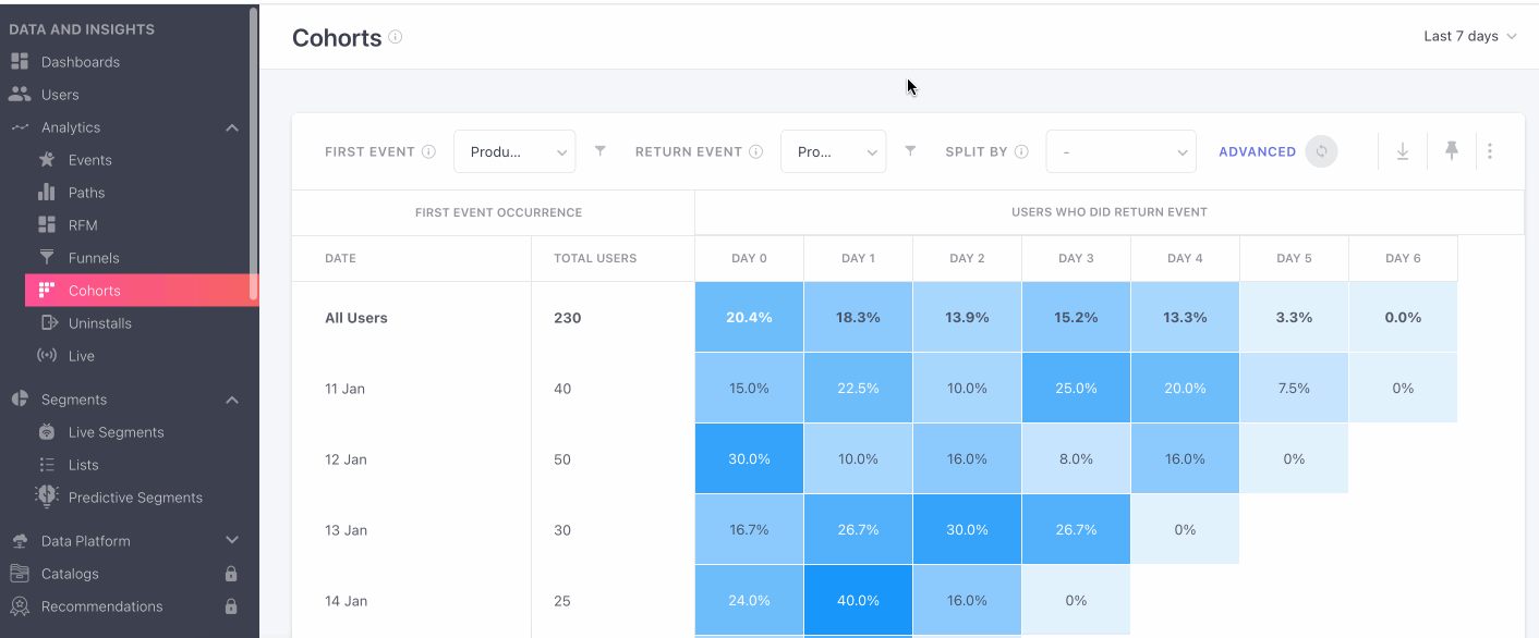
You can now add segments and user attribute filters by clicking on the ‘Advanced’ button.
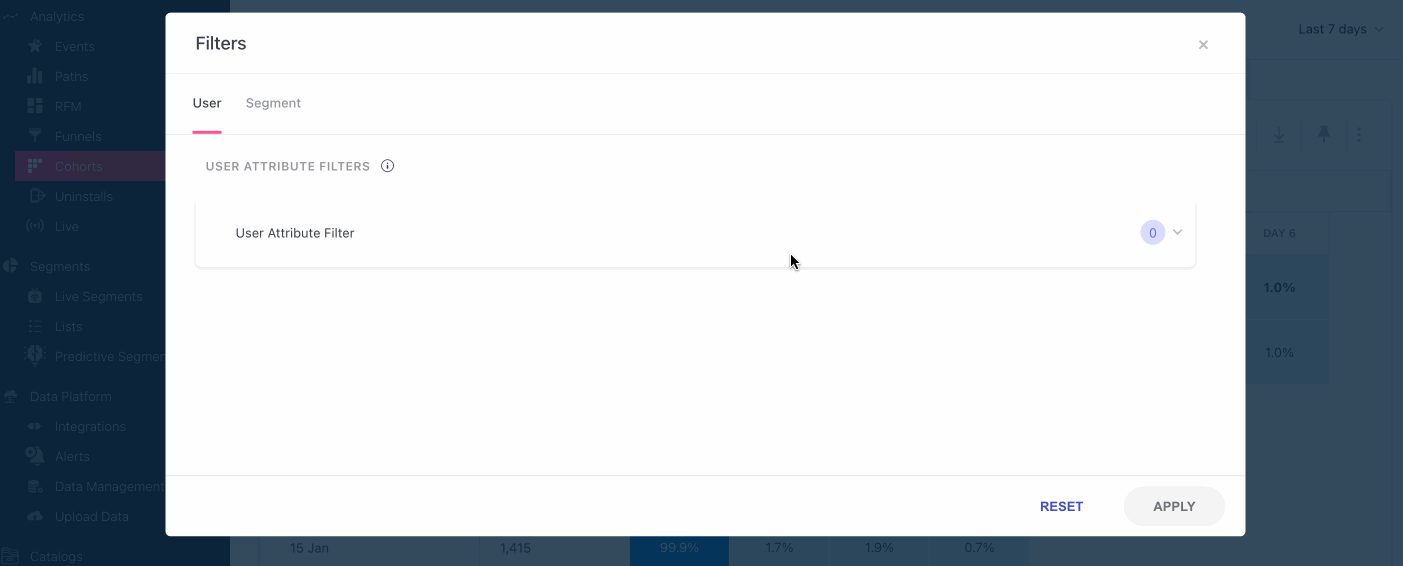
On clicking on the ‘Advanced’ option on your right, a filter window pops up that consists of two tabs, i.e. User and Segment.
- User Tab: The user tab lets you choose the user attribute filter that you’d like to take into consideration for your analysis.
- Segment Tab: The segment tab consists of 2 options i.e. Include Segments, and Exclude Segments.
- Include Segments: this option will allow you to either choose to include ‘Users from any of the segments’ or ‘Users from all of the segments’ for your analysis.
- Exclude Segments: this option will allow you to either choose to include ‘Users from any of the segments’ or ‘Users from all of the segments’ for your retention analysis
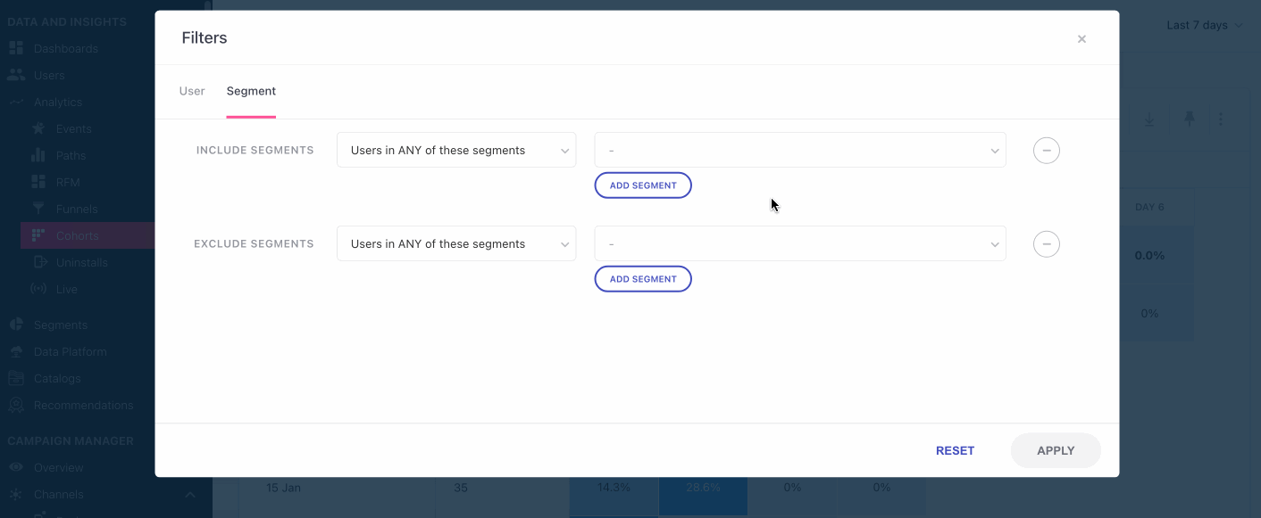
- By clicking on the Reset button, you will be able to reset the options you have selected only in the current filter tab.
- To implement your cohort filter, click on the Apply button and you’re ready to go.
Query Bar

Click to enlarge
The query bar allows you to define the behavior and parameters for analysis through the following fields and features:
- First Event (with an option to add event attribute filters)
- Repeat Event (with an option to add event attribute filters)
- Split by (add a dimension to analyze the behavior against, like location, devices etc.)
- Enter button (in purple)
- Overflow menu (select formats of visual representation of the data)
Here’s a detailed explanation of how each field works:
1. First Event
As mentioned before, events are the building blocks of cohorts. This is why a combination of the First Event and the Date Range defines the number of users included within each cohort.
The default option has been set to Any Event. You can change this by selecting a value from the dropdown menu - which includes a complete list of all the System Events, Campaign Events and Custom Events being tracked for your account.
2. Return Event
A combination of the First Event and the Return Event form the basis of your analysis. While it's default option has been set to Any Event, You can change this by selecting an event from the drop-down menu placed here.
The following events are included in the drop-down menu under both the fields:
Default (Any Event)
System (list of all the system events and campaign events included here)
Custom (all the custom events defined and passed by you to your WebEngage account - a list of these can be found under the Data Management section of your dashboard. Any changes made to the custom events passed by you will get reflected in real-time.)
Adding event attribute filters to each event

Click to enlarge
Once you have selected an event in both the fields, you can further define their scope by adding attribute filters to each. This can be done through the filter icon placed on the right of each field. On clicking the icon, you will be prompted with a modal, allowing you to apply several attribute filters.
The following event attribute filters can be added to events selected under both fields:
Custom (as applicable to the selected custom event)
Time (Event time)
Location (Country, State, City)
Technology (Browser Name, Browser Version, Browser Code, OS Name, OS Version, Device, Device Type, Device Model, Device Manufacturer, Device Brand, Carrier, App Version, App Version Code, App ID, Platform, SDK Version)
Screen (Page Title, Page URL)
Others (API Version, Session Count, Language)
Please note that event attributes cannot be added to the default option, Any Event as it is not possible to filter a set of events by a common parameter.
How to add one attribute filter
Let's demonstrate a use-case to help you understand the workings of this feature.
Use-case: Analyzing engagement trends for high-value customersLet's say that you run an e-commerce site and are keen on understanding the engagement trends of high-value customers. To find out, you decide to conduct a cohort analysis for all the high-value customers who made a purchase over the previous week and later came back to interact with your app or website.
We will add the following data points to the field, First Event:
Custom Event: Checkout Completed
Custom Attribute: Discount (over $100)
Here's how you can go about your analysis;
(We will proceed with the pre-selected value of last 7 days under the date range filter and the default option of Any Event under Return Event.)

Click to enlarge
Step 1: Add Checkout Completed to First Event
Step 2: Click the filter icon to add the attribute filter
Step 3: Select Discount from the drop-down
Step 4: Define Greater than $100.
Step 5: Click Apply to add the filters.
Step 6: Hit Enter to view results!
ResultsSeems like most of these high-value customers stayed active up to 2 days after making a purchase, post which their frequency of engagement with the platform starts lowering.
How to add multiple attribute filters to an event
To demonstrate this, let's extend the use-case discussed above and analyze a specific repeat behavior.
Use-case: Analyzing social media shares by high value customersNow, let's see how many users from India have viewed apparel in the last 7 days.
To execute this analysis, we add the following data points to the field Return Event:
Custom Event: Product Viewed
Custom Attribute 1: Category (equal to Apparel)
Custom Attribute 2: Country (is equal to India)
Here's how you can go about your analysis;
(We will proceed with the pre-selected value of last 7 days under the date range filter and the events and attributes added to First Event, previously.)

Click to enlarge
Step 1: Add Product Viewed to Return Event
Step 2: Click the filter icon to add the attribute filter
Step 3: Select Category from the drop-down
Step 4: Define Category as; is equal to Apparel
Step 5: Select the AND logic to combine the attributes
Implications of using AND/OR to combine multiple attributesUsing the AND logic to combine the attributes narrows the scope of the event to include only those customers who; shared a product that cost $500 or higher AND belongs to one the specified categories.
On the contrary, if we used the OR logic to combine the attributes then it would widen the scope of the event to include customers who; have either shared a product that cost $500 or higher OR have shared a product that belongs to one the specified categories.
Step 5: Select Country from the drop-down
Step 6: Define Country equal to India from the drop-down list.
Step 7: Click Apply to add the filters.
Step 8: Hit Enter to view results!
ResultsSeems like over 3 million users in India have viewed the products in the apparel category.
3. Split By

Click to enlarge
Using this field, you can add a dimension to your analysis by splitting the First Event. While the default state is blank, we suggest that you select a value from the drop-down for an in-depth analysis of user behavior.
Hence, in cases where a value is added to this field, the cohort table will include a Main Cohort, broken down into Subcohorts.
- Main cohorts: formed by a combination of First Event and the Attribute selected under Split By.
- Subcohorts: Each main cohort will include a down arrow, allowing you to view its subcohorts which are formed by a combination of First Event and a Date (falling within the selected date range).
The following system attributes can be selected from the dropdown:
Location (Country)
Technology (Browser Name, OS Name, App Version, App ID, Platform, Device Model, Device Manufacturer, Carrier)
UTM (Channel, Campaign Source, Campaign Name, Campaign Medium, Referrer Host, Referrer URL, Landing Page)
Engagement (Journey ID, Campaign ID)
Please note that custom attributes are not included under Split By.
For example, in the visual below, City has been selected under Split By and the analysis is being done over a period of 7 days.

Click to enlarge
4. Select Format of Data

Click to enlarge
Using the overflow menu placed on the top right corner, you can choose to analyze your data in several formats.
The following option are included in the menu:
View Data Over (Days, Weeks, Months)
View Cohort As (Line, Table)
View Metrics As (# - Number, % - Percentage)
Let's go over each one:
- View Data Over
Using this field, you can change the format of time shown in the table. The selected format will get reflected across the leftmost column, Date and the topmost row under, Users Who Did Return Event.
For example, in the visual below, the format of time is in Weeks.

Please note that additional text indicating number of weeks in the first column has been added to simply represent what each date means. They are not equal to the weeks listed in the top row. (click to enlarge)
- View Cohort As
While the default format of cohort analysis is a table, you can choose to analyze the cohorts as a line graph. This can help you visualize repeat behavioral trends better, in some cases.

Click to enlarge
For example, in the visual above, the line graph helps us understand the repurchase trend of shoppers over a period of 12 weeks. As depicted by the line graph, maximum churn happens within the same week of purchase, after which the trend slows down, until a majority churn by Week 12. Analyzing such trends can be a tedious task when looking at tables.
- View Metrics As
Using the options nested here, you can choose to view the data as a percentage or as a numerical value.
The percentage values shown in the cells under, Users Who Did Return Event is a result of;
Number of users who performed Return Event on a day / Total Users
For the sake of ease of analysis, the percentage values have been rounded off to the nearest integer. So any value below 1 will be represented as 0. Hence, in cases where the repeat event has been performed by a few users, viewing the data as a percentage will show no users. But the numerical view will show you the exact count.
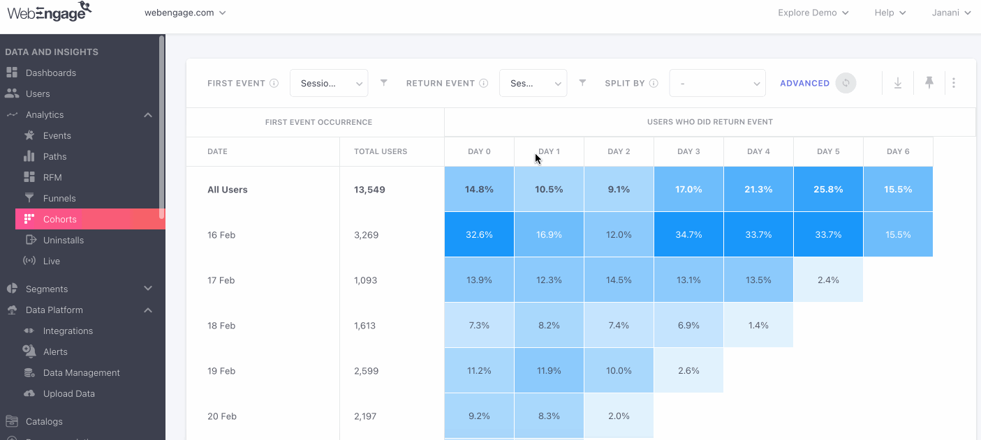
Understanding the Cohort Table
Once you have executed your use-case through the query bar, the table will get populated with relevant data. For the purpose of analysis, it has been broken up into two sections;
- First Event Occurrence
- Users Who Did Return Event

Click to enlarge
For beginnersPlease refer to Quick tips on how to analyze a cohort table for a general understanding of its working.
Now, let's go over what each section represents.
First Event Occurrence
This section forms the left half of the table and includes primary details of the main cohort(s) and subcohorts, including their name and the total number of users included within a cohort. But depending on the state of the field, Split By, the main cohort(s) and subcohorts shown here, change.
Let us explain how:
- When_Split By_ is left blank
In this case, the cohort table will feature just one main cohort named All Users. This main cohort will include all the users who have performed the First Event over the selected date range.
The following subcohorts will be a date-wise wise breakup of All Users - each including only those users who have performed the First Event on a particular day/ within a particular period (as shown below).

Click to enlarge
Now, let's go over the details shown above:
- Date: A combination of the First Event and the selected Date Range defines the number of users included within each subcohort.
As discussed under, Query Bar (ref: Select Format of Data), the format of time can be selected as Days, Weeks or Months depending on your analytical needs.
As you can see, Days has been selected for analysis here. Hence, each subcohort is represented as a row, with a day as its heading.
-
Total Users: This shows the total number of users included within a particular cohort.
-
Main cohort, All Users: Since the field, Split By is blank, the main cohort will include a sum of all the users who performed the First Event within the specified date range.
When a value is added to_Split By_
In this case, the cohort table will feature several main cohorts named as per the parameter selected under Split By.
For example, as shown in the visual below, if we select OS Name under Split By, then it leads to the creation of main cohorts by OS Name. Each one can further be expanded into subcohorts (formed by date) using the down arrow placed next to the title.

Click to enlarge
Hence, in this case, the following changes are made to the section, First Event Occurrence:
- The name of the first column represents the selected attribute.
- Each main cohort, formed by a combination of the First Event and selected attribute, is further divided into subcohorts, formed by a combination of the First Event and date. So, a sum of the number of users included within the subcohorts will be equal to the total number of users included in the main cohort.
Why is this section called First Event 'Occurrence'?As discussed under; How are Events Calculated for Analysis?, only the total number of occurrences of the event selected under this field is taken into account for analysis.
Users Who Did Return Event
This section forms the right half of the table and represents repeat behavior over the selected time frame.

Click to enlarge
-
Each column header represents a Day, Week or Month - depending on the format of time selected by you. Irrespective of the format, a total of 46 columns can be analyzed in this table.
-
Each cell under a column shows the percentage of users that have performed the return event. You can switch to a numerical format via the overflow menu on the top right.
Actionable Cohort
Export to List
Using a Cohort analyser to export your users showcasing the same behaviour into a list, in order to send relevant communication or other analysis.
How to Export to List?
Once you’ve received the data you were looking for, you can now click on the particular cohort that you want to export to list.
- Click on the cohort you want to export to list
- You will be presented with 2 sets of data that you can export i.e. a list for Retained Users and Dropped-off Users.
- This then opens a new ‘Create List’ tab, where you fill in the required fields.
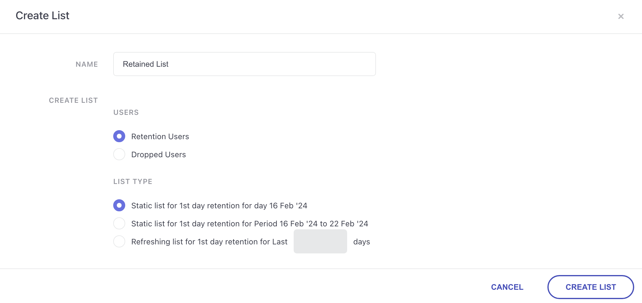
- Name: Naming the List you want to export.
- Users: You can choose the type of user data you’re exporting i.e. Retained Users and Dropped-off Users.
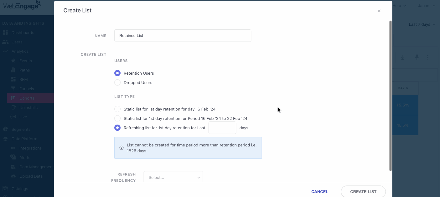
- List type: This allows you to choose the type of list you’d like to export.
- Users who retained or dropped on X th Day between rolling time windows.
- Users who retained or dropped on X th Day between specific date ranges.
- Users who retained or dropped on X th Day specific date.
Let’s take the example of a D2C cohort tracking App usage for users who had made a purchase in the past. With this feature you can create separate lists for:
- Users who did / didn’t open the app on Day 4 after making a purchase between rolling the window- Last 7 days, for instance i.e. a Rolling time window.
- Users who did / didn’t open the app on Day 4 after making a purchase between the time period 09 Feb ‘24 - 14 Feb ‘24 i.e. a Specific date range.
- Users who did / didn’t open the app on Day 4 after making a purchase on 09 Feb ‘24 i.e. a Specific Date.
Once all of the above fields have been filled, you can now click on ‘ Create List’ and can view it in the ‘List’ section of your dashboard.
We hope this gives you a good idea of how you can analyze cohorts in your dashboard. Please feel free to drop in an email at [email protected] in case you'd like some expert assistance, we're always just an email away!
Updated 5 months ago