Analyzing Events
A walkthrough of how you can analyze user behavior in your dashboard
WebEngage just got a new UI, that’s gonna amp up your experience with us. This document gives you a brief of all that you need to guide your way through your new dashboard.
Must ReadPlease ensure that you have a robust understanding of all the concepts related to Events and Event Attributes before proceeding. Doing so will help you understand the working of this section better.
There are few changes and new additions to the features of the event analytics section. Let’s dive into each of the features in detail and where you’ll be finding them.
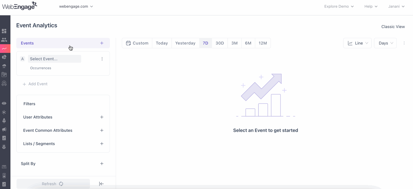
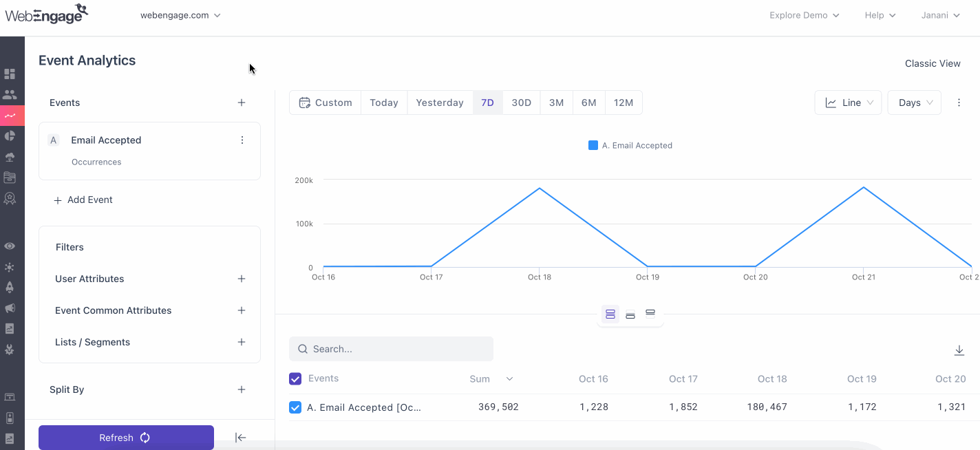
First Impression
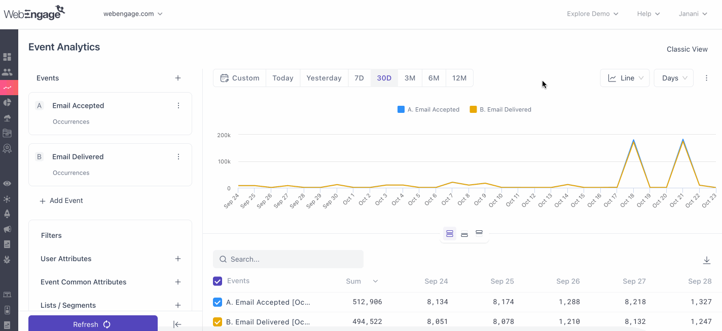
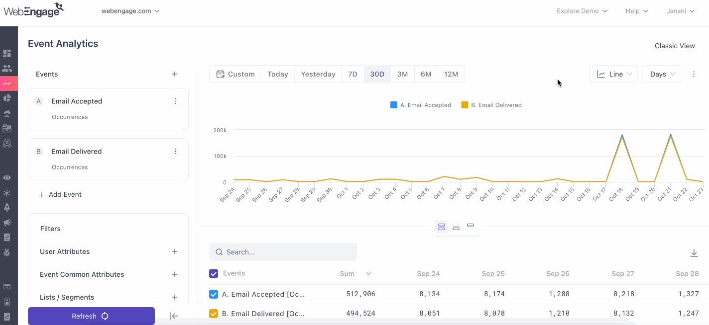
The new UI of the events section consists of a blank dashboard, which will show you a graph as and when you select the event/events that you'd like to analyze.
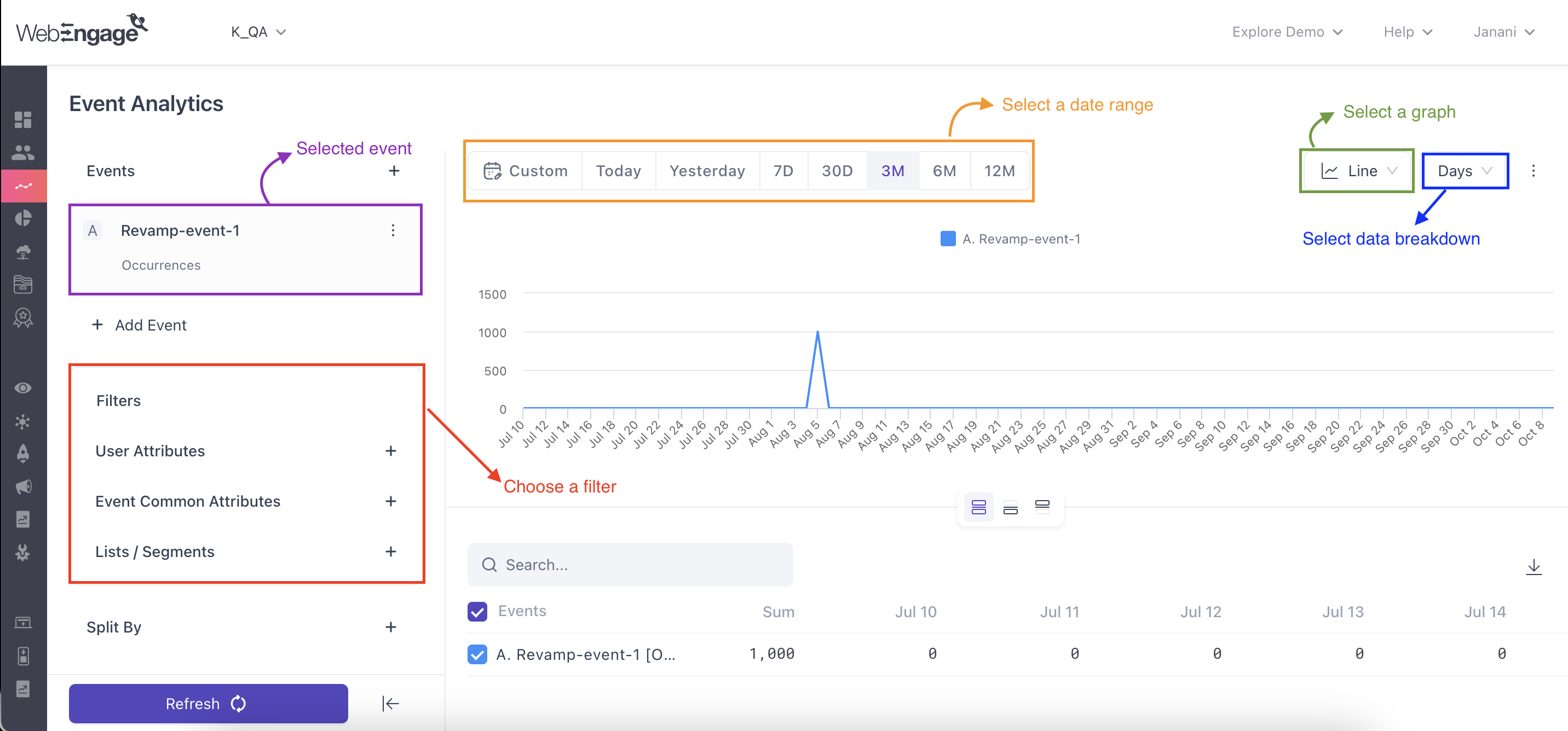
Click to enlarge
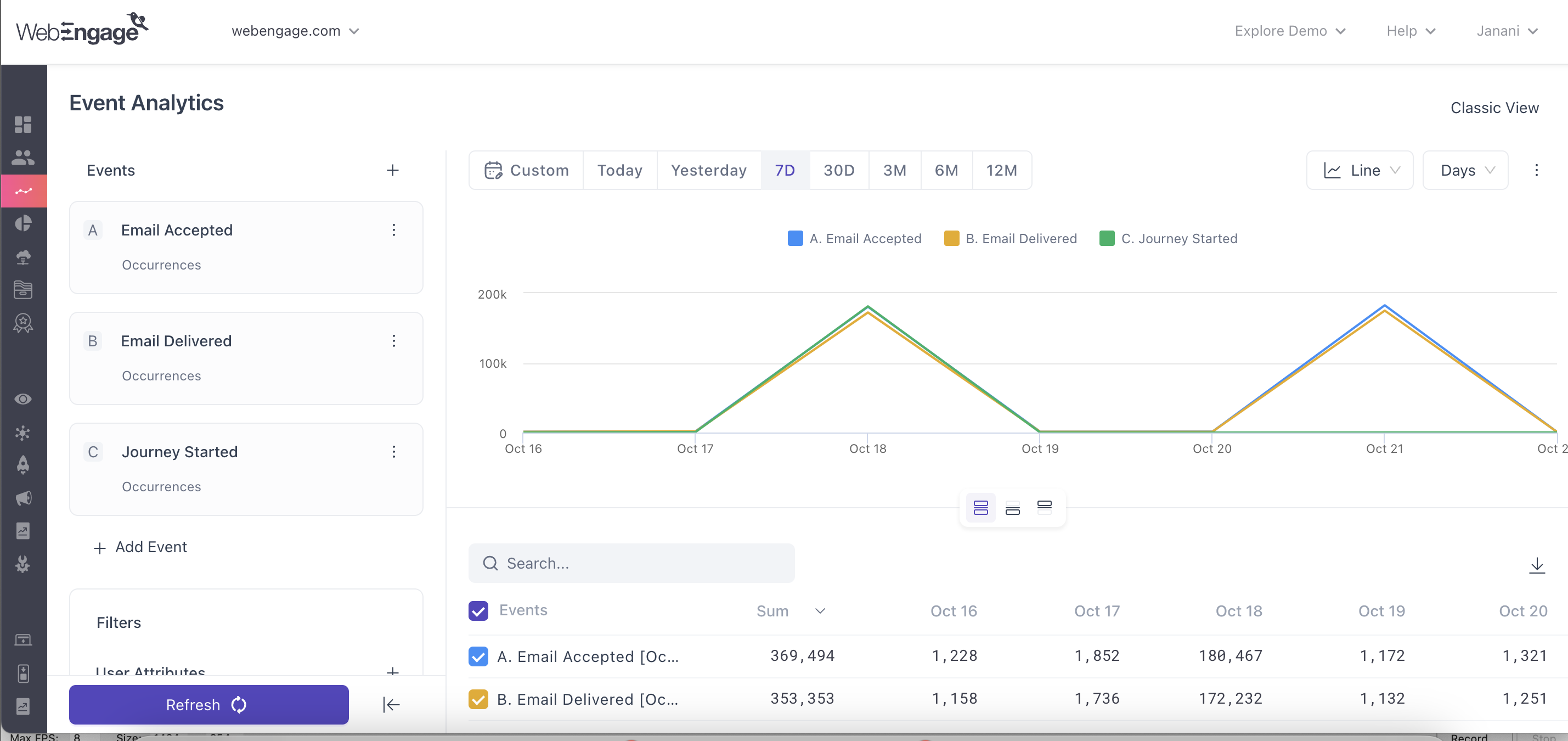
- On selecting the event from the drop down on the left you can analyze each of them in more detail
- Each event can be examined in greater detail by selecting their respective line or bar graphs or metrics.
- On doing so, you will be shown a day-wise breakup of total user activity.
- The results can further be refined by adding values to the fields of the drop down placed on top from where you can choose how you want to refine your data i.e. Hours, Days, Weeks, and Months.
This new UI introduces a smart search feature that goes beyond exact matches, delivering a range of relevant results based on your search query.
OBAC Views in Analytics
Analytics supports OBAC Views to ensure users can only access data from the Views they are authorized to use. This applies to Event Analytics, Funnels, Paths, Cohorts, and RFM.
- Analytics data is displayed only for the selected View(s).
- Listing pages display the associated View for saved analytics where applicable.
- You can explore analytics across multiple Views, but saving, pinning, or exporting requires selecting a single View.
- Once an analysis is saved or pinned, its associated View is locked and cannot be changed.
- On dashboards, users only see data for analytics associated with Views they have access to.
- If access is unavailable, the analytics card displays a message indicating that the associated View is not accessible.
Note: View selection, access control, and view-locking behavior are consistent across all supported Analytics modules.
Understanding features of the event analysis section
Now that you've got the hang of how this section works, let’s deep dive into its features to help you gain maximum insights:
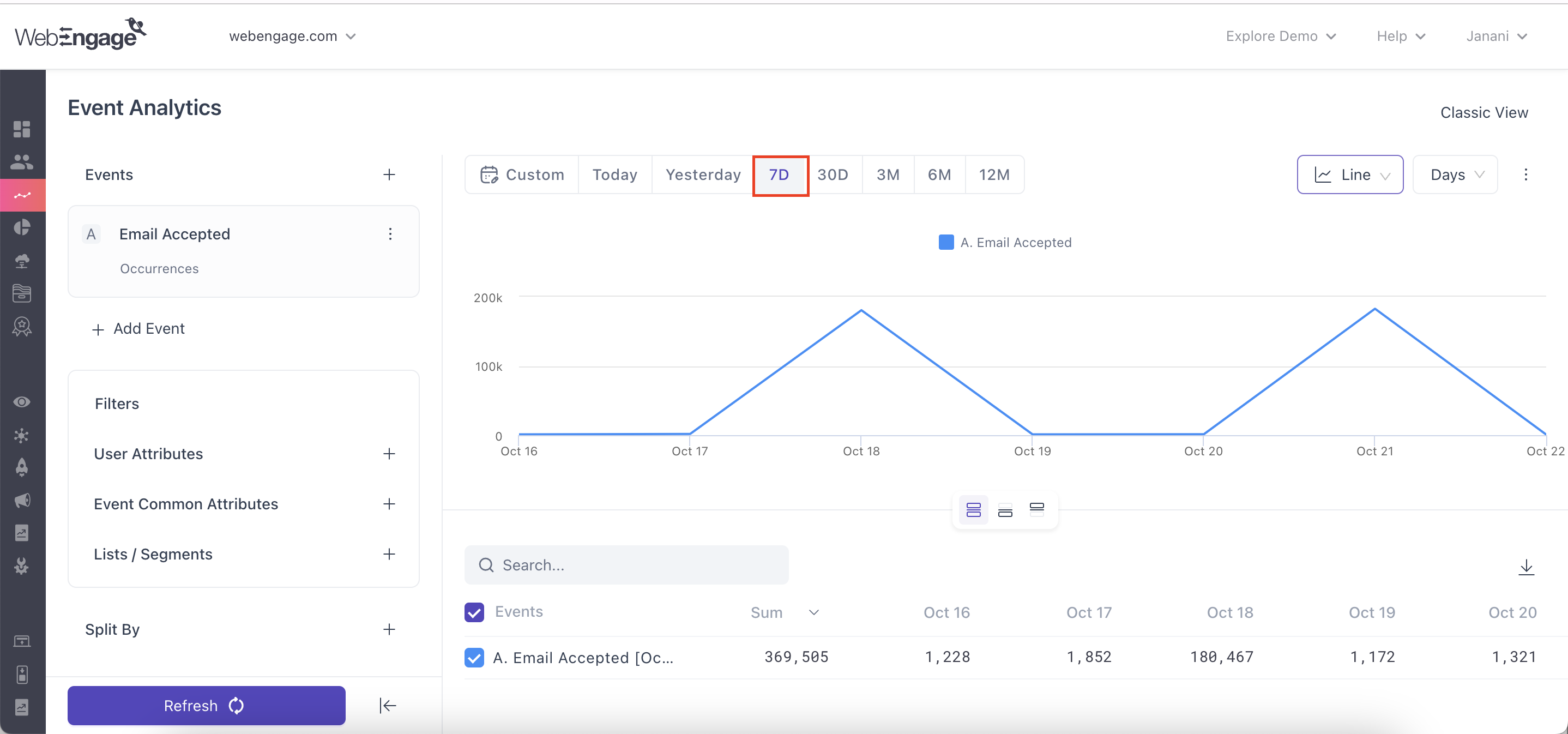
Step 1: Select the Date Range
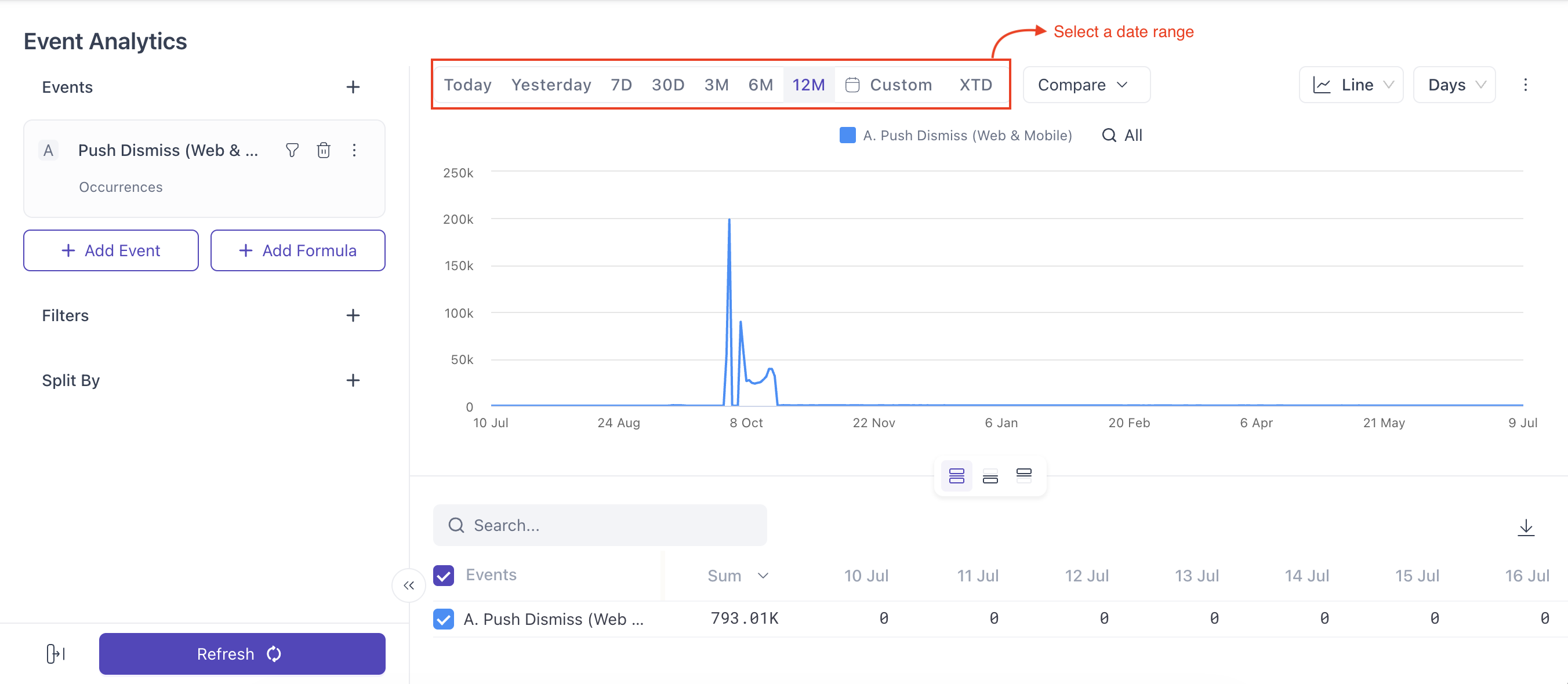
Using the date range filter placed on the top right, you can specify a period for which you want to analyze user behavior. The default period has been set to, Last 7 days.
You can choose from the following to select a date range for the events you are analyzing:
- Today: Displays data for the current day only.
- Yesterday: Displays data for the previous calendar day.
- 7D: Displays data for the last 7 days, including the current day.
- 30D: Displays data for the last 30 days, including the current day.
- 3M, 6M, 12M: Lets you view data for the last 3, 6, or 12 months.
- Custom: You can select a custom date range as you wish.
- XTD: Lets you analyze cumulative data from the start of a time period until today. This is useful for tracking progress within the current week, month, quarter, or year.
- Week to Date: Includes data from the start of the current week up to the current day.
- Month to Date: Includes data from the first day of the current month up to the current day.
- Quarter to Date: Includes data from the beginning of the current quarter up to the current day.
- Year to Date: Includes data from the first day of the current year up to the current day.
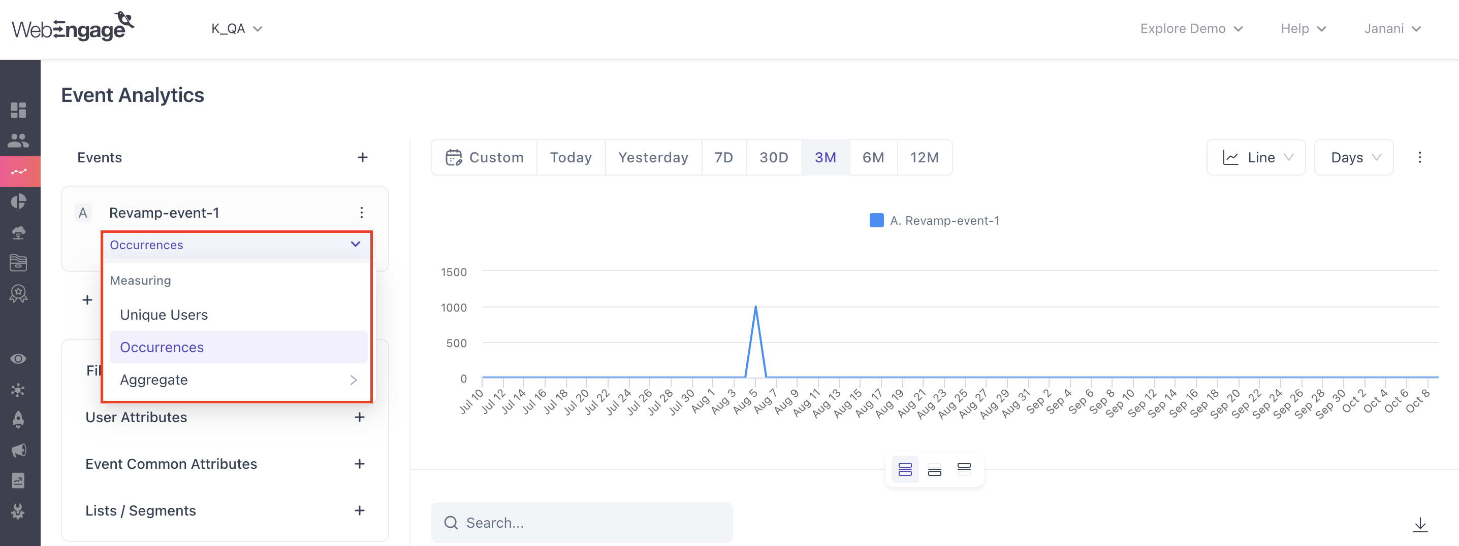
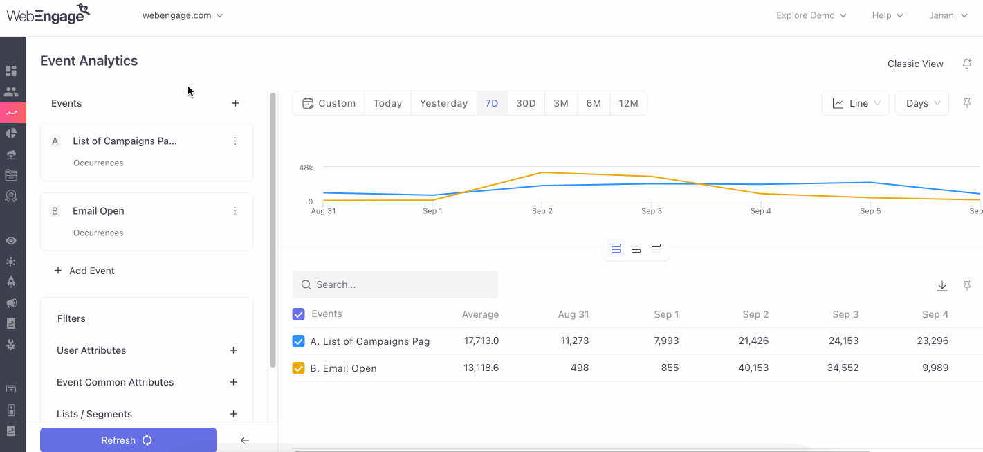
Step 2: Select Show (Occurrences, Uniques or Aggregate)
As discussed under, How are Events Calculated for Analysis?, there are three ways in which we calculate the number of times users perform an event; occurrences and uniques and aggregate.
As shown in the visual below, once you've selected the event or events you want to analyze, proceed to clicking on the dropdown below the selected event/s, that consists of the three option i.e. Occurrences and Uniques and Aggregate.
Click to enlarge
Aggregation of data refers to summarizing or combining data to help users analyze trends beyond individual events. It is applied in dashboards for trend analysis (e.g., average spending over time) and respects event/ user filters.The process involves two levels:
- Level 1: Aggregating data at the user level (e.g., total spending by a user across multiple purchases).
- Level 2: Aggregating user-level data to show overall trends (e.g., average spending across all users).
Types of Aggregation:
- Sum, Average, Median: For numeric values (e.g., total/average spending).
- Distinct: Counts unique values (numeric or string).
- Min/Max: Finds smallest/largest values.
- CountIfNull/ NotNull: Counts null or non-null values.
Note: Handling Nulls/Blanks: Null/blank values are ignored in calculations, but actual zeros are valid data points.
Step 3: Select the Event
Next, define the event you'd like to examine by choosing an event or a set of events from the dropdown nested under the field, Events on the left.
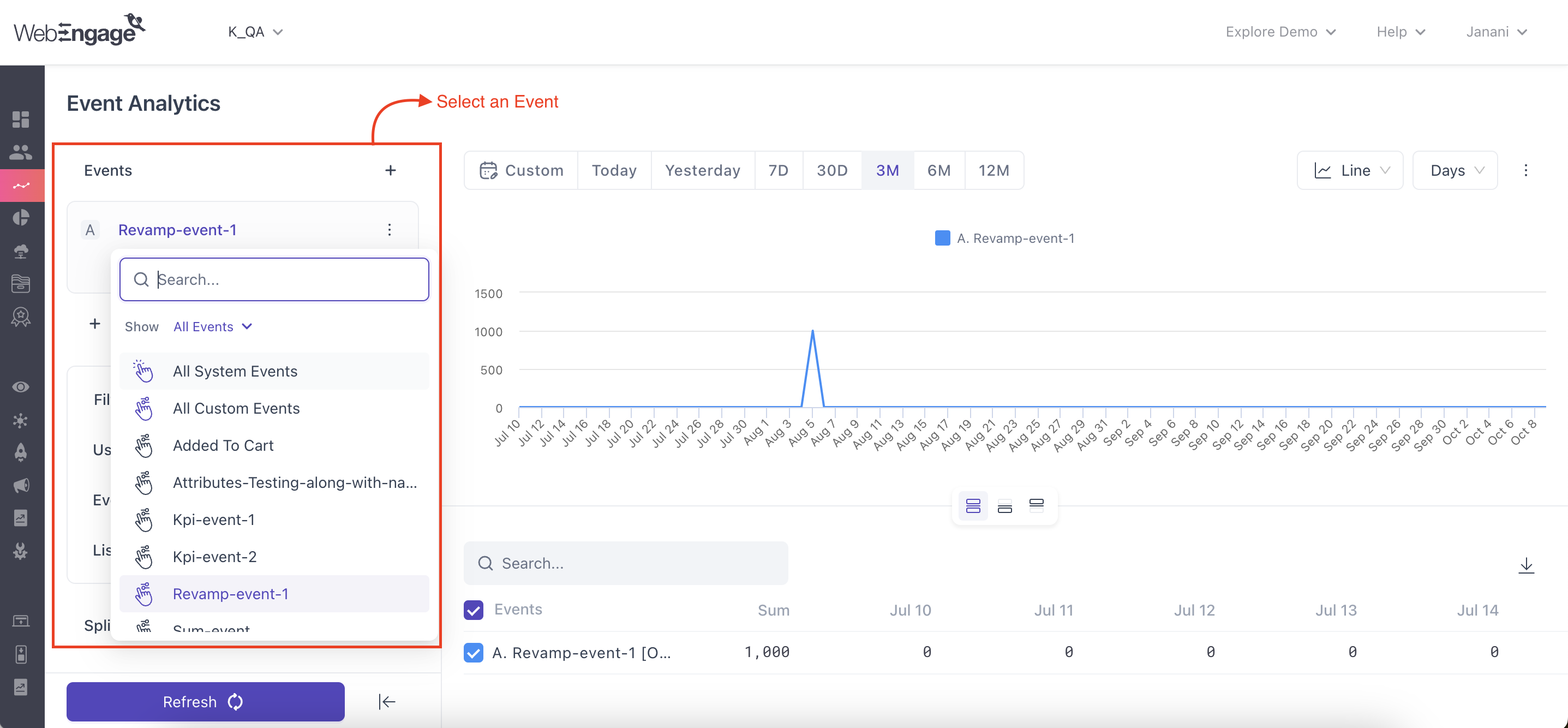
Click to enlarge
Follow the following steps to analyze the events of your choice
- Select the event that you want to analyze from the first option on the left column.
- Once you’ve selected an event, you are presented with a dropdown below the event you’ve selected to measure: Occurrences or Unique users.
- You can continue by adding more events by clicking on the ➕ Add Events in the events column.
Multi Event allows you to gain a more in-depth understanding of how events may coincide or affect each other by plotting and comparing multiple events to visually spot any correlation between events.
The drop-down includes all the system events, campaign events and custom events tracked for your account. All the system event and campaign events pre-defined by us are listed here for reference.
Using Split byThe Split by option will only be applicable while analyzing a single event. You can add up to 2 attributes to be Split by (user + event)
2 level of split allows you to analyse cross cut of event data on 2 different attributes. In old UI, this was achieved using "Over" and "Split by" together.
Apply Attribute Filters to the Event
You can select individual filters for your events, through filtering them out on the event columns, under which dropdown you’ll be able to view ‘All Attributes (custom + system), or just Custom Attributes or only System Attributes.
Now let’s show you how to apply these attribute filters to the event, using the AND-OR logic.
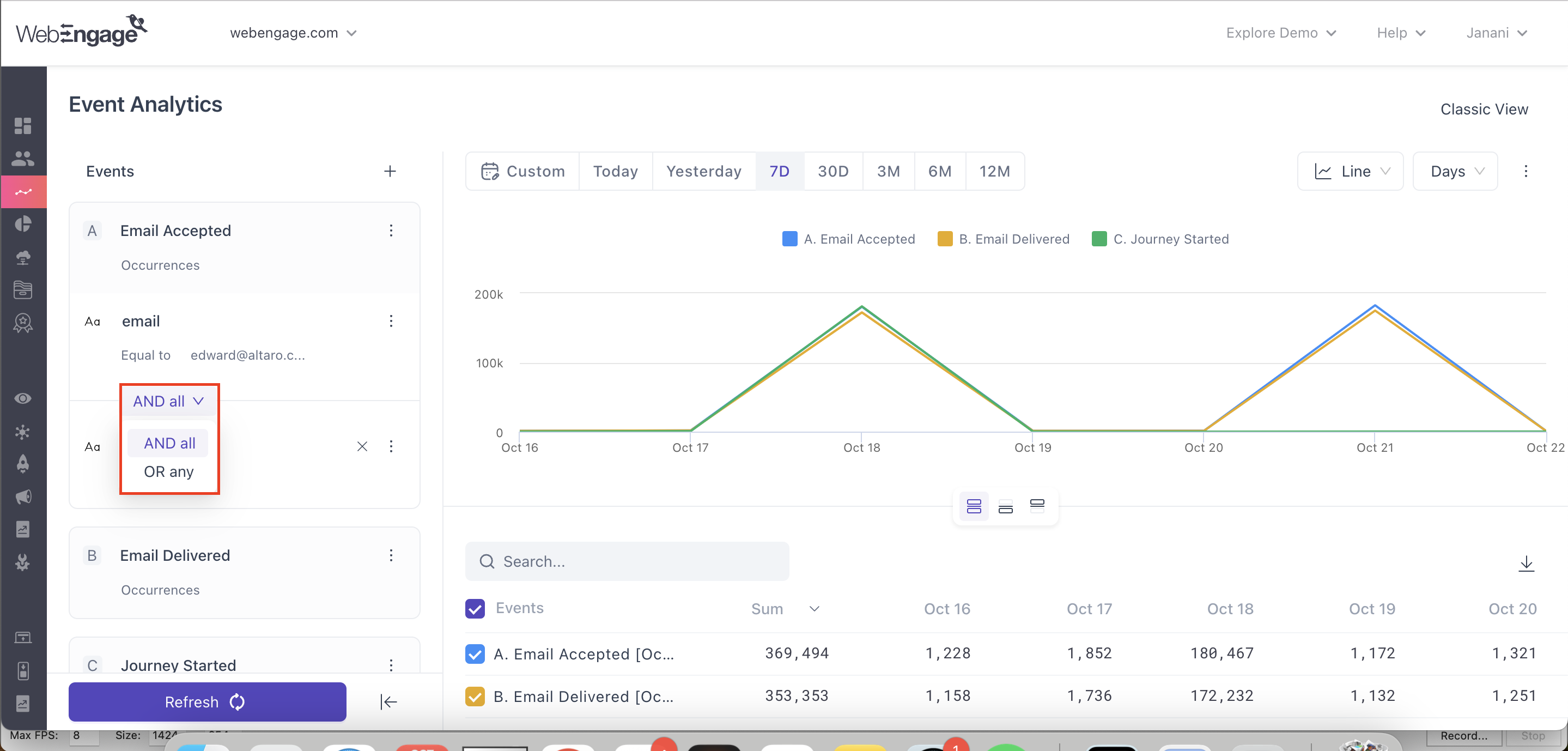
Method 1: Using the AND logic to club attributes filters
If we use the AND logic to apply all the attribute filters listed above, then your analysis will be limited to a set of users who have only viewed Puma Running Pants, AND on the page, www.companyname.com//women/pants AND are from the US AND use an iOS device.
Implications: So, using the AND logic to club event attributes you can narrow down the scope of analysis to a particular set of users whose actions fall in line with a sum of all the attributes.
Method 2: Using the OR logic to club attributes filters
If we use the OR logic to club and apply all the attribute filters listed above, then your analysis would include a broader set of users who have either viewed Puma Running Pants OR have visited the page www.companyname.com/women/pants OR have viewed any Product Page from the US OR have performed the event on an iOS device.
Implications: So, using the OR logic to club event attributes you can broaden the scope of analysis by including users whose actions fall in line with any one of the attribute filters.
Hence, when using the OR logic, we suggest that you broaden the user base by clubbing related parameters together. For example, including the last two attributes; Location and OS, doesn't help us gain any valuable insights as these parameters are unrelated to Product Name and Page URL.
Note:It's not possible to add attribute filters when analysing All System Events or All Custom Events as the attributes which can be applied to each event, vary.
Step 3.2 : Select a Common Global Filter
You can also select a common filter for the events you’ve chosen above. These common filters have been categorized into 3 i.e. User Attributes,Event Common Attributes and Segments.
Click to enlarge
User Attributes
This filter allows you to filter based on User Attributes:
- Once you’ve chosen the user attribute you want to use.
- You’ll be presented with an operator and criteria value you want to set for the respective attribute.
Event Common Attributes
This event filter allows you to choose from filters based on common event attributes:
- Once you’ve chosen the common event attribute you want to use,
- You’ll be presented with an operator and criteria value you want to set for the respective attribute.
List / Segments
Here you’ll be able to filter based on live segments/ lists (refreshing and static and predictive),
- You have the ability to include, exclude segments, or specify if you want users to be included/ excluded from all the listed segments or any of them.
Step 4: Select the Dimension(s) for Analysis -Split By
The next step is to define the dimension(s) against which you'd like to analyze the event. The query bar has been designed to facilitate in-depth behavioral analysis by combining an exhaustive list of pre-defined parameters.
Using the drop downs nested under the fields, Split By, you can combine up to two parameters to slice-and-dice your data.
The limit for the number of series displayed in the table has now been increased to 2000!For example, If you want to view a city ranked 2001 or lower, you'll need to apply a filter for that specific city within the Event filter
Currently, sorting occurs on the client side, meaning it is applied within the top 2000 series. This change will not only sort within the top 2000 series, but also allow you to retrieve the bottom 2000 series directly from your database.
NoteWhen adding filters using attributes (User/Events), the right-handside (RHS) displays a dropdown with the first 200 values that entered the system as options for comparison. If the value you need is not listed, you can type it in manually.
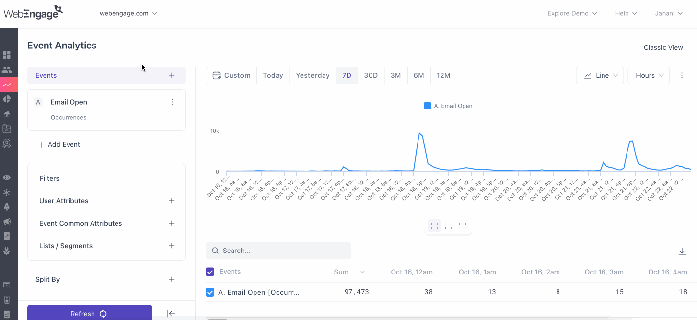
Hours Granularity
Events can be analyzed on an hourly basis. To achieve this you can navigate to the ‘Over’ dropdown, where you can find ‘Hour’, by selecting this the graph that is produced will have hours on the X- axis. After which you can find the date and time (AM/PM format) on the X axis.
This hour level granularity can be used with a period of 31 days i.e maximum of one month, if you try to increase the number of days beyond 31, the ‘over’ option switches to the day option automatically along with an error.
For last 7 days

For Last 30 days
Step 5: Select the Format of Visualisation
Lastly, while Bar Graph has been set as the default format of visualisation, you can change this to a Line Graph or a Table, using the overflow menu placed on the top-right.
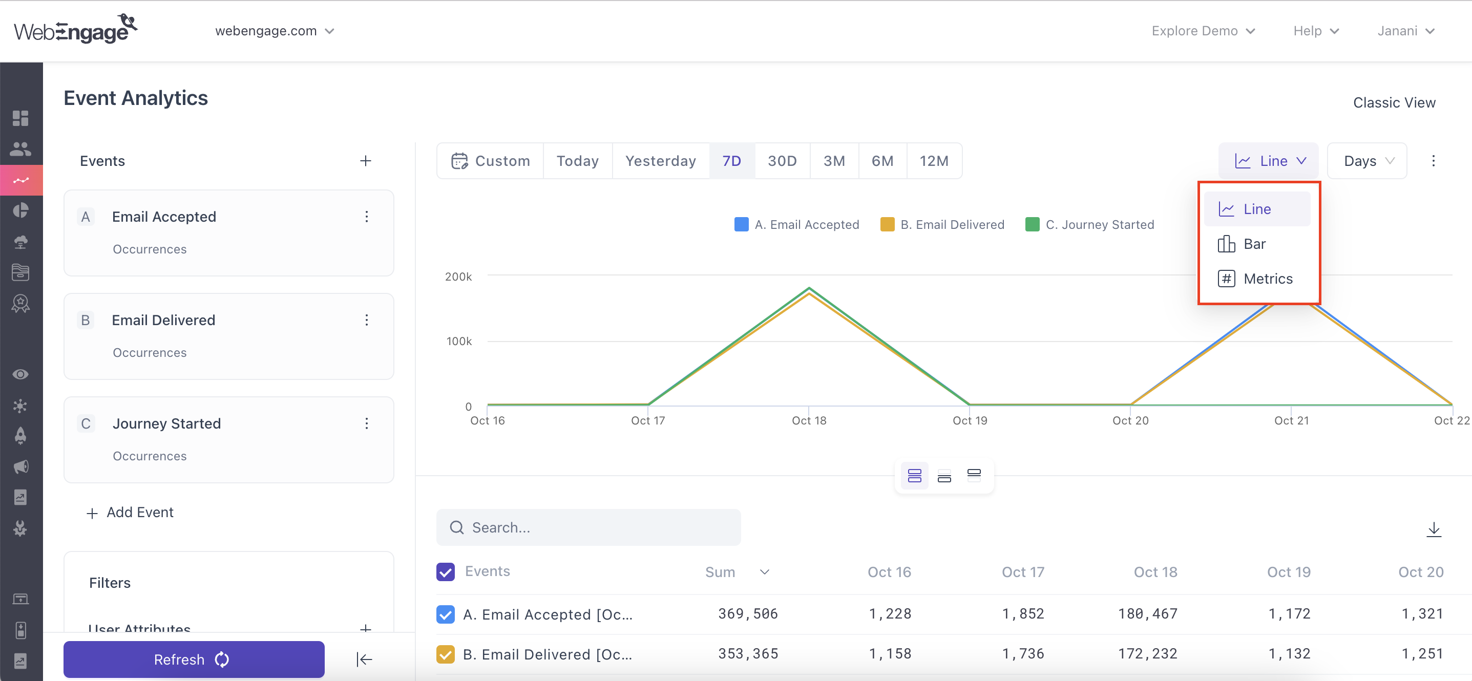
Click to enlarge
Bar Graph 🆕
In the new EA approach, where the X-axis is always time, we will repurpose bar visualizations to better serve this need.
Bar visualization will now display one horizontal bar for each series of a line chart, making data more accessible and actionable.
- No Split: Displays the aggregated event data over the selected time period.
- With Split: Shows aggregated event + user attribute (e.g., Session_Started by Country or Country-Browser) for deeper insights.
Bar values will reflect accurate aggregation for the time period, not just a simple sum of line chart data points, providing a more accurate representation of trends.
This new approach offers clearer insights with concise totals across the selected date range, while also resolving the challenge of visualizing data combinations like browser vs. country.
Metrics
You can now pin custom data points as cards to your dashboard directly from Event Analytics.
Selecting Metrics will display event counts, including the event name and any split (if applicable). For example, you’ll see something like “Product View [Occurrences] / Chrome,” with the count displayed below.
The Metrics option will only be available if you’ve selected 10 or fewer series. If more than 10 are selected, it will be disabled.
Metrics make it easier to track key data points at a glance, and you can tailor your dashboard to fit your needs.
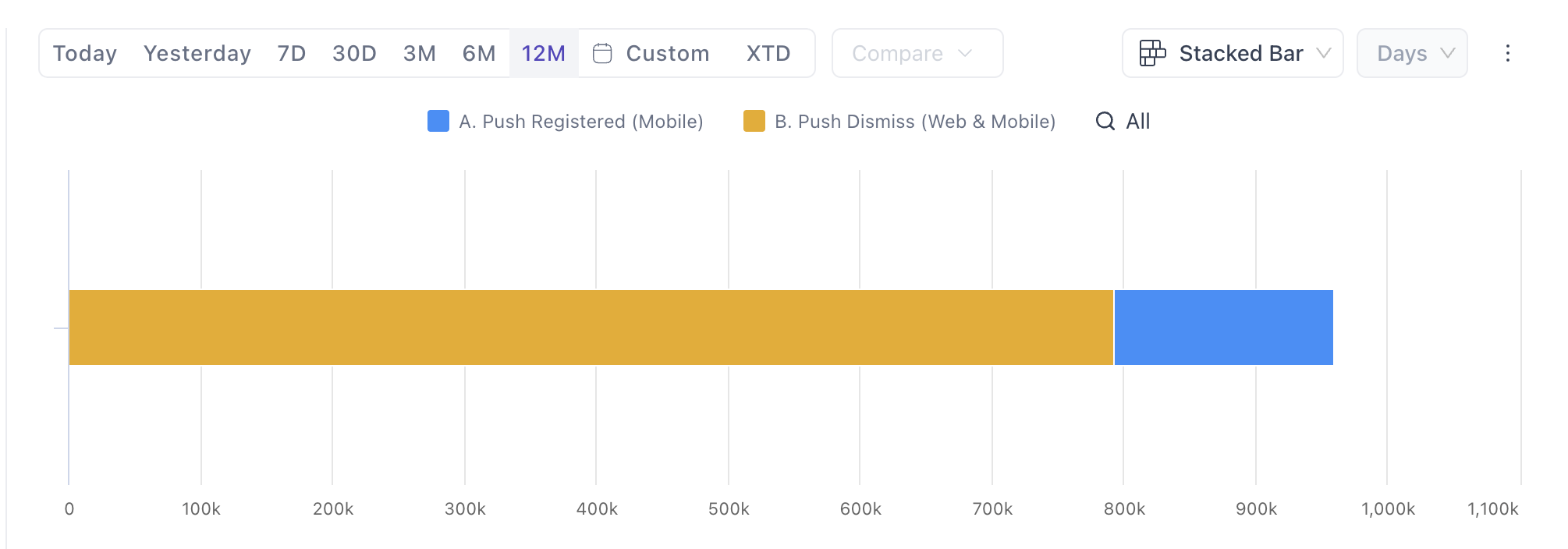
Stacked Bar Graph
Displays data using horizontal bars, where each bar is divided into stacked segments representing different data series. It is ideal for comparing compositions across multiple categories, especially when category labels are lengthy.
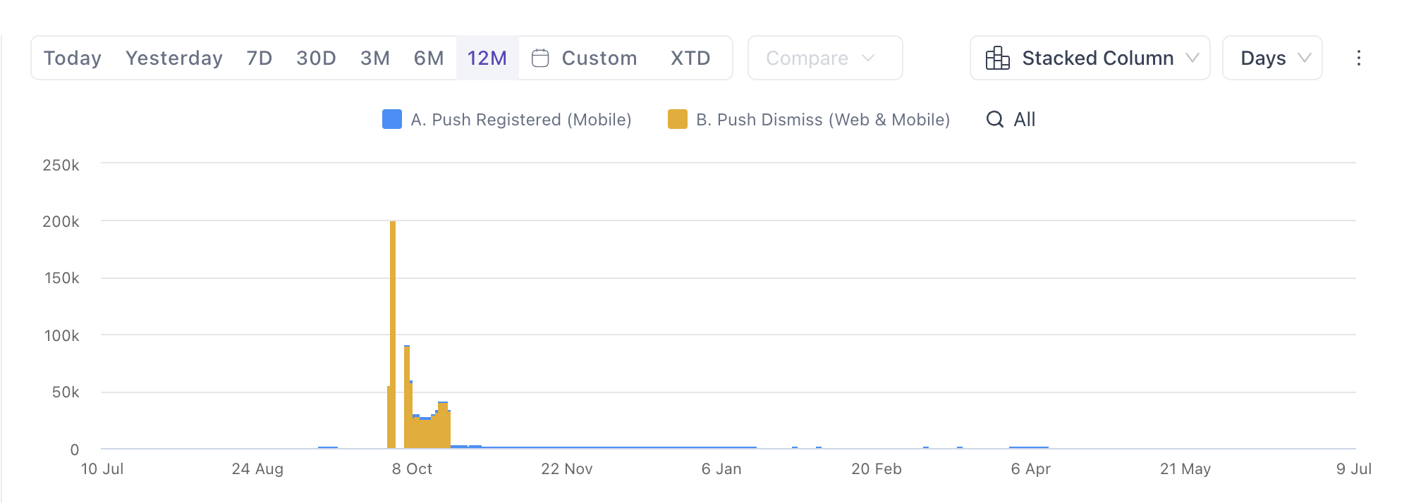
Stacked Column Graph
Displays data using vertical columns, where each column is divided into stacked segments representing different data series. It is best suited for comparing totals and compositions across time or a small number of categories.
Actionable Event Analytics
Event analytics provides insights into your users behaviour, this becomes an important point where you can discover a segment of your users, for whom you would want to create a list for.
Additionally, you will be able to preserve an event analytics search or query as a list (Static and Refreshing Lists). This list may be for a single event or a collection of related events. Which can be further used to engage users by sending segmented campaigns.
How it works?
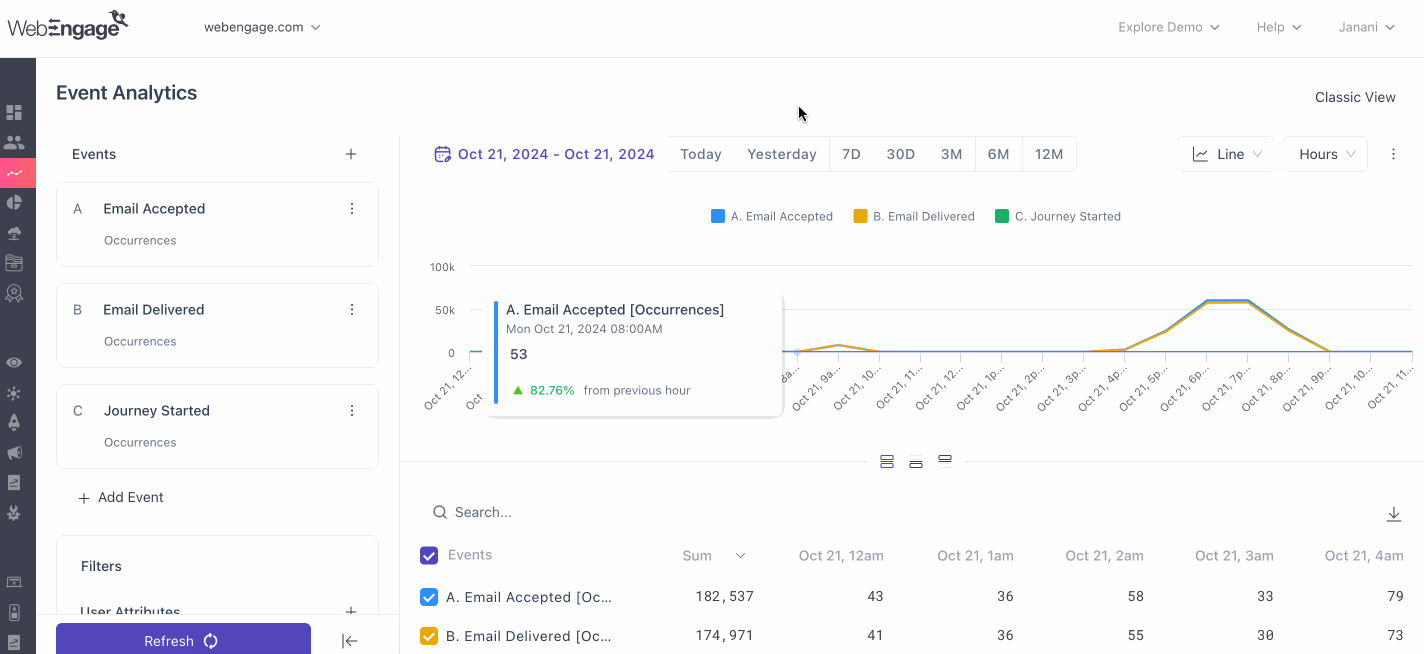
Imagine you are doing analysis over a specific set of events and wish to create a list of users who did a particular event on a particular day. Now you will be able to export users list for a specific date or user list for over a period of time.s,
You can do this by clicking on the Zoom In option when you hover over the event you are analyzing.

Lets understand 2 ways of creating List.
You can start by choosing between Data Point or Series:
For Data Points:
- The data point through which you selected the option to create a list, will be selected by default.
- The order will be the same as the way it is shown on the graph.
- You can also select all the data points.
For Series:
- The series through which you selected the option to create a list, will be selected by default.
- The order will be the same as the way it is shown on the graph except, for “Others”, they should be anchored at the bottom and should be unselected.
- You can also select all the series.

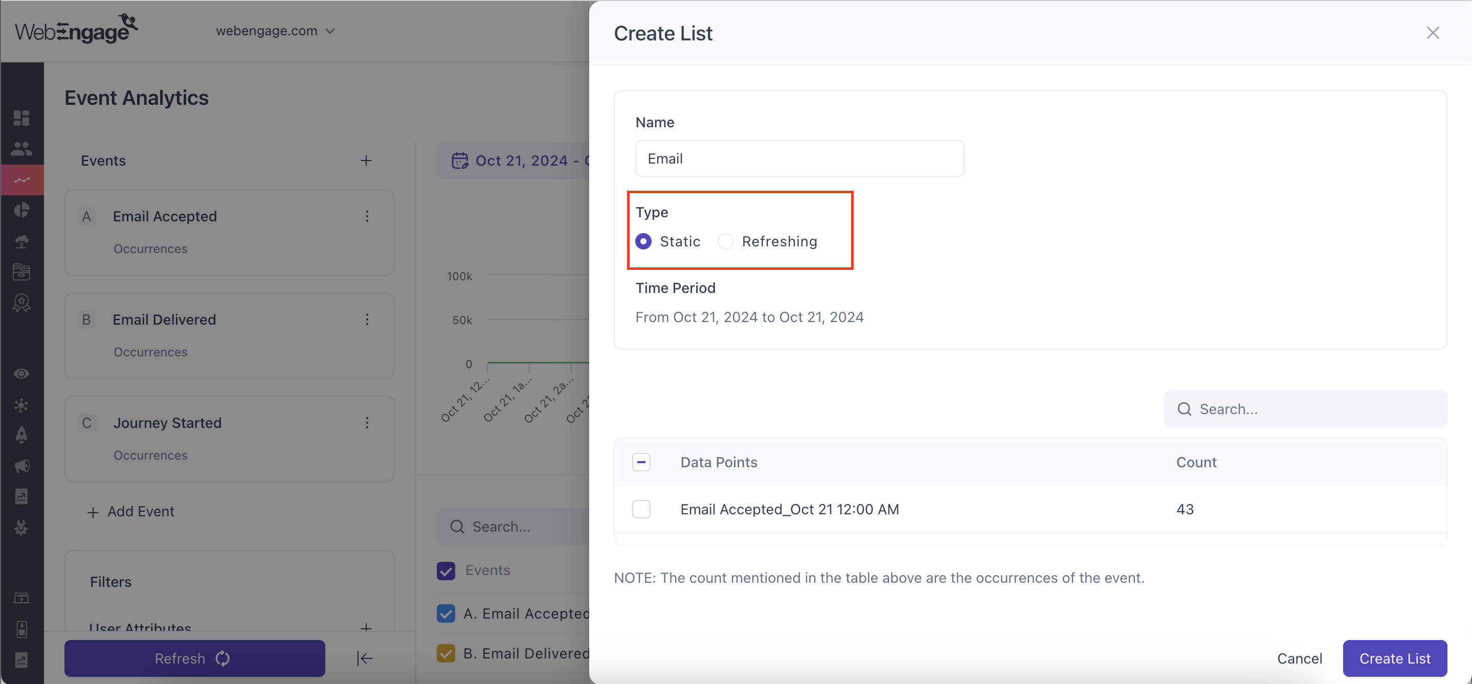
Let us consider a scenario where you choose to analyze the data points of an event. And walk through the steps of creating a list from event analytics.
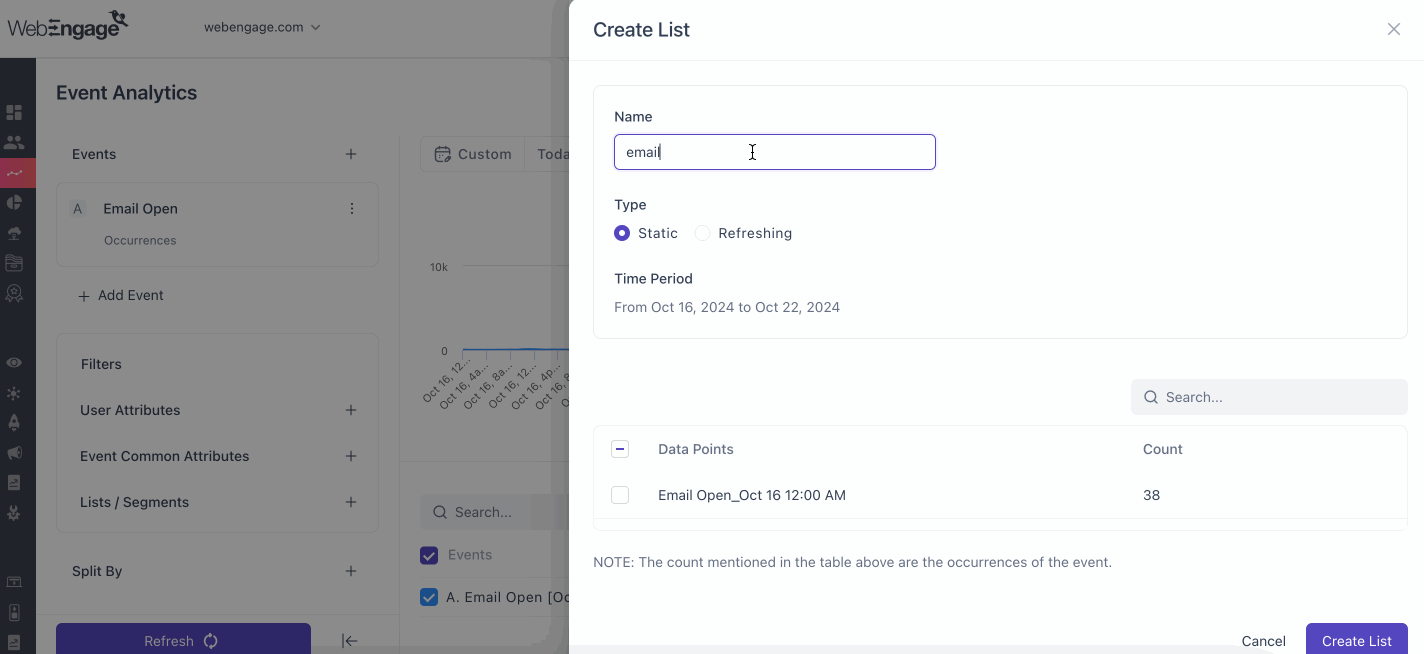
- Step 1: You can now proceed with filling up the name of the list you want to create.
- Step 2: Now choose from the type of list i.e. Static or Refreshing.
- Static: A one time list, where users will not receive them again and are used for executing campaigns for a small group of users, these are ideal for running one-off campaigns where your end goal is to invoke immediate action like user activation, conversion, registration, or convey a personalized message. Click here to know more.
- Refreshing: refers to a type of list that you can update or reload either by manually triggering a refresh action or by setting a periodic schedule i.e. daily, weekly, monthly, for automatic refreshing. Click here to know more.
- Step 3: If you’ve chosen the Refreshing lists option, Last ‘x’ days.
- For Refreshing Type, text will be displayed with the last X days and number of days are editable in the future.
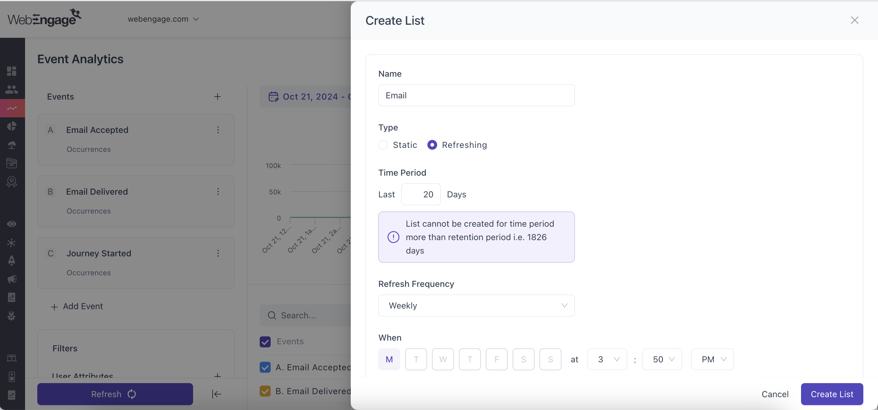
- Step 4: Selecting Refreshing Frequency: : A refresh schedule, similar to the one we have for the refreshing segment, to refresh the lists in every time period such as daily, weekly, or monthly.
Once the above fields have been filled, you can now proceed to selecting the data points or series from the table below.
Use CaseUser Onboarding Optimization:
Brief: Track user onboarding touchpoints, including account creation, profile completion, tutorial views, and feature interactions. Access a comprehensive view of the onboarding process, enabling a nuanced understanding of user interactions.
Impact: Granular insights allow for targeted improvements to the onboarding journey, resulting in a smoother user experience.Product Feature Adoption:
Brief: To track the adoption of specific product features, combine multi-event analytics with segment and static list filters. By analyzing events related to feature usage and creating segments based on user behavior, tailor communications sent to different user groups. User attributes can further refine this targeting.
Impact: A personalized approach to promoting features, increasing user engagement, and driving feature adoption.User Engagement Journey Mapping
Brief: Identify key touch points, behaviors, and preferences in the user journey; user attributes further refine insights. Export this data to allow for a comprehensive understanding of the user journey.
Impact: Informed decision-making, personalized marketing strategies, and an improved overall user experience.
Step 5: Click on Create List to save the list
Once the lists have been saved, they will be visible to you under the Segment section under Lists.
Keep in mindOnce the list is created and saved you cannot update the criteria of the list. You can follow the same steps in case you want to analyze Events for Series List.
We hope this has given you a good idea of how you can make the most of the Events section of your dashboard to gain relevant behavioral insights. Please feel free to reach out via [email protected] in case you have any further queries. We’re always happy to help!