In-app Layouts: Image & Text Guidelines
Make the most of our ready-to-use Layouts to deliver impressive & engaging In-app messages
Please Note
This document only covers image and text specifications for the In-app Message Layouts listed in your dashboard. Please navigate to Creating In-app Campaigns, to start building your campaign from scratch.
Visual specs apply to all images and icons that are:
Uploaded directly to the dashboard.
Added through a link.
Personalized to a user by adding a User Attribute/Event Attribute to the respective fields.
(Regarding the last two scenarios, please host the pictures on your server/cloud account in the aspect ratios specified below.)
Header
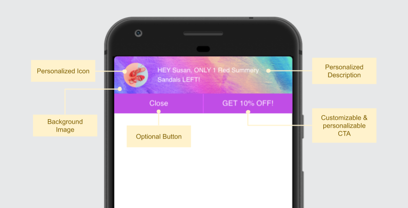
A simple template, Header Notifications are ideal for engaging users with contextual offers and updates. (How to customize)
Click to enlarge
Text Specifications
Field | Max Length Recommended |
|---|---|
Description (displayed over the background image/color) | 90 characters |
Button Label (CTA text) | 12 characters |
-
You can also choose to add a Close Button to the Header Notification while creating the campaign.
-
You can easily personalize the Description as per each user's preference and behavioral history. This could be anything like highlighting products added to Wishlist/Cart, recommending shows or courses as per the user's interactions and so on!
Visual Specifications
Element | Size & Aspect Ratio (w:h) | File Type & Size |
|---|---|---|
Icon | 200px by 200px (1:1) | JPG, JPEG, PNG (less than 3MB) |
Background Image | 640px by 160px (4:1) | JPG, JPEG, PNG (less than 3MB) |
You can easily personalize the Icon and Background Image to engage one-on-one with your users!
Footer
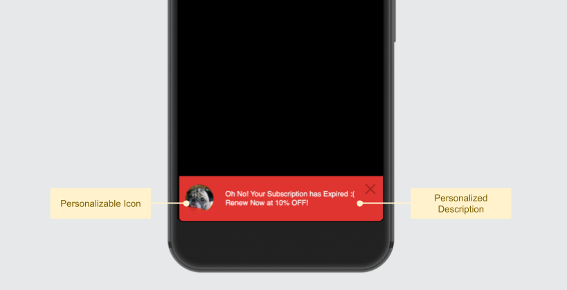
A buttonless template, you can easily personalize Footer Notifications to each user's preferences and behavioral history, creating minimally intrusive In-app experiences. The entire notification can be linked to an app screen/webpage, allowing your users to act instantly. (How to customize)
Click to enlarge
Text Specifications
Field | Max Length Recommended |
|---|---|
Description | 90 characters |
You can easily personalize the Description as per each user's preference and behavioral history. This could be anything like highlighting products added to Wishlist/Cart, recommending shows or courses as per the user's interactions and so on!
Icon Specifications
Size & Aspect Ratio (w:h) | File Type & Size |
|---|---|
200px by 200px (1:1) | JPG, JPEG, PNG (less than 3MB) |
You can easily personalize the Icon to engage one-on-one with your users. This could be anything like highlighting products they viewed in your app, products added to Wishlist/Cart and so on!
Popout Modal
Portrait Mode Popout Modal (click to enlarge)
Text Specifications
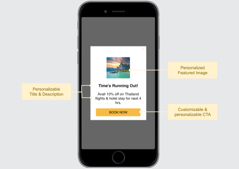
The amount of text added under the field, Description, determines the actual height of the notification seen by a user. A maximum of 5 lines can be under the field and the additional text is truncated.
Field | Max Length Recommended |
|---|---|
Title | 18 characters (Portrait Layout) |
Description | 135 characters approx. |
Button Label (CTA text) | 22 characters |
You can easily personalize the Title, Description and Button Label as per each user's preference and behavioral history.
Featured Image Specifications
Size & Aspect Ratio (w:h) | File Type & Size |
|---|---|
120px by 90px (4:3) | JPG, JPEG, PNG (less than 3MB) |
Here's how you can personalize the featured image to engage one-on-one with your users.
Pro Tip: Given its thumbnail-sized dimensions, we recommend that you add an icon or an image containing an easily recognizable character/landscape to the Featured Image.
Classic Modal
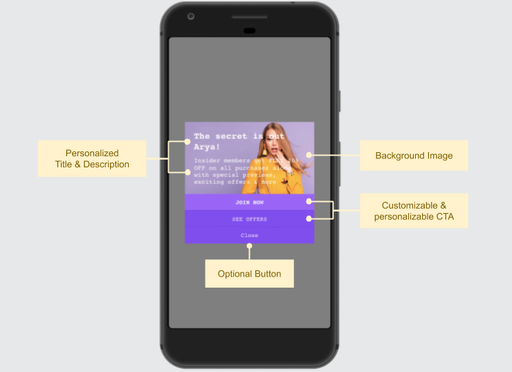
A rich media template, the Classic Modal is ideal for engaging users with brief, yet visually enticing messages. (How to customize)
Portrait Mode Classic Modal (click to enlarge)
The actual size of the Classic Modal Notification seen by a user is determined by the amount of text added under the Description.
The background image is the main visual element of the notification and is cropped from all corners as per the text area. A margin of 20px (min) is maintained around the text area by us to ensure the In-app message looks dapper.
This is why we recommend that:
-
You avoid images that contain text. Instead, you can add the text to the Description while creating the campaign.\
-
You align the character in the image (person/object) to the left/right/top/bottom to accommodate the Description.\
-
You create a message containing 100 to 200 characters to ensure that the background image renders optimally.
You can gauge the notification's appearance through the Preview section, as shown below.
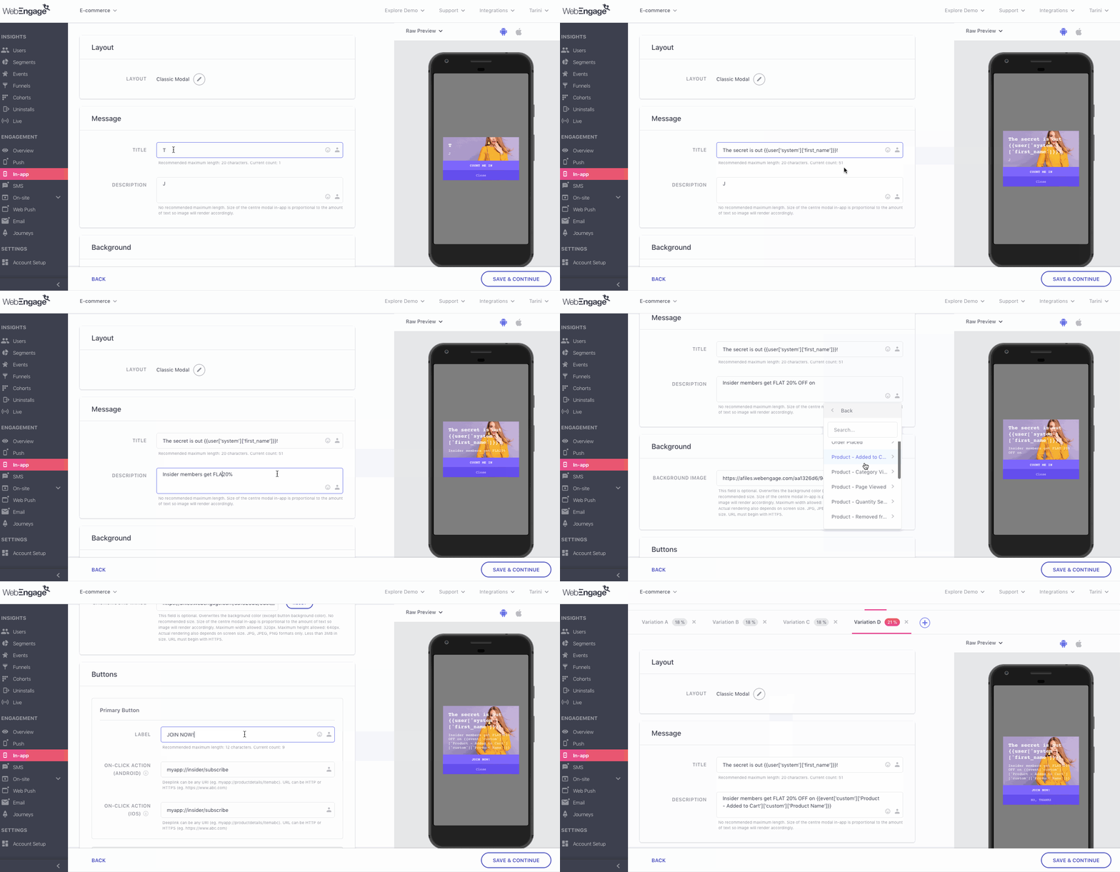
Click to enlarge
Text Specifications
Field | Max Length Recommended |
|---|---|
Title | 20 characters (Portrait Layout) |
Description | 100 - 200 characters (No min/max limit on character count) |
Button Label (CTA text) | 12 characters |
-
You can add up to 2 CTAs to the layout by configuring the Secondary and Primary Buttons while creating the campaign.
-
You can also choose to add an additional Close Button to the In-app Notification while creating the campaign.
-
Here's how you can personalize the Title and Description to engage one-on-one with all your users. This could be anything like highlighting products added to Wishlist/Cart, recommending shows or courses as per the user's interactions and so on!
Background Image Specifications
Size & Aspect Ratio (w:h) | File Type & Size |
|---|---|
320px by 640px (1:2) | JPG, JPEG, PNG (less than 3MB) |
You can easily personalize the Background Image to each user's preferences and behavioral history. This could be anything like highlighting a show from their most-watched genre, recommending products based on their previous purchase, highlighting products added to Wishlist/Cart and so on!
Full-screen Modal
A visually impressive template, the Full-screen Modal brings the best of both - message & media to engage users in style. (How to customize)
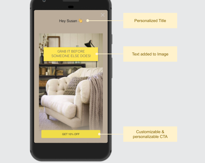
Portrait Mode Full-screen Modal (click to enlarge)
Text Specifications
Field | Max Length Recommended |
|---|---|
Title (Shown above image) | 18 characters (Portrait Layout) |
Button Label (CTA text) | 22 characters |
You can easily personalize the Title and Button Label to engage one-on-one with all your users.
Background Image Specifications
Size & Aspect Ratio (w:h) | File Type & Size |
|---|---|
Portrait Layout: 1200px by 2000px (1:2) | JPG, JPEG, PNG (less than 3MB) |
Landscape Layout: 2000px by 800px (5:2) | JPG, JPEG, PNG (less than 3MB) |
You can easily personalize the Background Image to each user's preferences and behavioral history. This could be anything like highlighting a show from their most-watched genre, recommending products based on their previous purchase, highlighting products added to Wishlist/Cart and so on!
Adding Text to Portrait Background Image
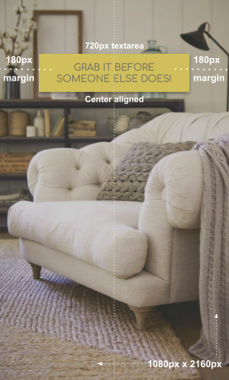
Click to enlarge
As highlighted above, please ensure that:
- The content block is center-aligned. (Max Textarea = 720px by 2160 px)
- A minimum margin of 180px is maintained on the text area's left and right side. Doing so will ensure that it's rendered optimally across most mobile screen sizes.
Adding Text to Landscape Background Image
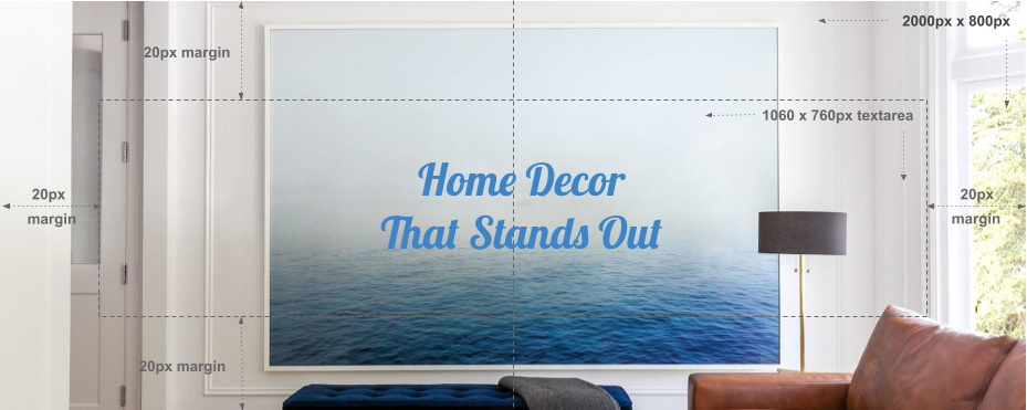
Click to enlarge
As highlighted above, please ensure that:
- The content block is center-aligned. (Max Textarea = 760px by 1060 px)
- A minimum margin of 20px is maintained on all sides of the text area. Doing so will ensure that the content doesn't spill over to the screen's edges.
Screen Blocker
A pure media template, screen blockers are ideal for promoting fashion collections, movies, courses, albums and the likes of it, with custom banners. (How to customize)
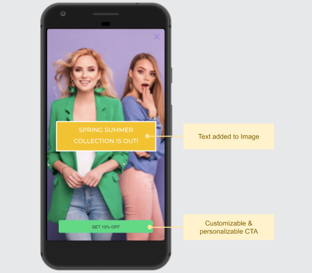
Portrait Mode Screen Blocker Layout (click to enlarge)
As highlighted above, the layout is text free and allows you to add a prominent CTA below the image.
Button Label(CTA text): Maximum length of 22 characters recommended.
Background Image Specifications
Size & Aspect Ratio (w:h) | File Type & Size |
|---|---|
Portrait Layout: 1080px by 2160px (1:2) | JPG, JPEG, PNG (less than 3MB) |
Landscape Layout: 2160px by 1080px (2:1) | JPG, JPEG, PNG (less than 3MB) |
You can easily personalize the Background Image to each user's preferences and behavioral history. This could be anything like highlighting a show from their most-watched genre, recommending products based on their previous purchase, highlighting products added to Wishlist/Cart and so on!
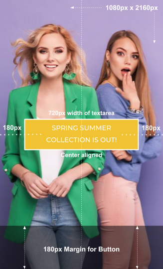
Adding Text to Portrait Background Image
Click to enlarge
As highlighted above, please ensure that:
- The content block doesn't exceed 720px by 2160 px (width x height). We recommend that you center align the text keeping these dimensions in mind.
- A minimum margin of 180px is maintained on the text area's left and right side. Doing so will ensure that it's rendered optimally across most mobile screen sizes.
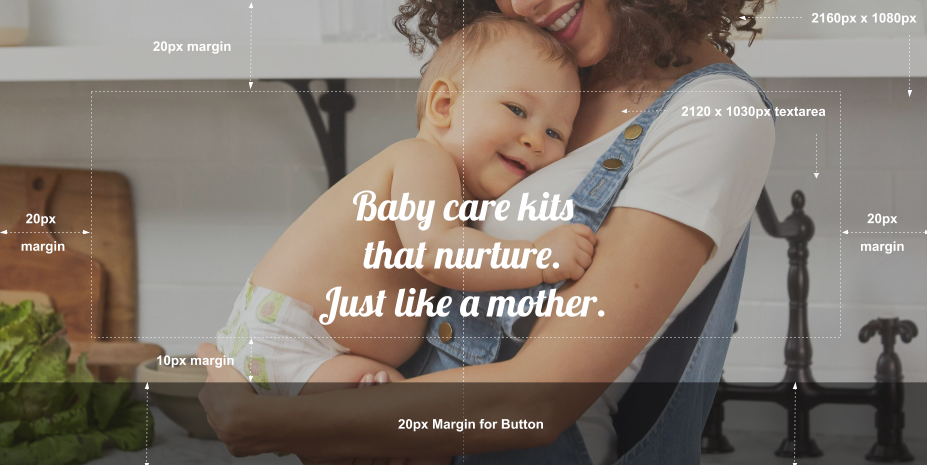
Adding Text to Landscape Background Image
Click to enlarge
As highlighted above, please ensure that:
- The context block doesn't exceed 2120px by 1030px (width x height).
- A margin of 30px is maintained towards the bottom of the text area to accommodate the button.
- A margin of 20px is maintained on the top, left and right sides of the text area to ensure that the content doesn't get cropped on small-screen mobile devices.
Things to Keep in Mind
- If your message is in a language that incorporates right to left alignment, then the message will automatically be oriented that way when users receive the In-app Notification, as shown below. (No additional settings or SDK changes are required to enable this!)
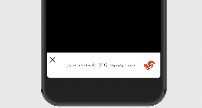
Right-to-left auto-alignment as per selected Language (click to enlarge)
-
The actual dimensions of the In-app Notification seen by a user depend on the device's screen size.
-
If you have added personalization variables to the text like User Attributes/ Events/ Journey Events/ API Call Data, then we recommend that you gauge its actual length through User Preview.
- Similarly, if you have personalized the image to a Custom User Attribute/ Custom Event, then you can view the actual image that a user will see by previewing the notification for their User ID through User Preview. (How Image Personalization works)
-
If you have added a link under the field, Image then:
- Its URL must begin with HTTPS.
- The responsiveness of the server on which the image is hosted may affect image rendering.
Please feel free to drop in a few lines at [email protected] in case you have any further queries or feedback. We're always just an email away!
Updated 6 months ago