Analyzing Users
A detailed walkthrough of how to analyze users in WebEngage
From getting a top-level view of known users, active users, channel reachability to accessing details of the last time a user interacted with your app/website - this section has everything you’ll ever need to understand your audience!
To give you structured insights, Users has been divided into three sections - Overview, Analyze, List of Users. You can toggle between these sections through the navigation bar, as shown below.

Click to enlarge
Let’s walk you through each, starting with Overview.
Overview
This section presents a top-level view of your entire user base against important parameters like;
- Total number of users who have ever interacted with your website (skip to Overview)
- The frequency of user activity broken down by months, weeks, days (skip to Activity)
- Channel wise reachability calculated for your entire user base (skip to Channels)
- Technological preferences, locations and sources of acquisitions for all your users (skip to User Details)
Let’s deep-dive into how this section can help you understand your users better:
1. Overview
The first section gives you a brief breakdown of all the users who ever have interacted with your app and/or website, over the entire lifetime of your account. It has further been broken down by known users and monthly active users, as shown below.

Click to enlarge
Let's go over each card:
1. Total Users
It indicates the total number of known users and those anonymous who have interacted with your app and website in the last 6 months.
2. Known Users
It indicates the total number of identified users in your database and is updated in real-time. To give you a sense of how it compares with Total Users, a percentage value, indicating Total Users divided by Known Users, is also included here.
3. Monthly Active Users (MAU)
It indicates the total number of users who have interacted with your app or website at least once over the last 30 days. MAU is split by the device preference of active users, indicated by - Web, iOS and Android.
When a sum of Web, iOS, Android users is not equal to Total MAULet's assume that a user interacts with your website through - a Desktop (Web), iPad (iOS) and Smartphone (Android).
This means that the user will be counted towards the numbers shown against each device type (Web, Android, iOS) but will be counted towards Total MAU only once. Hence,Total MAU will be less than the sum of the device-wise split.
2. Activity
The most viable measure of a product’s success is the frequency at which users interact with its app/website. It's measured as Monthly Active Users (MAU), Weekly Active Users (WAU), and Daily Active Users (DAU).
Since we have already covered MAU in the previous section, let’s go over the other concepts:
-
WAU: It indicates the total number of users who have interacted with your app/website at least once over the last 7 days.
-
DAU: It indicates the total number of users who interact with your app/website at least once in a day.
Fact checkA quick DAU/MAU analysis will reveal the average number of days a user interacts with your platform(s) in a month.
For example, if your DAU/MAU ratio is 70%, then it means that you have a very healthy active user base and it’s a sticky product!
First Impression
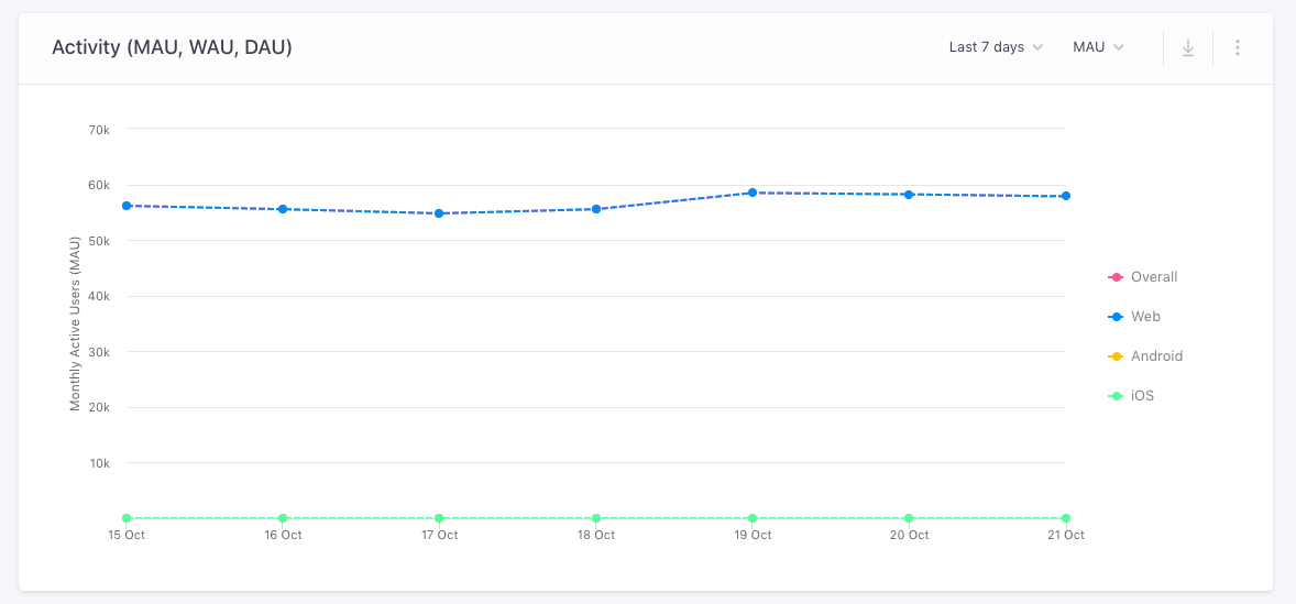
The default view of this section has been set to show you MAU over the last 7 days. This means that you’re looking at a set of users who have interacted with your platform(s) at least once a month, over the last 7 days. (as shown below)
Click to enlarge
For example, in the visual above, you can see that no activity is recorded for Android and iOS users. This could happen due to any one of the following reasons:
- The business hasn't integrated their app with their WebEngage account yet.
- They don’t have a mobile app.
How to Analyze Activity
Now, let’s show you how you can analyze the frequency of user interaction on your app/website:

Click to enlarge
Step 1: Select Date Range
Using the filter placed first on the top left of this section, you can select a custom date range for analyzing the frequency of user activity.
Step 2: Select Frequency of Activity
Using the drop-down second from the date range filter, you can choose to analyze user activity as MAU, WAU or DAU, for the period selected by you.
Step 3: Select the Format of Visualization
Lastly, while the default format of data visualization here is a Line Graph, you can change this to a Bar Graph or a Table through the overflow menu on the top-left.
3. Channels
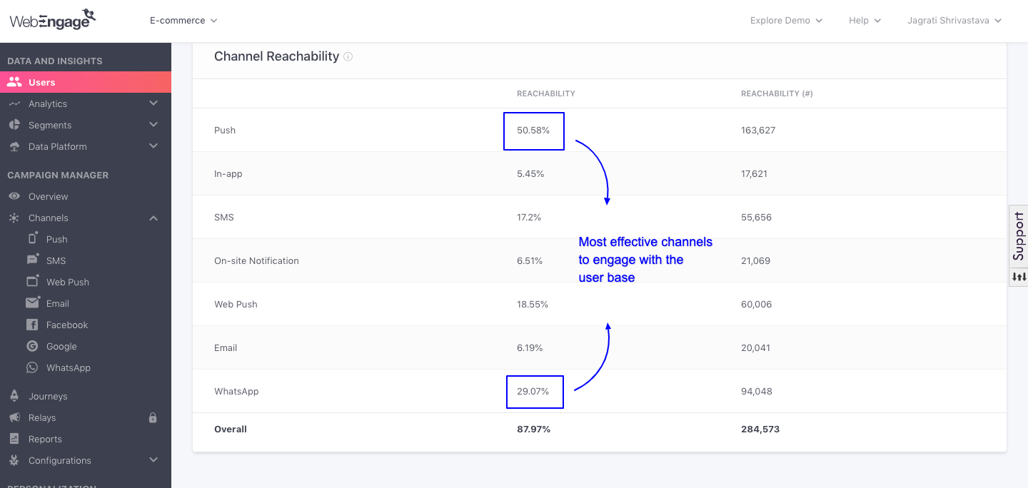
This section helps you identify the most viable channel to engage your entire user base. At WebEngage, you can engage users through Push, In-app, SMS, On-site, Web Push and Email.
The reachability of your all users has been indicated against each channel, to help you identify the most viable channel of engagement. And to ensure that you’re not guided by a biased representation, two parameters have been included here; Reachability Percentage and Reachability Number, as shown below.
Click to enlarge
Understanding Channel ReachabilityPlease refer to Channels and Channel Reachability for a detailed understanding of what reachability means for each channel and how it's calculated.
Analyze
This section allows you to slice-and-dice all your user data in multiple ways to gain actionable insights. Let's get you acquainted with its features.
First Impression
The default view of this section will show you a break up of All Users by their location, Country.
- Using the query bar, you can change these parameters to analyze your user base against up to two dimensions.

Click to enlarge
A Hands-on Analysis
Let's demonstrate a use-case to help you get acquainted with the workings of this section.
Use-caseLet’s say that you run an international travel app and need some insights to narrow down on ideal platforms for running targeted ads.
The best way to identify these platforms would be to find out which ones have helped you acquire maximum users organically. You can do this by analyzing users against campaign source and location (for geo targeting).
Here’s how one can go about it:
Step 1: Analyze (Select Type of Users)
The first step is to select the type of users you want to analyze; All Users, Known Users, Unknown Users. This can be done through the drop-down menu placed under Analyze.
For our analysis, we’ll go with Known Users.
Why?
Because that’s a clear indicator of users who are genuinely interested in your services and have shown intent by sharing their contact details with you.
Step 2: Select the Dimension(s) for Analysis
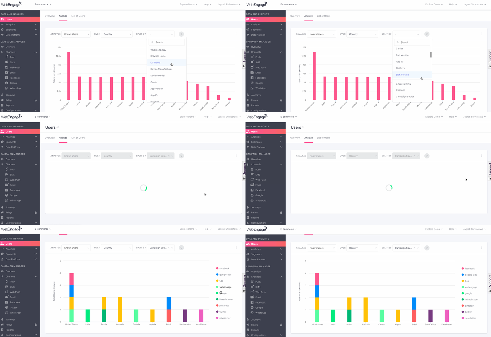
Next, we’ll select the parameters against which we want to analyze these users. Using the dropdowns nested under the fields, Over and Split By, you can combine up to two parameters for your analysis.
Dropdown options in both fields include the following attribute categories:
- Location (City, Country)
- Technology (OS Name, Device Model, Device Manufacturer, Browser Name, App Version, App ID, SDK Version, Carrier)
- Acquisition (Channel, Campaign Source, Campaign Name, Campaign Medium, Referrer Host, Referrer URL, Landing Page)
- Other (Gender, Date of birth, Company)
- Custom (all custom user attributes being tracked for your account)
Step 2.1.: Select Over (Dimension 1)
For our analysis, we’ll go with the pre-selected value of Country here.
Step 2.2.: Select Split By (Dimension 2)
As discussed previously, we’ll select Campaign Source here.
Click to enlarge
In case you'd like to analyze users against just one parameter, leave the field, Split By blank, and hit enter.
Step 3: Select the Format of Visualization
Lastly, while the default format of data visualization here is a Bar Graph, you can change this to a Line Graph or a Table through the overflow menu on the top right.
For our analysis, we’ll go with the default bar graph.

Click to enlarge
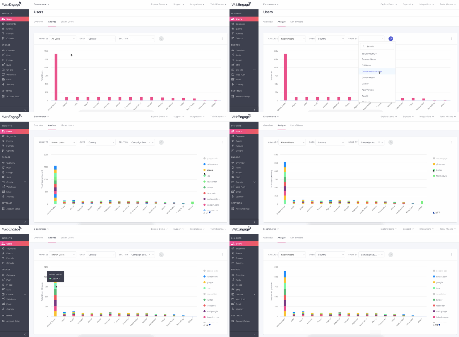
And here are your insights!
Click to enlarge
It seems that a big chunk of your Known Users are based in the United States and have majorly been acquired through Twitter (sum of twitter.com, t.co and twitter as campaign sources).
ResultsSo there you have it - running Twitter ads, targeted at an audience based in the US have the highest chances of bringing in high-intent users to your app. :)
List of Users
List of Users has been designed to give you an in-depth view of all the users who have ever interacted with your app, website or have been added manually by you. This section comes in handy when digging into the details of a premium customer, solving customer grievances or downloading a list of user for retargeting on other digital platforms.
First Impression
The default view of this section will show you important details of your Known Users. Using the filter on the top left, you can customise the columns of this table.
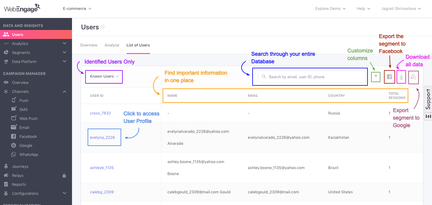
Click to enlarge
Now, let’s get you acquainted with all the features of this section:
1. Search for a User
The most popular features of this section: Using the search bar placed on the top right, you can search for a particular user to analyze their latest interactions with your campaigns and app/website. This can be done by entering a unique identifier like their phone number, email address and customer ID.
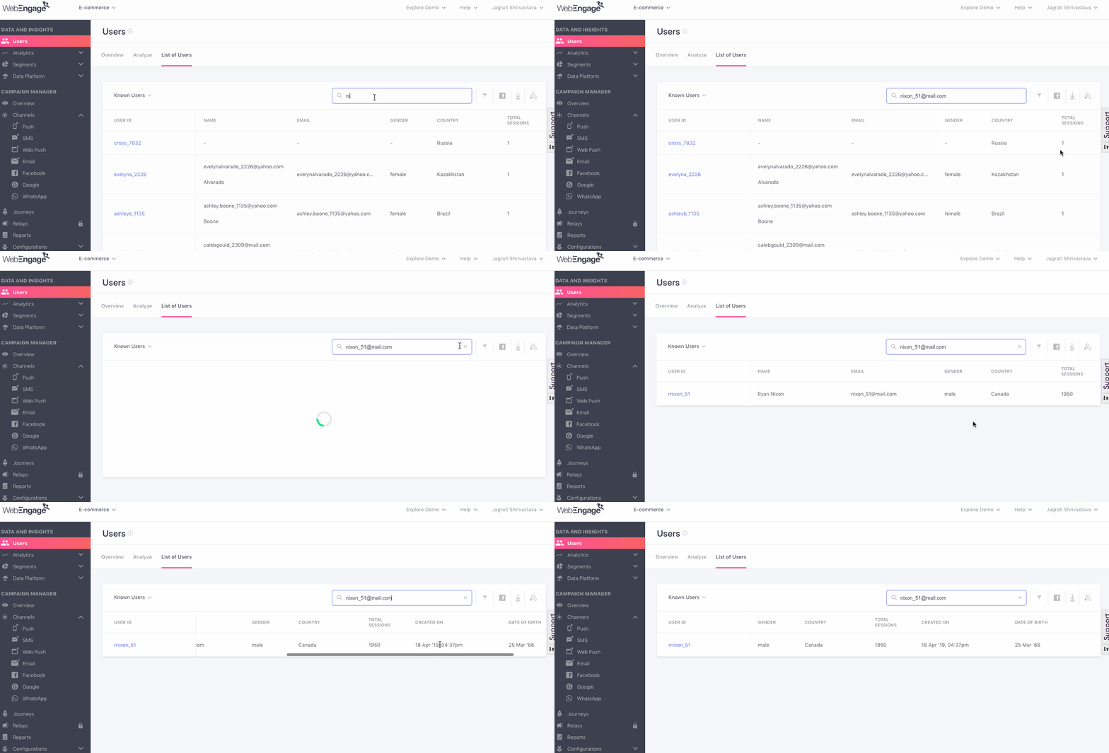
Click to enlarge
For example, in the visual above, we have used the email address to track down the profile of a user.
2. Customize List
Let's show you how you can customize the list of users as per your analytical needs.
2.1. Filter by User Type
Using the drop-down placed on the top left, you can filter the type of users by All Users, Known Users, and Unknown Users, depending on what you’re looking for.

Click to enlarge
However, depending on the type of user, data under some sections may be missing. For example, if you’re looking at Unknown Users then details like their name, email address and phone number will be missing.
2.2. Add/ Remove Attribute Columns
All the attribute columns of the table here can be customized to match what you’re looking for. Here’s how you can go about it:
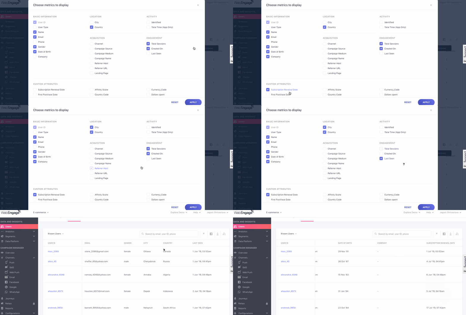
Click to enlarge
Step 1: Click the filter icon placed next to the search bar.
- You will see a simple checkbox interface listing all the attributes collected for each user.
Step 2: All you need to do is select/ deselect the attributes to customize the columns.
Step 3: Then hit the Apply button!
3. Download List of Users
The best part - you can download the entire table shown here! This comes in handy especially when you want to run retargeted campaigns on other digital platforms or interact offline with your users. Here’s how you can go about it:
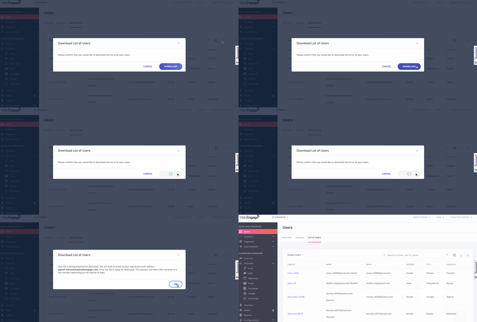
Click to enlarge
Step 1: Click the Download icon, placed on the extreme top left of the table.
- You will be prompted with a pop-up, asking you to confirm your decision.
Step 2: Click the Download button on the pop-up.
- A link for downloading the list of user details will be sent to your registered email address.
4. Access User Profiles
As discussed under Users, User Attributes and User Profiles, a user profile is automatically created for all the users who have ever interacted with your app and website.
One of the biggest advantages of this section - you can access the profile of each user by clicking their (hyperlinked) User IDs, as shown below!
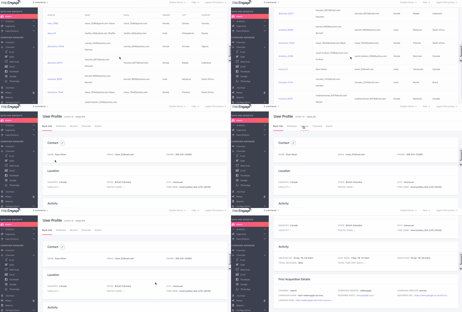
Click to enlarge
How to Analyze a User ProfileAll the details included in a user profile and how to analyze it has been covered in extensive detail under Analyzing User Profiles.
5. Browse Through All Details
Lastly, you can click the page numbers listed at the bottom right to browse through all user details, page by page.

Click to enlarge
We hope this has given you a good idea of how you can make the most of the Users section of your WebEngage dashboard to gain valuable insights into your ever-evolving user base.
Please feel free to reach out via [email protected] in case you have any further queries. We’re always happy to help!
Updated 3 months ago
Let's walk you through the concepts related to behavioral data, referred to as Events in WebEngage.