Analyzing Email Campaigns
A step-by-step guide on how you can analyze the performance of an Email campaign in your dashboard
Once you launch an Email campaign through the channel or a journey, its impact on user engagement and revenue can be analyzed in detail through Campaign Overview.
How to Access
Let's quickly show you how you can access campaign analysis through the various sections of your dashboard:
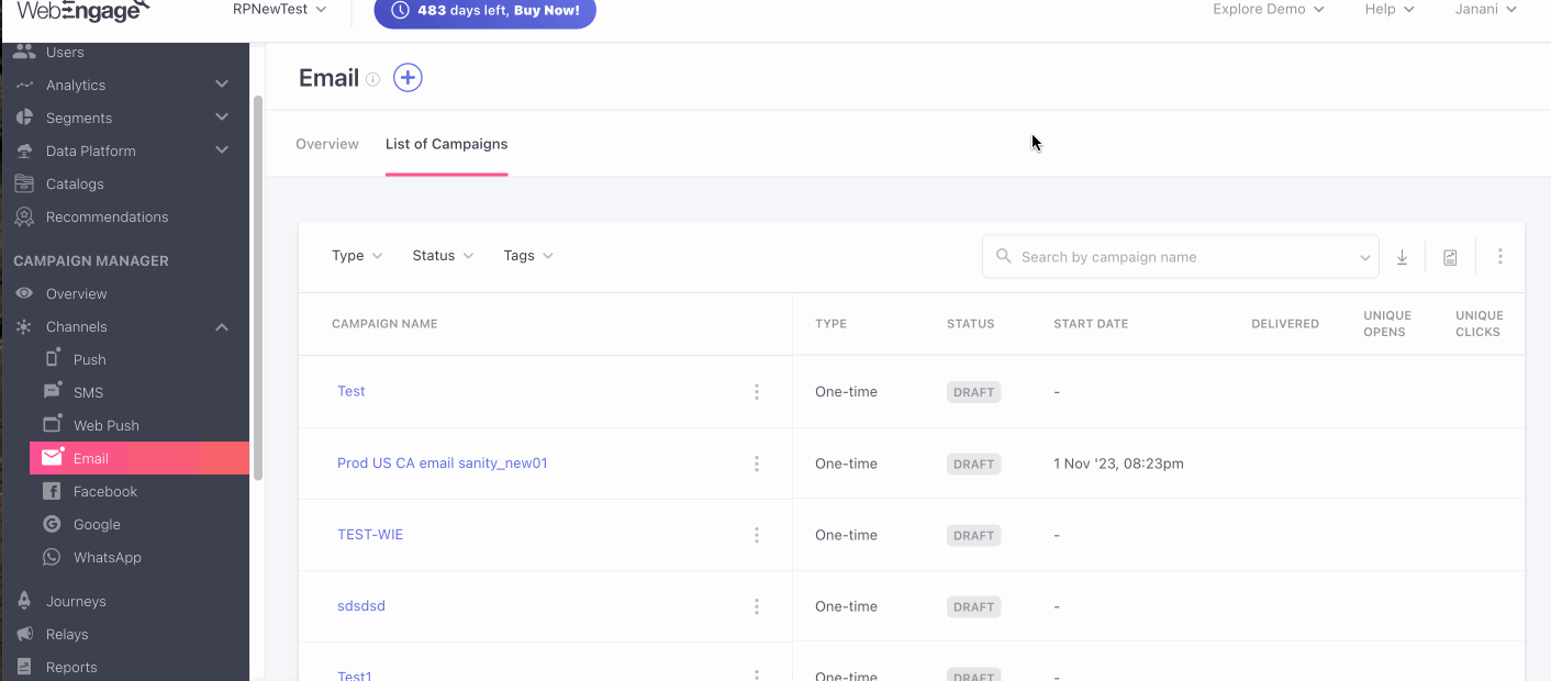
Access Campaign Overview through List of Campaigns
A list of all the campaigns created through the channel can be found under the List of Campaigns or the central hub of Email. As shown below, you can click on the (hyperlinked) Campaign’s Name to analyze a campaign in further detail.

Accessing an Email campaign's overview (click to enlarge)
Access Campaign Overview Through Journey Overview
A list of all the campaign attached to a journey can be found under Campaigns in the journey's Overview. As shown below, you can click on the (hyperlinked) Campaign Name to analyze the Email campaign in further detail.

Accessing an Email campaign's overview through its journey (click to enlarge)
Before we dive into campaign analysis, let's get you acquainted with the top panel.
Understanding Top Panel

Top Panel indicating campaign details (click to enlarge)
As highlighted above, the top panel provides a quick snapshot of the campaign with key details like:
-
Campaign Name: As defined at Step 1: Audience, while creating the campaign.
-
(Target) Audience: Indicates the segment targeted by the campaign, as defined at Step 1: Audience, while creating the campaign.
- You can click the (hyperlinked) segment's name to analyze its users and rules of segmentation, as shown below.

Click to enlarge
- (Campaign) Type: As selected when you initiate camaign creation in your dashboard. Email campaigns can be of the following types:
- One-time
- Triggered
- Recurring
- Transactional
- Journey (created only through the Journey interface)
- Relay (can be created only through the Relay interface)
As shown below, all Journey (and Relay) campaigns can be traced back to the journey (and Relay) they're attached to by clicking on the (hyperlinked) campaign type, Journey/Relay. Doing so will direct you to the Journey/Relay Live View.

Click to enlarge
-
(Campaign) Status: Indicates the current status of the campaign, as per the settings specified at Step 2: When, while creating it.
- If you save a campaign without launching it, then it will be saved as a draft. The same is reflected by the status, Draft.
Now, let's get you acquainted with its features:
Modify Campaign
As shown below, using the icons placed next to the Campaign's Name, you can choose to Edit, Delete, Duplicate, Pause/Resume and Tag the campaign, as per your marketing needs.

Click to enlarge
- Given the short lifespan of one-time campaigns, Pause has been disabled for such campaigns.
- Further, all modification icons are hidden for journey campaigns, since they can be modified only through the journey they have been created through.
- Once you Pause a Running campaign, you can choose to Resume it's delivery to the target audience by clicking the Resume icon, as highlighted above.
Related Read: Modifying Email Campaigns
A step-by-step guide on how you can modify Email campaigns.
Download a Report
Please Note
Reports can be downloaded only by Admins who have access to Account Management. Please get in touch with the account owner if you're unable to do so.
You can download a copy of campaign stats for offline analysis, upload it to another platform, and so on. Here's how you can go about it:
Step 1: Click the Download icon
As shown above, in doing so, you will be prompted to specify the kind of data you want to analyse.
Step 2: Specify the time frame for which the stats should be shown (Data to Include)
As shown above, you can specify the time frame as:
- Campaign's Start Date till Present Date
- Custom Dates
Detailed Read
How Data to Include works
Step 3: Select Data Breakdown
In this dropdown you can choose from 4 options i.e. Day-wise, Week-wise, Month-wise, and 30 days rolling window. Each of these have been explained below.
- Day-wise: When you choose the day-wise option the report that will be sent to you will have an aggregate of each day i.e. each row will consist of each campaign or variations day wise statistics.
For example, if you want to download a report for the last 7 days, by choosing the day wise data breakdown option, you will receive a report with 7 rows each containing data for each of the days. - Week-wise: When you choose this option the report will consist of the aggregate of each week, i.e. Every row will contain the week-wise statistics for each campaign or variation, with each week defined from Monday to Sunday.
For instance, if you download a report for the past 1 month on the 30 Nov ’23 , and set the data breakdown option to week-wise, then you will receive a report that consists of 5 rows of aggregated data for each week starting from Monday to Sunday. Whereas, if a month starts during the middle of the week, for example the 1st of the month is on a Thursday, then the row for the first week will be from Thursday to Sunday. - Month-wise: On choosing this option your statistics will be aggregated for each month i.e. each row will consist of month wise statistics. (calendar month will be considered)
If you wish to download a report spanning from January 1st to November 30th and select the month-wise data breakdown option, you will receive 11 rows. Each row will contain aggregated data for each respective month, providing a comprehensive breakdown of information (based on calendar month). - 30 day (Rolling window): On choosing this option, your statistics will be aggregated based on every 30 days irrespective of the calendar month, i.e. Every row will include the rolling window statistics for each campaign or variation for up to 30 days.
For example, if you choose a date range from 15th June to 14th August, two rows will be generated i.e. 15th June to 14th July and 15th July to 14th August.
Step 4: Specify Level of Data Granularity
You can create up to 5 versions of a campaign and test each to determine the copy that resonates with your audience. Thus, while downloading a report, you can choose to analyze consolidated campaign stats OR a variation-wise breakdown.
As shown above:
-
Select Campaign Level Granularity to view the average performance of all campaign variations.
-
Select Variation Level Granularity to view the individual performance of each variation and identify the top-performing version.
Step 5: Click Download!
Schedule a Report
In our quest to make campaign reporting a seamless experience, we built Scheduled Reports - customizable and automated reports delivered straight to your inbox!
Using the Reporting icon, you can set up a periodic report to have all the stats shown under Overview, emailed to multiple team members.
Here's how you can go about it:

Click to enlarge
Step 1: Click on the Reporting icon
- As shown above, in doing so you will be prompted with a pop-up allowing you to customize the report's settings.
- The report's name will be the same as the campaign's name. This will be included in:
- The emailed report's subject line
- under the Scheduled Reports section of your dashboard
Step 2: Define the Frequency of report delivery
You can choose to have a report delivered on a Daily, Weekly or Monthly basis, as per your needs.
- As shown above, we have selected Weekly as the Frequency for our report.
Step 3: Specify the time of delivery (When)
As shown above, you can choose to have the report delivered at a specific time of the day. The same can be defined in an AM/PM format against the field, When.
Step 4: Specify the time frame for which the stats should be shown (Data to Include)
Too many data points always lead to chaotic insights. This is why we have made it possible for you to specify the time frame (number of days) for which you'd like to receive campaign stats.
As shown above, you can select a time frame between Last 1 Day to Last 30 Days _against _Data to Include.
Detailed Read
How Data to Include works
How a combination of Data to Include & Frequency determine the date of stats included in the report
Step 5: Select option for Data Breakdown
In this dropdown you can choose from 4 options i.e. Day-wise, Week-wise, Month-wise, and 30 days rolling window. Each of these have been explained below.
- Day-wise: When you choose the day-wise option the report that will be sent to you will have an aggregate of each day i.e. each row will consist of each campaign or variations day wise statistics.
- Week-wise: When you choose this option the report will consist of the aggregate of each week, i.e. Every row will contain the week-wise statistics for each campaign or variation, with each week defined from Monday to Sunday.
- Month-wise: On choosing this option your statistics will be aggregated for each month i.e. each row will consist of month wise statistics. (calendar month will be considered).
- 30 day (Rolling window): On choosing this option, your statistics will be aggregated based on every 30 days irrespective of the calendar month, i.e. Every row will include the rolling window statistics for each campaign or variation for up to 30 days. For example, if you choose a date range from June 15th to August 14th, two rows will be generated i.e. June 15th to July 14th and July 15th to August 14th.
Step 6: Select Level of Data Granularity
At WebEngage, you can create up to 5 versions of a campaign and test each one with a small test segment to determine the copy that resonates with your audience. Thus, while scheduling a report, you can choose to analyze consolidated campaign stats OR a variation-wise breakdown.
-
Select Campaign Level Granularity to view the average performance of all campaign variations.
-
Select Variation Level Granularity to view the individual performance of each variation and identify the top-performing version.
Step 7: Add team members as Subscribers
As shown above, you can choose from a list of all the team members who have access to your WebEngage dashboard. Doing so will ensure that all the added users receive the campaign performance report as per its settings.
- However, if a team member is not a part of your WebEngage account, then you will not be able to add them as a Subscriber.
Step 8: Click the Schedule button
-
A notification will pop up on the bottom right corner of the page, confirming that the report has been scheduled. (Understanding Report Stats)
-
You can modify or delete the report anytime you like through the Scheduled Reports section, nested under Settings in your account.
Please Note
Reports can be configured only by Admins who have access to Account Management. Please get in touch with the account owner if you're unable to do so.
You can schedule additional reports for campaigns sent through Email and all the channels combined through Settings > Scheduled Reports, in your dashboard.
See Campaign Details
As demonstrated below, clicking Show Details reveals a thorough recap of all the rules and settings specified while creating the campaign. This section can be minimized by clicking Hide Details.

Click to enlarge
Here's a list of all the details shown here:
-
Campaign ID: A unique campaign ID is generated by us each time you create a campaign.
-
Email Type: As selected at Step 1: Audience, while creating the campaign, Email campaigns can be of the following types:
- Promotional
- Transactional
-
Start Date / Send Date: Indicates the date-time on which the campaign was launched or will be launched (if the campaign is still scheduled), as specified at Step 2: When, while creating it.
-
End Date: Indicates the date-time on which the campaign will end or ceased getting delivered.
- Applicable only to triggered and recurring campaigns, An End Date can be specified at Step 2: When while creating it.
-
Time zone: Applicable only to one-time campaigns, it indicates whether the campaign was sent in the user's timezone, or in your project's timezone. The same can be specified at Step 2: When while creating the campaign.
-
Tags: Tags is a handy feature that helps you categorize your campaigns as per their purpose, target audience, frequency or any other parameter that makes them easier to search for.
- If a campaign is tagged: All the tags added to the campaign will be shown here. You can click on a hyperlinked tag to add more tags to the campaign or remove existing ones.
- If no tags have been added: As shown below, you can click on Add Tags to create new tags for the campaign and add existing ones to it.

clikc to enlarge
-
Audit Logs: Click View to access a history of all the interactions your account admins have had with the campaign. Each action, including campaign creation, message edits and changes made to its settings is recorded here. (Detailed Read)
-
Conversion Event: Indicates the action users are expected to perform on your app after receiving the campaign, as specified at Step 4: Conversion Tracking, while creating it.
- If you have not set up Conversion Tracking for the campaign or the journey it's attached to, then the same will be indicated by the status Disabled, here.
-
Conversion Deadline: Indicates the duration till which the campaigns' Conversion Event will be tracked after it has been delivered. The same can be specified at Step 4: Conversion Tracking while creating the campaign.
- If you have not set up Conversion Tracking for the campaign or the journey it's attached to, then the same will be indicated by the status Disabled, here.
-
Control Group: Indicates whether or not a Control Group was set up to measure the campaign's effectiveness against organic user behavior at Step 4: Conversion Tracking, while creating it. The same is indicated by:
- Enabled
- Disabled
-
Frequency Capping: Indicates whether or not the campaign was sent with Frequency Capping enabled at Step 2: When while creating it. The same is indicated by:
- Follow
- Ignore
-
DND: Indicates whether or not the campaign was sent with DND Hours enabled at Step 2: When while creating it. The same is indicated by:
- Follow
- Ignore
-
Queueing: Indicates the duration for which the campaign will be queued for delayed delivery if we are unable to deliver it immediately to a user. The same can be specified at Step 2: When while creating it.
-
Email campaigns can get queued due to the following reasons:
- The daily, weekly, monthly frequency cap on the number of messages a user can receive has been extinguished.
- DND Hours are currently applicable to a few users as per their time zone.
- If the user's server network is currently down or unresponsive.
-
If you choose to disable Queueing for the campaign while creating it, then the same will be indicated by the status - Disabled.
-
Throttling: Indicates the message rate limit specified for the campaign at Step 2: When. It enables you to control the number of messages sent to users per minute. (Detailed Read) It's status is indicated by:
- Follow
- Ignore
-
Send Winner: Indicates whether or not automated Variation testing was configured for the campaign while creating it, by setting up Send Winning Variation Automatically at Step 4: Conversion Tracking. The same is indicated by:
- Enabled
- Disabled
- If Send Winner is enabled, then the following details will help you out with a quick recap of the rules of testing:
- Size: Indicates the size of test audience with which all the _Variations _of the campaign will be tested with to determine a winning variant.
- Time to Test: Indicates the duration for which all the Variations of the campaign will be tested for.
- Win Criteria: Indicates the parameter (Impressions, Clicks, Conversions) based on which a winning Variation will be determined.
-
Created By: Indicates the name of the user who created the campaign.
-
Created On: Indicates the date-time on which the user started creating the campaign.
-
Last Edited By: Indicates the name of the user who has made the most recent edit to the campaign.
-
Last Edited On: Indicates the date-time on which the most recent edit was made to the campaign.
Now, let's show you how you can analyze an Email Campaign to gain valuable insights into its impact on user engagement, conversions, and revenue.
How to Analyze
Must Read
Please refer to Campaign and Channel Performance Indicators for a complete list of all the user-channel interactions tracked for Email campaigns.

Click to enlarge
As shown above, using the navigation bar, you can toggle between the following sections to slice-and-dice data and analyze multiple aspects of the campaign:
Define the Time Frame of Analysis
Please Note: You Cannot Analyse 'List of Users' for a Specific Duration
List of Users includes campaign engagement details for all the users that have been a part of the campaign's target audience throughout its lifetime.
By default, all stats under Overview and Analyze are shown from the campaign's Start Date till present day (if the campaign is running) or till upto 45 Days from the campaign's End Date (if the campaign has ended).

Click to enlarge
Using the date range filter shown above, you can analyze the campaign's performance for a custom duration.
The following time periods can be selected here:
Today
Yesterday
Last 30 Days
Last 60 Days
Last 90 Days
Custom Dates (as selected by you)
Now, let's dig into each section, starting with Overview.
Overview
Here you can analyze the campaign's performance from its Start Date till the present day (if the campaign is running) or till 45 days from the campaign's End Date (if the campaign has ended), against key performance indicators like Impressions Clicks, Conversions, Revenue for each Variation. You can alter this by selecting a time frame.
1. Performance Overview
This subsection presents a summary of the campaign against parameters like the total number of messages Sent, Failed, Delivered, Queued and indicates its overall performance against key metrics like Unique Opens, Unique Clicks, Unique Conversions, and Revenue.

Click to enlarge
Let's go over each card:
Sent
Indicates the total number of messages that have been sent to the campaign's target audience within the selected time frame, including all the messages that failed or got queued for delayed delivery.
- Failures: Indicates unique users who failed to receive the message within the selected time frame. As shown below, you can hover over the field to analyze the reasons for failure.

Click to enlarge
For example, in the above visual, we have analyzed delivery failures for a running journey campaign. It reveals that the maximum number of messages failed to get delivered to users due to the error, Channel Not Available.
- This indicates that the users had not shared an email address yet, due to which they were unreachable through the channel.
Related Read: Why an Email Campaign can Fail
Complete list of all the reasons due to which an Email campaign can fail to get delivered.
Delivered
-
Delivery Rate: Calculated against the total number of messages Sent, it indicates the percentage of messages Delivered, within the selected time frame.
-
The card also indicates the total number of messages Delivered within the selected time frame.
-
Queued: Indicates unique users for whom the messages are currently queued for delayed delivery. As shown below, you can hover over the field to analyze the reasons for queueing.
- You cannot analyze queued messages for a particular time frame as it represents the current state of message delivery to the target audience.

Click to enlarge
- For example, in the visual above, we have analyzed Queued campaigns for a running journey campaign. It reveals that maximum Emails (762) are currently queued for delayed delivery as a soft bounce was recorded for these users.
- In such cases, we will continue to attempt delivery till the specified queueing duration. If a delivery window doesn't open up within the specified time frame, then the campaign will fail. (Detailed read on how delivery time is determined for queued campaigns)
Related Read: Why an Email Campaign can get Queued
Complete list of all the reasons due to which an Email campaign can get queued for delayed delivery to a user.
Unique Opens
-
Unique Open Rate: Calculated against the total number of messages Delivered, it indicates the share of users that have opened your Email campaign at least once within the selected time frame.
-
The card also indicates the number of users that have opened the Email, helping you gauge the campaign's real impact on user engagement.
Unique Clicks
-
Unique Click Rate: Calculated against the total number of messages Delivered, it indicates the share of users that clicked on a link included in the Email's body within the selected time frame.
-
The card also indicates the number of users that clicked on a link included in the Email, helping you gauge the campaign's real impact on user engagement.
Unique Conversions
-
Unique Conversion Rate: Calculated against the total number of messages Delivered, it indicates the share of users that performed the campaign's Conversion Event at least once within the selected [time frame.
-
The card also indicates the number of users converted through the Email campaign, helping you draw a fair comparison between the number of users who opened the email, clicked on it, users who converted, and the total *Revenue.

Click to enlarge
Comparing Number of Opens, Clicks, Conversions & Total Revenue for an Email Campaign
For example, the campaign's Performance Overview above reveals:
An Average Revenue per User (ARPU) of $70
A Click to open rate (CTOR) of 42.92%
A Click-through Conversion Rate of 4.5%
The CTOR implies that 42% of the users who opened the email, had a high intent to convert since they clicked in the link to their shopping cart.
So, why the campaign record such a low conversion rate? We will need to dig into the following aspects to find our answers:
- Is the checkout process too long or cumbersome? Can it be optimized to enable faster transactions?
- Does the platform offer multiple payment options to cater to varying user preferences?
- Does the platform offer competitive prices for the products?
Please Note
Conversions will not be tracked for your campaign/journey if you have not specified a Conversion Event at Step 4: Conversion Tracking, while creating it.
- Compare Unique Conversions with Control Group: If you have enabled Control Group while creating the campaign, then as highlighted below, you will be able to draw a scientific comparison between the campaign's conversion rate and the organic conversion rate - helping you understand its true impact.

Click to enlarge
Analyzing Email Campaign's Conversion Rate against Control Group
In the above visual, we've compared the Conversion rate of a one-time Email campaign against that of a Control Group.
The email campaign offers a 15% off on booking Air France flight tickets from various locations in the USA.
The end goal was to find out if the offer causes a significant uplift in flight bookings. Hence, the campaign was sent to 95% of the target audience, while 5% of users were included in the Control Group (they did not receive the campaign).
On analyzing the stats, we see an uplift of 1.77% in the Unique Conversion rate achieved by the campaign! But does this suggest a clear win?
Maybe not. Here's why:
- Unique Conversion Rate of campaign: 1.1.5%
- Unique Conversion Rate of CG: 1.13%
The nominal difference between the conversion rates suggests that users would have purchased the air tickets even if they weren't sent the offer. So, even though the campaign achieved a higher conversion rate, the ROI would have been much higher if it wasn't sent.
Thus, it's always advisable to test your campaigns (and journeys) with a Control Group before sending it to the entire target audience to ensure that it helps amplify the desired user behavior (and revenue), not hinder it. Here's how you can automate Variation testing with a Control Group.
Now, let's walk you through the metrics shown here:
-
Unique CG Conversions: Calculated against the total number of users included in the Control Group (CG), it indicates the share of users that performed the campaign's Conversion Event at least once within the selected time frame, even though they didn't receive the campaign.
-
Conversion Uplift: Indicates the percentage increase or decrease in the Unique Conversion rate achieved by the campaign, calculated against the Unique Conversion rate of the Control Group.
- It's shown beside the campaign's Unique Conversion rate, in Green for positive uplift, in Red for negative uplift, and in Grey for no uplift.
Fact Check
Conversion Uplift equals [(Unique Conversion Rate of Campaign/ Unique Conversion Rate of CG) x 100] - 100
Revenue
Indicates the amount of Revenue tracked for the Total Conversions that have occurred within the selected time frame.
- Revenue numbers are always shown in the currency selected by you while setting up Revenue Mapping
Please Note
Revenue will not be tracked for your campaign if:
You have not set up Revenue Mapping for your account
You have not specified a Conversion Event while creating the campaign (or its journey)
You have not mapped the specified Conversion Event as a Revenue Event in your account
Detailed Read on how Revenue Tracking works and how Revenue is attributed to a campaign.
2. Variation Comparison

Click to enlarge
The most insightful section of Campaign Overview, Variation Comparison helps you analyze the impact of each message Variation against the following metrics for the chosen time frame:
- Sent
- Failures
- Queued
- Delivered
- Unsubscribes
- Spam Reports
- Unique Opens
- Unique Clicks
- Unique Conversions
- Revenue
However, depending on the settings specified while creating the campaign, the stats shown here may vary. Let's walk you through each:
Skip to: How to customize and analyze this section as per your strategic needs.
2.1. When Variation Distribution is Set Manually
If you have manually specified the audience size for all the Variations at Step 4: Conversion Tracking, then using this section, you will be able to identify a winning Variation by analyzing the performance of each. The following aspects of the test will be highlighted here:
- Percentage of the audience targeted by each Variation (calculated against the total target audience)
- The performance of each Variation against all the performance indicators tracked for Email campaigns
Let's demonstrate a short use-case to show you how it works:
Analyzing Manual Variation Distribution Test Results
Let's take the examples of a ticketing platform that enables its users to purchase flight, train, bus, movie and theater tickets with great ease. With each purchase, they charge a platform fee that contributes to their overall revenue.
Marketers of the app recently noticed a drop in movie ticket bookings and decided to engage their existing users (who have purchased movie tickets at least once) with a one-time Email campaign.
However, the team was split between the following approaches:
Approach 1: Re-engaging users with an Email, personalized to the genre of their previous booking
Approach 2: Re-engaging users with an Email, highlighting the latest top-grossing movies
Hence, they decided to run an A/B test. They create two versions of a campaign targeted at the segment - Movie Ticket Purchased At least Once.
Variation A was sent to 45% of the target audience, personalized to the genre of each user's booking history (as per approach 1)
Variation B was sent to 55% of the target audience, highlighting the latest top-grossing movies (as per approach 2)
Here's what their analysis looked like...

Click to enlarge
Key takeaways:
-
Even though Variation A was sent to 45% of the target audience, it recorded the highest Unique Conversion rate (2.66%) and Revenue ($766,987).
- This clearly indicates that their users were highly motivated to book tickets for movie recommendations personalized to their preferred genre!
- This insight is further reinforced by Variation B's lower Unique Conversion rate (2.38%) and Revenue ($50,780), even though it was sent to 65% of the target audience.
-
Hence, marketers of the ticketing platform decided to replicate Variation A for all their re-engagement campaigns targeted at the segment - Movie Ticket Purchased At least Once.
Skip to: How to customize and analyze this section as per your strategic needs.
2.2. When Send Winning Variation is Enabled
If you have enabled Send Winning Variation Automatically at Step 4: Conversion Tracking while creating the campaign, then you will be able to analyze the test results through this section. As shown below, the following aspects of the test will be highlighted here:
- The winning Variation (which was automatically sent as the only campaign to the entire target audience)
- The performance of each Variation that was tested with the test audience

Click to enlarge
Skip to: How to customize and analyze this section as per your strategic needs.
2.3. When Control Group is Enabled
You can compare each Variation's conversion rate with the Control Group's organic conversion rate to determine it's true impact on driving conversions. This can be done by enabling Control Group at Step 4: Conversion Tracking while creating the campaign or the journey (the campaign is attached to).
As shown below, the extent to which a Variation influences users to perform the Conversion Event can be measured through its Conversion Uplift, indicated alongside Total Conversions and Unique Conversions, in Green, for positive uplift, in Red, for negative uplift and in Grey for no uplift.

Click to enlarge
Analyzing Variations with Control Group through Conversion Uplift
In the above visual, we have compared the performance of 2 Variations of an Email campaign and a Control Group against Unsubscribes, Spam Reports, Unique Opens, Unique Clicks, Unique Conversions, and Revenue.
Both Variations and the Control Group were equally divided amongst the campaign's Test Audience.
Since Control Group was enabled for the campaign, Unique Conversion rate was the sole Win Criteria used to identify a winner version.
On comparing the Variations against the Control Group we learn that:
Users who did not receive the campaign as a part of the Control Group converted at a rate of 2.43%, contributing $540,360 in Revenue.
Variation A influenced the maximum number of users to perform the campaign's Conversion Event, achieving a Conversion Uplift of 9.47% and contributing a whopping $766,987 in Revenue!
- As a result, Variation A was determined as the winner and was sent to the entire target audience of the campaign (indicated by the test results highlighted above).
Variation B achieved a Unique Conversion rate of 2.38%, indicating a decrease of 2% in conversion, compared to the organic behavior of the Control Group.
- This indicates that the notification had a negative impact as it deterred users from performing the Conversion Event.
Related Reads
Why you should (almost) always use a Control Group to measure the effectiveness of your campaign and how it works.
How you can test Variations with a smaller test audience and automatically send the winner to the entire target audience of the campaign!
Now, let's show you how you can slice-and-dice this section to gain relevant insights:
Step 1: Select Performance Indicators

Click to enlarge
As shown above, using the filter icon placed on the top right, you can select/deselect metrics to customize the table as per your analytical needs.
The following metrics can be selected here:
Overall
Sent: Helps you analyze the total number of messages sent to the target audience within the selected time frame, including all the messages that may have failed or may still be queued.
Delivered: Helps you analyze the total number of messages successfully delivered to the target audience within the selected time frame.
Unsubscribes: Helps you analyze the total number of users that unsubscribed to your channel after receiving the campaign within the selected time frame.
Spam Reports: Helps you analyze the total number of users that reported your Email campaign as spam within the selected time frame.
Totals (Total Opens, Total Clicks, Total Conversions, Total Open-through Conversions, Total Click-through Conversions)
Uniques: (Unique Opens, Unique Clicks, Unique Conversions, Unique Open-through Conversions, Unique Click-through Conversions)
Failures: Helps you analyze all the reasons why an Email campaign could fail to get delivered. Here's the complete list.
Queued Helps you analyze all the reasons why an Email campaign could get queued for delayed delivery. Here's the complete list.
Revenue (Total Revenue, Open-through Revenue, Click-through Revenue)
Step 3: Preview Variation's Message & Layout

Click to enlarge
As shown above, using the View icon _placed next to each _Variation's header, you can preview the layout and message of the email campaign sent to all the users. This is a great way to compare and analyze the impact of varying layouts and messaging formats on the open, click, and conversion rates.
Step 4: Select a Data Format

Click to enlarge
While the default view shows you percentage values (%) for all the campaign performance indicators, using the overflow menu highlighted above, you can choose to analyze these stats as numbers (by selecting #).
-
Percentage value of messages that have been Delivered, are Queued or have Failed (Failures) is calculated against the total number of messages Sent.
-
Percentage value of all the performance indicators like Opens, Unsubscribes, Spam Reports, Clicks, Conversions is calculated against the total number of messages Delivered.
3. Engagement Trends

Click to enlarge
This section helps you analyze day-wise user engagement trends for each Variation against the following performance indicators, as per the chosen time frame:
- Sent
- Total Failures
- Total Queued
- Unsubscribes
- Spam Reports
- Unique Opens
- Unique Clicks
- Unique Conversions
Let's get you acquainted with the workings of this section by analyzing a short use-case:
Skip to: How you can customize the stats shown here as per your analytical needs.
Use-case: Analyzing Engagement Trends of a Subscription Renewal Reminder
For example, in the visual below, we have analyzed the engagement trends of a journey Email campaign for a month (Feb 1 - 28) as a Funnel View.
About the campaign:
The campaign aims at driving subscription renewals by reminding all users about the fact their Quarterly Subscription is going to expire within the next 7 days.
Hence, the journey email campaign is triggered for all users who have performed the custom event - Subscription-Purchased 83 Days ago.
All purchases/renewals are tracked as the event, Subscription-Purchased. Hence, it's set as the campaign's [Conversion Event]((conversion-tracking#section-conversion-event).

Click to enlarge
On analyzing it's engagement trends we learned that:
-
An average of 1.2K messages (renewal reminders) were Sent between Feb 1 - 28.
-
The highest Unique Conversions, 69, occurred on Feb 14.
-
The trends of Opens, Clicks, and Conversions suggest that there is no correlation between the three metrics.
- Contrary to the popular assumption, the highest number of users converted without clicking or opening the email. This suggests that the Email's Subject Line played a crucial role in motivating the users to renew their subscription (as the subject line can easily be viewed in a mobile notification or the inbox, without opening the mail).
- Such Conversions are tracked as Send-through Conversions in your dashboard and can be further analyzed through campaign's Analyze section.
- The fact that the email played an important role in driving renewal rate is further reinforced by the campaign's Control Group's organic behavior. As shown below, the Control Group's Unique Conversion trends indicate that only 24 users performed the campaign's Conversion Event - Subscription-Purchased, organically.

Click to enlarge
Now, let's analyze these stats for a longer duration (Feb 1 - April 30) to gain a better perspective on its overall impact on subscription renewals.

Click to enlarge
As shown above, it reveals that within the selected time frame:
-
The highest number of messages were Sent on April 10 - 16,952.
-
The highest number of Unique Conversions occurred on April 12 - 269.
-
Interestingly, the highest number of Unique Opens occurred on April 19 - 405, even though the only 94 Unique Conversions occurred on this day. Such conversions are tracked as Open-through Conversions in your dashboard and can be further analyzed through the campaign's Analyze section.
We hope this has equipped you with a robust understanding of how you can leverage Engagement Trends to gain valuable insights into user behavior and the campaign's overall performance.
Now, let's show you how you can customize this section as per your analytical needs:
Step 1: Select a Variation

Click to enlarge
By default, engagement trends are shown only for Variation A (the first version of the campaign). Using the dropdown placed on the top left, you can choose to analyze trends for each Variation against the key performance indicators shown on the right.
- If you have enabled Control Group for the campaign, then you can choose to analyze its Unique Conversion trends by selecting 'Control Group' from the dropdown highlighted above.
Step 2: Select a Format of Visualization

Click to enlarge
While the default format of visualization is a Line Graph, as shown above, using the overflow menu placed on the top right, you can change this to a Bar Graph or a Table, as per your analytical needs.
4. Top Clicked Links

WebEngage lets you analyze how the customer interacts with the components of emails through Top Clicked Links. You can see and analyze the clicks through different metrics like Top Links, Total Clicks, Unique Clicks, and Unique Clicks (%).
When you send personalized emails to your users, they see different content and links depending on their data. Email Top Clicked Links is an excellent identifier as it helps to analyze the links that have been clicked by the user and find out which instance of the link was accessed by the user.
Filter
Click on the drop-down to choose the Variation to see the links that were clicked the most.
Top Links
Lists down the links from the email that the users clicked. The list is in the descending order of clicks. You will be able to see the text that has links, unsubscribe links, and any other link that you add to your Email.
Total Clicks
Indicates the number of times users clicked on a particular link over the selected time frame. This includes clicks on CTAs and hyperlinks.
Unique Clicks
Indicate the number of users that have clicked on the links included in an Email campaign sent within the selected time frame. This metric includes clicks on the notification, buttons, and deep links.
Total Click Percentage
View the number of total clicks in a percentage format.
Download
Download the Top Clicked Links report for the email.
View Click Map

Email click maps are graphic representations of links that have been clicked in the email. When you select 'View Click Map,' you'll see a preview of the email and the data for each link in the Top clicked links table will be mapped to its own 'Link Label.'

Links with more clicks will be darker, while those with fewer clicks will be lighter. On hover further details of the link will be shown.
Analyze
While Overview presents a comprehensive view of the campaign's performance, this section helps you slice-and-dice data in multiple ways to gain maximum insights into user-campaign interactions.
First Impression
The default view of this section shows you a Day-wise trend for all the messages that have been Sent from the campaign's Start Date till the present date or its End Date (whichever occurs first).

Click to enlarge
Using the query bar highlighted above, you can choose to analyze the campaign's performance against a specific performance indicator, split by 2 parameters for a custom time frame.
Step 1: Select a Variation/Control Group

Click to enlarge
If you have created multiple Variations for an Email campaign, or have enabled Control Group for it, then using the dropdown highlighted above, you can choose to selectively analyze the performance of each.
However, if your campaign consists of just one Variation, then this dropdown gets hidden.
Any one of the following options can be selected here:
Overall: Helps you analyze the combined performance of all the Variations against each metric for the selected time frame.
- For example, if you choose to analyze Revenue, Overall, then we will sum up the Revenue tracked for each Variation to help you analyze their collective impact.
Variation A/B/C/D/E: Helps you analyze the performance of a Variation against a selected performance indicator, as per the chosen time frame.
Control Group: If you have enabled Control Group at Step 4: Conversion Tracking while creating the campaign or its journey, then selecting this option will help you analyze its Unique Conversions/ Total Conversions.
Related Read
Please refer to Campaign Variations and Testing for a quick read on how you can test multiple Variations of a campaign with a smaller audience and automatically send the winner to the entire target audience!
Step 2: Select a Performance Indicator

Click to enlarge
You can choose to analyze the overall performance of the campaign or each Variation against a performance indicator or campaign event (like Clicks, Conversions, Revenue) by selecting an option under the field - Show. As highlighted above, the total value of the selected performance indicator is also indicated under the query bar.
Any one of the following campaign events can be selected here:
Overall
Sent: Helps you analyze the total number of messages sent to the target audience within the selected time frame, including all the messages that may have failed or may still be queued.
Unsubscribes: Helps you analyze the total number of users that unsubscribed to your channel after receiving the campaign within the selected time frame.
Spam Reports: Helps you analyze the total number of users that reported your Email campaign as spam within the selected time frame.
Totals (Total Opens, Total Clicks, Total Conversions, Total Open-through Conversions, Total Click-through Conversions)
Uniques: (Unique Opens, Unique Clicks, Unique Conversions, Unique Open-through Conversions, Unique Click-through Conversions)
Failures: Helps you analyze all the reasons why an Email campaign could fail to get delivered. Here's the complete list.
Queued: Helps you analyze all the reasons why an Email campaign could get queued for delayed delivery. Here's the complete list.
Revenue (Total Revenue, Open-through Revenue, Click-through Revenue)
Step 3: Select the Dimension(s) for Analysis (Over & Split By)

Click to enlarge
As demonstrated for the use-case discussed above, by selecting an option under the fields - Over and Split By, you can choose to analyze the selected performance indicator (campaign event) against two dimensions (system attributes). This is a great way to dig into multiple aspects of the campaign like:
-
The top Locations and Devices used to perform the selected campaign event
-
The trend of occurrence of selected campaign event against Hours of the Day, Days or the Week or Months of the Year and so on.
The following options can be selected under both the fields:
Time (Days, Weeks, Months)
Time Block (Hours of Day, Days of Week, Months of Year)
User Type (What it means)
Location (Country, City)
Technology (Device Type, OS Name, Browser Name)
List of Users
Must Read
Please ensure that you have a good understanding of the various types of Users and related concepts before proceeding. Doing so will help you understand the workings of this section, better.
This section has been specially designed to help you track down campaign engagement details for each user that targeted by the campaign, over its entire lifetime. Thus, analyzing List of Users comes in handy when digging into user-campaign engagement details for Triggered, Recurring, Transactional, Journey or Relay Email campaigns (as they are on-going cycles of communication).
First Impression
By default, List of Users shown you a Summary of user-campaign interactions for All Users who have been included in the campaign's target audience, from its Start Date till the present date or its End Date (whichever occurs first).

Click to enlarge
Now, let's get you acquainted with its features:
Customize List
Here's how you can customize the List of Users as per your analytical needs:
Select Time Frame

Click to enlarge
As shown above, you can select the Time Frame from the drop-down and customize your result. From the date range picker, you can select the date range for which you want the data. You will be able to view/ download data for a max of 30 days at one time.
Select a Parameter

Click to enlarge
As shown above, using the second dropdown placed on the top left, you can customize the List of Users by selecting a parameter.
Download List

Click to enlarge
As shown above, using the Download icon placed on the top right of the table, you can choose to download a user-wise engagement report for all the users targeted by the campaign over its entire lifetime. Here's how you can go about it:
Step 1: Click the Download icon.
- In doing so, you will be prompted with a pop-up to re-confirm your decision.
Step 2: Click the Download button on the pop-up window to proceed.
- You will receive an email containing a link to the downloadable file on your registered email address.
Search for a User

Click to enlarge
As shown above, using the search box placed on the top right, you can dig into the engagement status of a particular user by searching for their User ID, EMail ID, and Phone Number.
Why is the User ID shown multiple times?
Sometimes while searching for a user, multiple rows get populated with the same User ID. Each row contains a different message status with a varying date-time of Delivery, Opens, and Clicks.
This is because the same user was sent the _recurring Email campaign _in multiple runs, and in each run, the user interacted differently with the message. Thus, if a triggered, recurring, transactional, journey, or relay campaign is sent to a user multiple times, then you will be able to analyze their interaction with each run of the campaign, as shown above.
Access User Profiles

Click to enlarge
As shown above, you can access the profile of a targeted user targeted by clicking their (hyperlinked) User ID. Doing so will help you analyze the user's channel preferences, personal details, device preferences, latest interactions with your campaigns, app, website, the technical aspects of each interaction much more!
Must Read
Please refer to Analyzing User Profiles for a robust understanding of how you can dig into the preferences and behavior of individual users.
We hope this has equipped you with a robust understanding of how you can understand the real impact of your email on driving user engagement and revenue. Please feel free to drop in a few lines at [email protected] if you have any queries. We're always just an email away!
Updated over 1 year ago