Cohorts
A beginner's guide to cohort analysis to identify behavioral trends in your app and website
What are Cohorts?
A cohort is a group of individuals who experience the same event in an identical timeframe.
For example, all individuals who graduated the class of 2011, war veterans who fought in World War 2, individuals born in 1980 - each form a cohort.
In the context of marketing, a cohort refers to a group of people who have a unified experience within a specified time frame. This is generally limited to an action/event they may have performed. For example, all users who shopped for the first time within the last 30 days will fall under the same cohort - First Time Shoppers.
Let’s understand cohorts better to dispel incorrect notions and assumptions about cohorts.
1. Cohorts are often confused with segments; these are different concepts
General demographic indicators like age, income, location and gender are not sufficient basis for classifying a group of people as a cohort. People grouped by their demographics classify as a segment.
For example, each group listed here is a segment, not a cohort:
All teenage girls who like the colour black
All men above the age of 60 who have diabetes
All women who have given birth
These groups classify as a segment for the simple reason that they have not shared a time-bound experience in common, they simply seem to have common characteristics.
A cohort, as a concept, is something which separates specific groups of people within their demographic segment. This separation is made by the unified experience a certain group of people (within the segment) have, within a specified time frame.
For example, each group listed here classifies as a cohort;
All teenage girls who like the colour black and made their first purchase in November 2017 on an e-commerce site
All men above the age of 60 who have diabetes and started taking medication for it, 7 days ago
All women who gave birth in 2017
This means that a large number of cohorts can exist within a segment.
For example, in the case of the segment - All men above the age of 60 who have diabetes, the following cohorts can exist:
All men above the age of 60 who have diabetes and started taking medication today
All men above the age of 60 who have diabetes and started taking medication 7 days ago
All men above the age of 60 who have diabetes and started taking medication 14 days ago
All men above the age of 60 who have diabetes and started taking medication 21 days ago
Now you can go on to analyze the effects of the medication on each cohort - starting with one symptom at a time.
Thus, cohorts are far more specific than segments, which makes it a valuable tool for marketers.
2. Special events and experiences naturally make a cohort
People who are a part of special events which can occur only once or have certain experiences which can be had only once within a long period can naturally be classified as a cohort.
For example, all the financially independent people who lost their job during the Recession from 2008 to 2012 are a natural cohort.
For financial companies selling life insurances and gold investment schemes, this cohort is an important set of potential customers as all these people have experienced financial uncertainty and are bound to live in a state of semi-preparedness, in case such times return.
Similarly, all the fans who attended the Justin Bieber Purpose World Tour in 2017 can be classified as a cohort. This cohort can further be broken down into smaller cohorts when split by location.
For marketers tasked with selling event mementos and music CDs of Bieber’s latest album - this is an important data set. It allows them to analyze the purchase trends of people who attended the concert in different cities, over a period of time.
This brings us to another important aspect of cohorts - analysis.
What is Cohort Analysis?
Cohort analysis is a study which focuses on the activities of certain cohorts that allows you to draw comparisons among them.
In the context of marketing, cohort analysis can help you measure user engagement or user behavior for different groups of users over a period of time.
For example, you can analyze the repeat purchase patterns of new users you have acquired through various acquisition campaigns on Facebook, Google, etc. Here, cohort analysis will help you understand which acquisition campaigns have been working best for you.
If you only looked at the absolute sales numbers, you might be inclined to believe that a particular campaign is working well for you. But cohort analysis helps you normalize all the data for the different cohorts as percentages so that you can see which campaigns are actually working well.
So, cohort analysis enables marketers like us to understand whether there is an actual improvement in user engagement or if the improvement only appears due to growth in the user base itself.
Let’s understand this better with a use-case.
Use-case: Analyzing repeat purchases made by first-time shoppers
Let’s say that you run an e-commerce website and would like to analyze the organic repeat purchase behavior of first-time shoppers over a period of 4 months, January 2017 - April 2017.
Here’s what your analysis would look like:

Click to enlarge
Results
Each row above represent the repeat purchase behavior pattern of that cohort.
- The row with January 2017 under the first column represents a cohort.
- Similarly, the row with February 2017 represents another cohort.
Let us break this down for you with a detailed explanation of what the analysis reveals.
-
Going by the data, maximum repeat purchases (32%) were made in the month of February 2017 by all the customers you acquired in January 2017.
-
Further, the table also reveals that maximum customers made a second purchase a month after their first purchase (You can see this under the column, Month 1 that shows the highest values compared to the other columns).
- This implies that most of your users felt the need to reorder a product or make another purchase a month after their first purchase. Thus, as a marketer, your job will be to reduce this time-gap and drive more purchases.
- Even though March 2017 recorded the lowest number of first-time shoppers (compared to the other cohorts), these shoppers recorded the highest repeat purchase rate within the same month (17% is the highest among the values under Month 0).
- This implies that even though you acquired less number of customers in March 2017, the cohort included a bunch of high intent customers who found great utility for your e-commerce site (it's good news for you!)
Fact Check
Each user can belong to only one cohort at a time and cannot be present in other cohorts.
Quick Tips for Reading a Cohort Table
We understand that analyzing a cohort table can be a little confusing at first, but once you really get it - it's easy. Here are a few tips to help you out:
1. Each row in the table represents a cohort
Each row in a cohort table represents a cohort of users, generally grouped together based on the time at which they performed the first event.
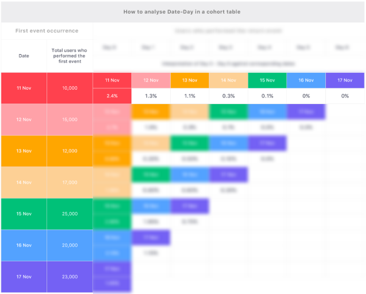
With reference to the table below, the first column, Date, under the section, First Event Occurrence, can be treated as the heading for each cohort.
Each date highlighted with a different colour represents different cohorts of users. This means that 11 Nov is cohort 1, 12 Nov is cohort 2, 13 Nov is cohort 3 and so on.

How to read rows in a cohort table (click to enlarge)
With reference to the table above, the second cell in each row shows the total number of users in that cohort. Thus, the cohort of 11 Nov has 10,000 users, the cohort of 12 Nov has 16,000 users and so on.
On observing the successive cells of the row, 11 Nov, we see that it lists certain percentage values against later dates. These values indicate the repeat behavior of the cohort.
We will cover this in detail and unveil the complete table in the following point.
2. Day 0 (or Week 0, Month 0) always corresponds to the date listed in the left-most column of the cohort table, in the same row
For most people who are just starting out with cohort analysis, the concept of Day 0 can be confusing. The simplest way to understand this is that the column of Day 0 represents all the events performed by the users on the same day, corresponding to the date listed in the same row in the left-most column of the table.
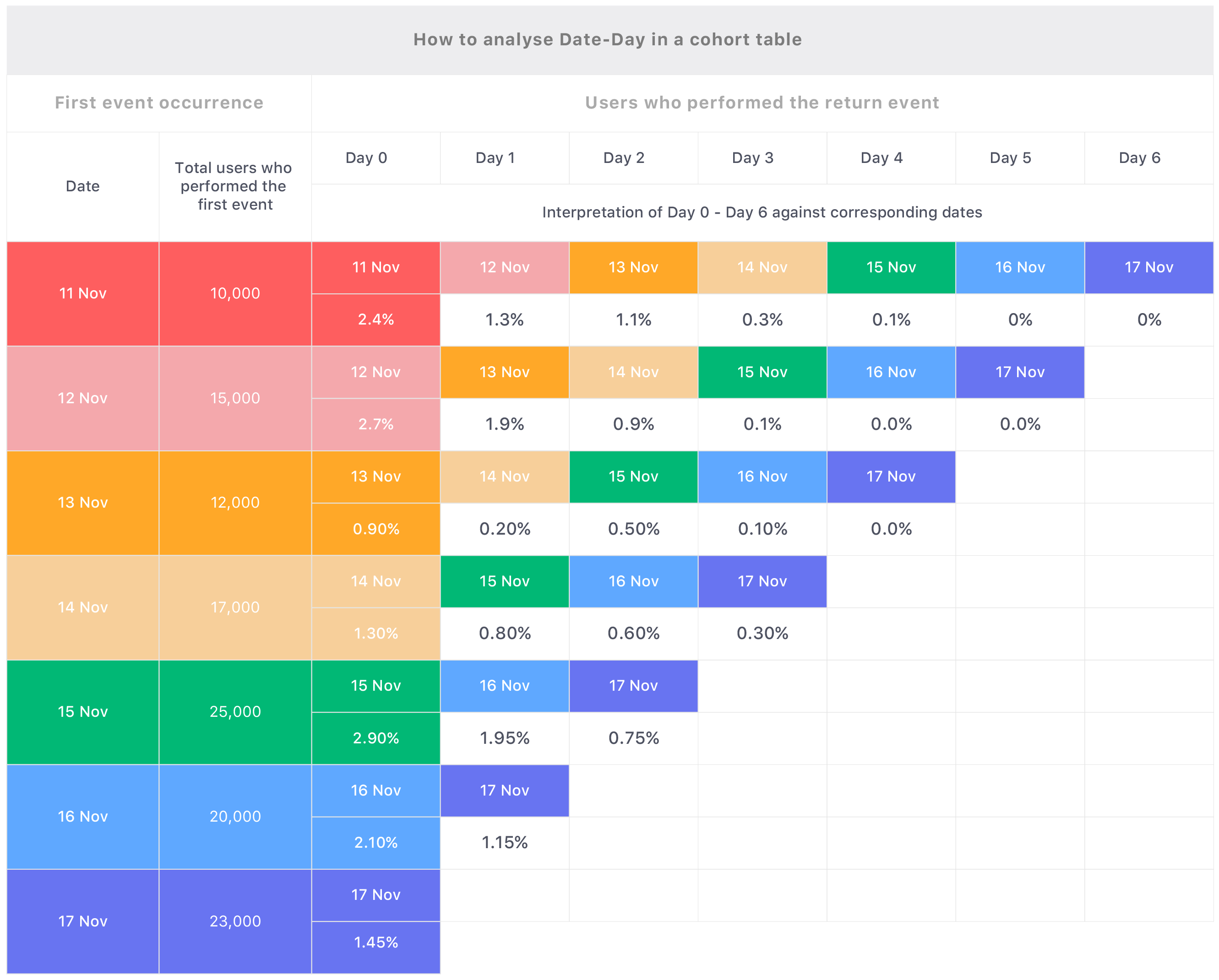
Please refer to the colour codes in the table below to visually correlate the dates (listed in the leftmost column) and the days (listed in the topmost row):

How to correspond Day-Date in a cohort table (click to enlarge)
Hence, if you are analyzing a cohort over a period of last 7 days, then Day 1 for each row will be different. With reference to the table above;
- Day 1 for the row, 11 Nov is 12 Nov
- Day 1 for the row, 12 Nov is 13 Nov
And so on.
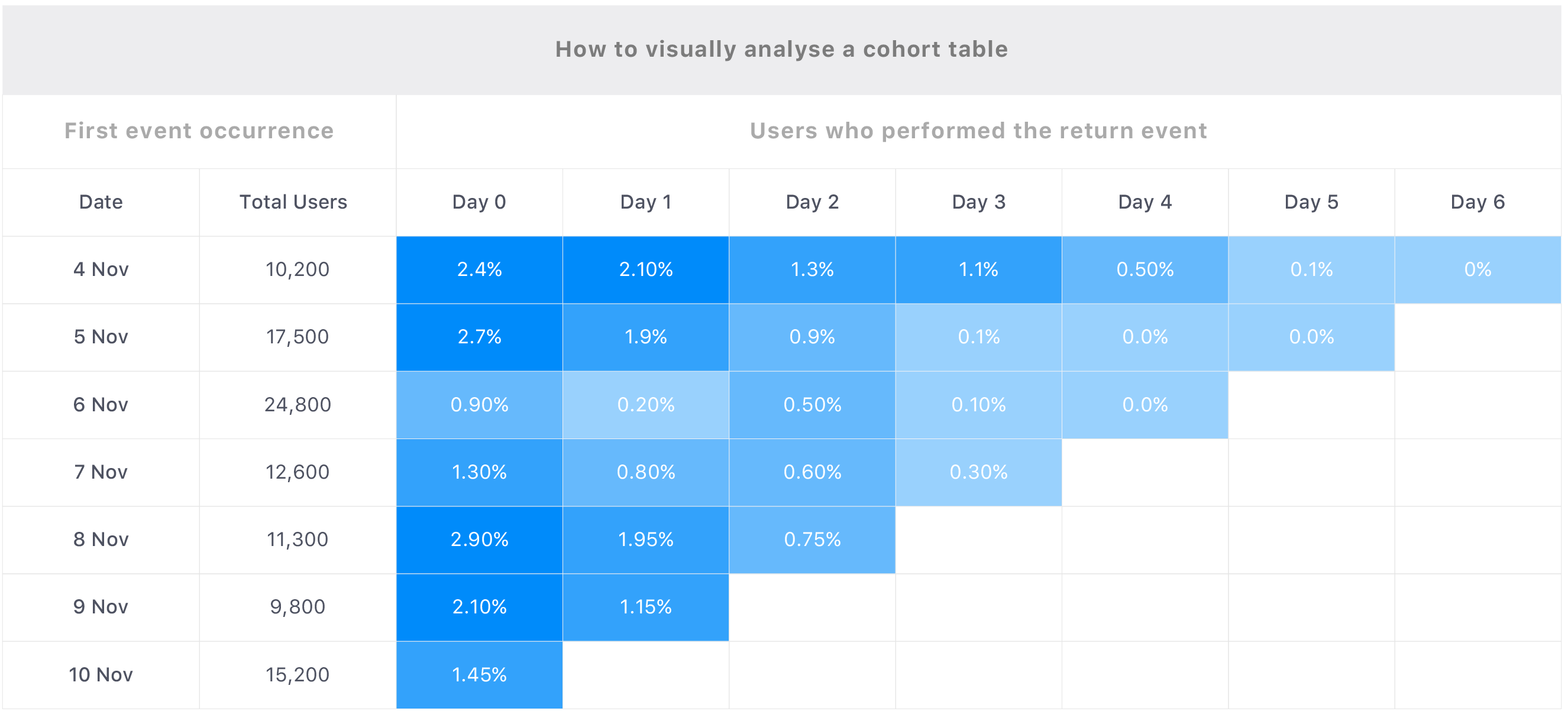
3. The darkest blue is an indicator of the highest percentage value
While analyzing cohorts in WebEngage, you can simply look at the rows/cells which have the darkest shade of blue. The darker the shade of blue, higher is the percentage and vice-versa. This way, you can skip most of the reading and focus only on the important areas.

Click to enlarge
For example, just by looking at the pockets of dark blue in the corresponding table one can tell that the cohort of 4 Nov is the best in terms of users who performed the return event.
- This means that users of this cohort recorded a higher engagement than the other users, within the defined time period.
Similarly, the cohort of 6 Nov seems to be the poorest as it consistently features lighter shades of blue. On closer inspection, one can understand that even though the highest number of users performed the first event on 6 Nov, most of them did not perform the return event.
- This suggests that either there was a problem with your site on November 6, or this set of users were just not motivated enough to interact with your site again.
Fact Check
The shades of blue are guided by the percentage values only, and not by the numbers.
Approach to Doing Cohort Analysis
Now that we have a good understanding of how cohort analysis can help us navigate real-life user behaviors, here are a few tips to help ensure that you get it right in the first go:
Step 1: Determine the questions to which cohort analysis can help you find an answer
Most analytical questions generally start with a simple; Why?
Eventually, snowballing into complex questions which may not have a straight-cut answer.
From ‘Why did a user suddenly stopped engaging with the product?’, to ‘Why did the signup rates skyrocket last week?’ - marketers are plagued with endless questions.
But cohort analysis cannot help you find an answer to each.
The end goal of doing a cohort analysis is to obtain specific actionable insights into particular user behavior. But to get there, you need to ask the right kind of questions. Let's understand this better with a use-case.
Use-case: Analyzing subscription renewal for a freemium music app
Let’s say that you run a freemium music app. You notice that even though the user engagement has continued to grow over the last 7 months, the revenues have dropped. This could be attributed to several reasons such as; lower registrations, a lower renewal rate of existing paid users, new users need more motivation to start using the paid version and so on.
A few questions cohort analysis can help you find an answer to:
1. Are the renewal rates low for user acquired in a certain period?
2. Are the renewal rates low for users acquired through specific channels?
3. Are the conversion rates low for users using certain mobile devices?
We'll show you how to go about the analysis in the following section.
Step 2: Define the associated actions/events which will help you find the right answers
Once you have identified the problem statements, you need to chart out a path which will help you find an answer. Since the basis of cohort analysis is the actions or events performed by your users, you will need to start charting out all the relevant events that will help you find an answer to each question.
Note
Please refer to, What are Events and Event Attributes?, to get yourself acquainted with the terms related to user behavior mentioned below (and across your dashboard).
Now, let's understand this better by charting out our approach to find answers to the questions listed above.
Which events (actions) should you track for solving Question 1, 2 and 3?
Going back to the use-case above; if you were to find an answer to the first question, ‘Are the renewal rates low for users acquired in a certain period?’, then the first step will be to track user behavior as the event, Purchase Complete.
- Purchase Complete represents both, the first purchase as well as repeat purchases.
For question two, 'Are the renewal rates low for users acquired through specific channels?', you will need to track two things, the event, Purchase Complete, and the event attribute, Acquisition Channel.
And in the case of question three, ‘Are the conversion rates low for users using certain mobile devices?’, you will need to track three things, the events, Purchase Complete, Registration Done and the event attribute, Device.
Fact check
The event attributes mentioned above - Device and Acquisition Channel are called system attributes in WebEngage and are automatically gleaned by us for all your users, in real-time! More details
Step 3: Observe and compare the cohorts over a period of time to derive valid conclusions
This is the most important step. Once you’ve defined the events you need to track, start creating your cohort tables over days, weeks, months or years to analyze the behavior of each cohort.
Let’s take the third question; ‘Are the conversion rates low for users using certain mobile devices?’ as a use-case to understand this better.
Step 3 for finding an answer to Question 3
In this case, a cohort is formed by the event, Registration Done, as this represents the time when new users were acquired. This can be filtered by adding the attribute, device to create the following cohorts:
New Users on iPhone X
New Users on Samsung Note 9
And so on.
Each cohort can then be drilled-down by the month of acquisition for a detailed analysis. So analysis 1 would include cohorts like;
New Users on iPhone X acquired in Jan 2017
New Users on iPhone X acquired in Feb 2017
And so on.
While analysis 2 would include cohorts like;
New Users on Samsung Note 9 acquired in Jan 2017
New Users on Samsung Note 9 acquired in Feb 2017
And so on.
Now we can understand the behavior of each by comparing which cohort performed the repeat event, Purchase Complete in the shortest span of time after performing the event, Registration Done.
Thus, depending on the use-case, the method and the period over which the analysis is done can vary greatly.
Here are a few practices we recommend:
- Take small steps first and scale the scope of analysis later, if necessary.
- Ensure that the data is relevant and reliable.
- Focus on identifying broad trends of user behavior and anomalies rather than digging deep into each metric in the first go.
Updated over 3 years ago
Now that you have a good hang of the concepts related to cohort analysis, let's walk you through a few use-cases to widen your pool of thought. Or, if you like, you could straight away jump into our step-by-step guide to analyzing cohorts.