Paths
A step-by-step guide to analyzing how users interact with your platforms & where they drop-off
Paths is a powerful analytical tool that displays the most common routes users experience while interacting with your app and website. It enables you to visualize the sequential actions they take before or after performing a specific _Event _and the various moments in which they exit your platform.
The Path Lab eliminates guesswork and indicates exactly what users do at specific stages in their user journey. It helps you connect the dots between each user interaction and reveals deviations between the intended behavioral flow and actual platform usage.
Thus, for Marketers and Product Managers, it's the key to answering critical business questions like:
-
What do users do before they convert?
-
When do users, who don't convert, exit the platform?
-
How do users discover a specific feature/product?
-
What do users do before they uninstall the app?
-
When do users drop-off from the onboarding quiz? - and much more!
While your exact problem statement may vary, depending on how you expect users to experience your app, website, you can leverage the Path Lab to:
-
Identify gaps in your platform experience to curb drop-offs with a highly engaging communication strategy.
-
Understand the varying trends of non-linear platform interactions and leverage these insights to deliver optimized brand experiences.
So without much ado, let's dig in!
How It Works
Must Read
Please ensure that you have a robust understanding of Events & Event Attributes before proceeding as these data points track user behavior and form the basis of Path analysis.
-
Insights gained through the Path Lab are as good as the behavioral data you track for your apps and websites. Thus, we highly recommend that you:
-
Step 1: Map the various user lifecycles of your product and highlight crucial interactions at each stage.
-
Step 2: Track all relevant user actions as Custom Events, and attach unique Custom Event Attributes to each. (Start Here) Doing so will enable you to:
-
Visualize the various flows taken by users in your app and website to achieve their end-goal like, discover products/content/courses/services, make a purchase, evaluate services/subscription models/flights, and so on.
-
Analyze platform interactions of a niche set of users that purchase a specific type of subscription, place high-value orders, consume content of a specific genre, and so on.
-
-
-
The various flows taken by users to interact with your app and website are plotted as a Sankey diagram, where each Event _performed by them is depicted as a _Step. (detailed read).
- These sequential Steps are plotted as per a time frame or Lookahead Window defined by you and are not limited to a user's actions in an on-going session.
Now, let's show you how you can leverage this tool to get granular behavioral insights!
Configure a View
The query tab enables you to drill down into several variations of the Paths users choose to interact with your app and website.
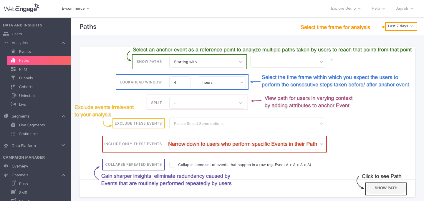
Click to enlarge
Here's how you can build a custom Path view for analysing specific user behavior:
Step 1: Select a Time Frame
While the default time frame of analysis is set to 7 days, using the date range filter placed on the top right, you can choose to analyze behavioral trends for the following durations:
Today
Yesterday
Lasy 7 days
Lasy 30 days
Lasy 90 days
Custom dates
Step 2: Specify Scope of Analysis (Show Path)
This is the most crucial step in building a Path view as the anchor Event and context selected here form the primary reference point of your analysis.
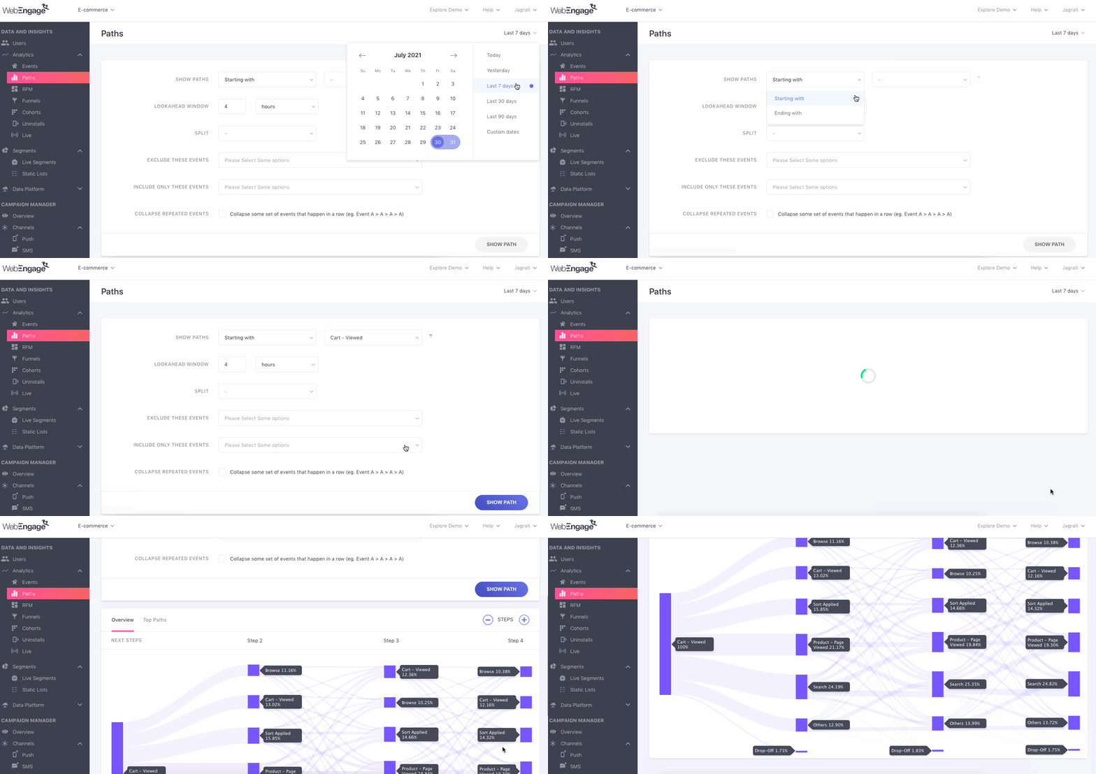
Click to enlarge
Step 2.1.: Specify the Context
As shown above:
-
Select Starts With to analyze the series of Events users perform after the anchor Event on your app/website.
-
Select Ends With to analyze the series of Events users performed before the anchor Event on your app/website.
Step 2.2.: Select Anchor Event
You can think of the anchor Event as the starting point, based on which, various flows will be plotted, highlighting the most common series of Events performed by users before or after performing it.
For example, in the above visual we've specified the Custom Event, Cart - Viewed as the anchor Event. As a result, we're able to analyze the various actions user perform after it.
Let's go over a short use-case to show you how it works:
Use-case: What do users do after they initiate checkout?
Let's take the example of an e-commerce app. While their userbase continues to grow at a steady pace, the purchase rate is lagging behind.
A quick funnel analysis indicated that most users drop-off the Checkout Flow after initiating the transaction. This prompted its Product Manager to dig deeper into what users do once deviate from the checkout screen.
Pre-requisite:
Each time a user clicks the checkout button in their cart, it's tracked as the Custom Event, Cart - Checkout Started.
Each time a user completes a transaction, it's tracked as the Custom Event, Checkout Completed.
Thus, to analyse the above use-case, we will define the following scope:
Show Paths that Start With the Event, Cart - Checkout Started.
This means: You will be able to analyze the most common series of actions taken by users after they perform the Anchor Event, Cart - Checkout Started.
Similarly, you can choose to trace back user actions leading up to purchase by specifying the following scope:
Show Paths that End With the Event, Checkout Completed.
Comparing the Path views mentioned above will help the e-commerce app's Product Manager identify various factors that causes users to deviate from the intended Checkout Flow.
Step 2.3. (Optional): Add Attribute Filters to Anchor Event
You can further narrow down the scope of occurrence of the anchor Event by adding attribute filters to it. As shown below, this can be done by clicking the filter icon placed next to the field, Event.
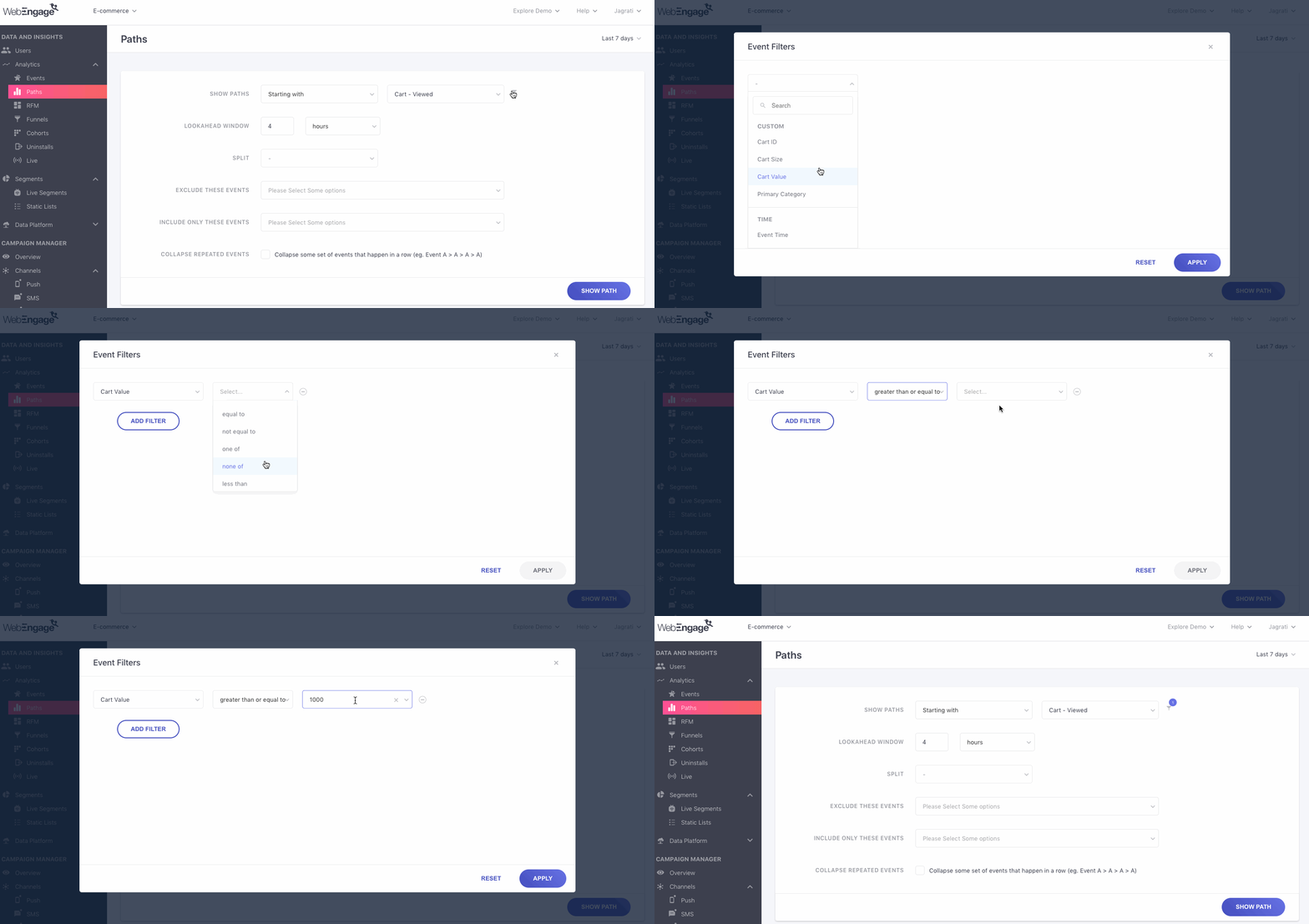
Click to enlarge
For example, in the above visual we have defined the scope of occurrence of the anchor Event, Cart - Viewed by adding the attribute filter, Cart Value greater than 1,000. Thus, Paths will be plotted for only those users who have products worth $1,000 or more lying in their cart.
The following event attributes can be applied as filters:
Custom Attributes (all the custom attributes attached to the custom event selected as the anchor event)
Time (Event Time)
Location (City, Country)
Technology (Browser Name, OS Name, Device Manufacturer, Device Model, Carrier, App Version, App ID, Platform, SDK Version)
UTM (Channel, Campaign Name, Campaign Source, Campaign Medium)
Screen (Page URL, Screen Name)
Engagement (Campaign ID, Journey ID)
Adding Multiple Attribute Filters to the Anchor Event
Depending on your analytical needs, you can choose to analyze platform interactions of a niche set of users who perform the anchor Event in the context of All/Either attribute filters. As shown below, click Add Filter and club multiple event attributes by the AND/OR logic.
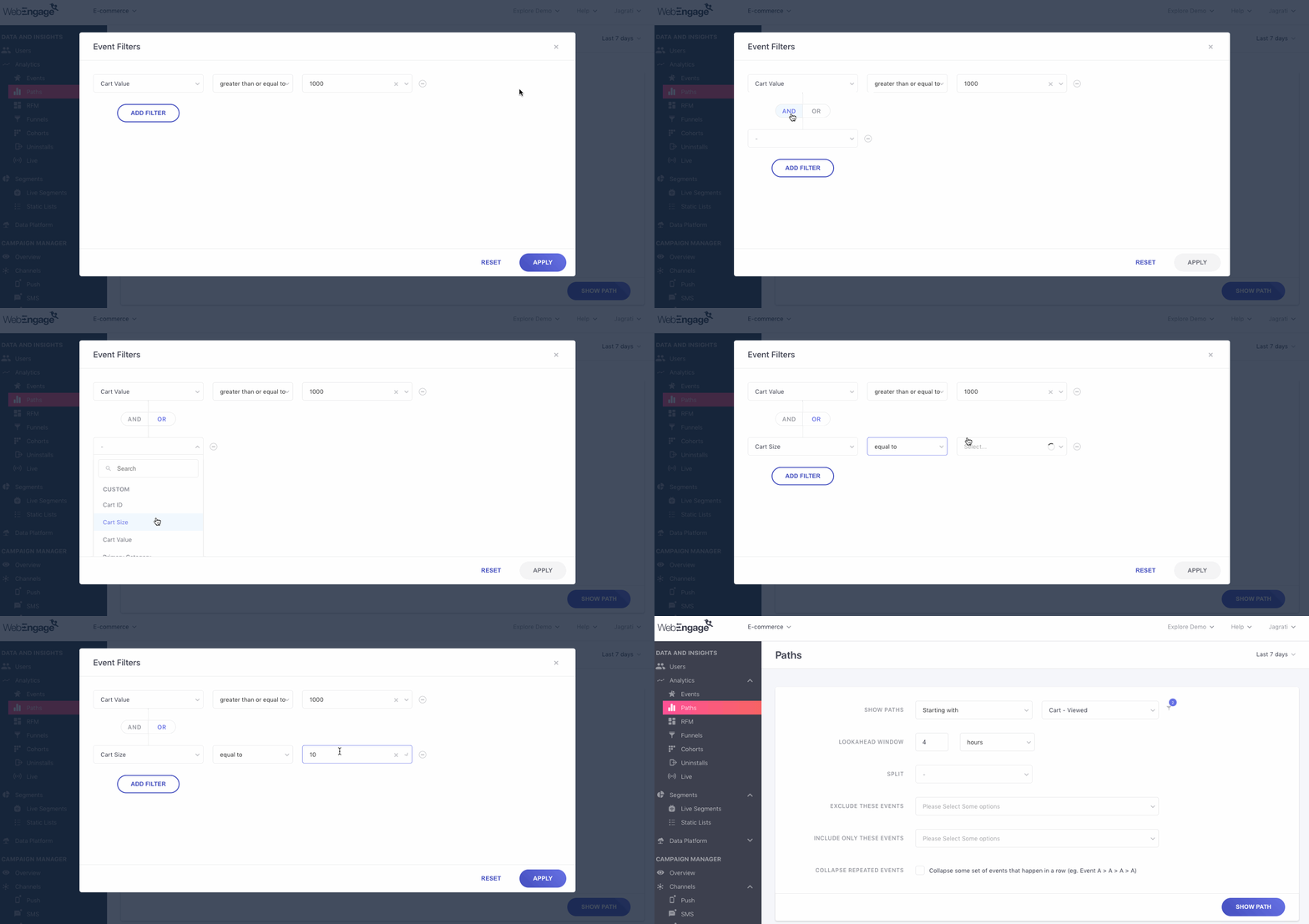
Click to enlarge
For example, in the above visual we have defined the scope of analysis as Show Paths starting with the Event, Cart - Viewed for all users whose Cart Value is greater than or equal to $1,000 OR users who have added 10 or more products to their cart (Cart Size). Thus, users who don't match either of these criteria will be excluded from the analysis!
Implications of using AND/OR to combine attributes
AND: Clubbing filters by the AND logic helps you narrow down the scope of occurrence of the anchor Event. This means that paths will be plotted for only those users who perform the Event in the context of all the event attributes.
OR: Clubbing filters by the OR logic helps you widen the scope of occurrence of the anchor Event. This means that paths will be plotted for all users who perform the Event in the context of any of the specified event attributes.
Step 3: Specify Lookahead Window
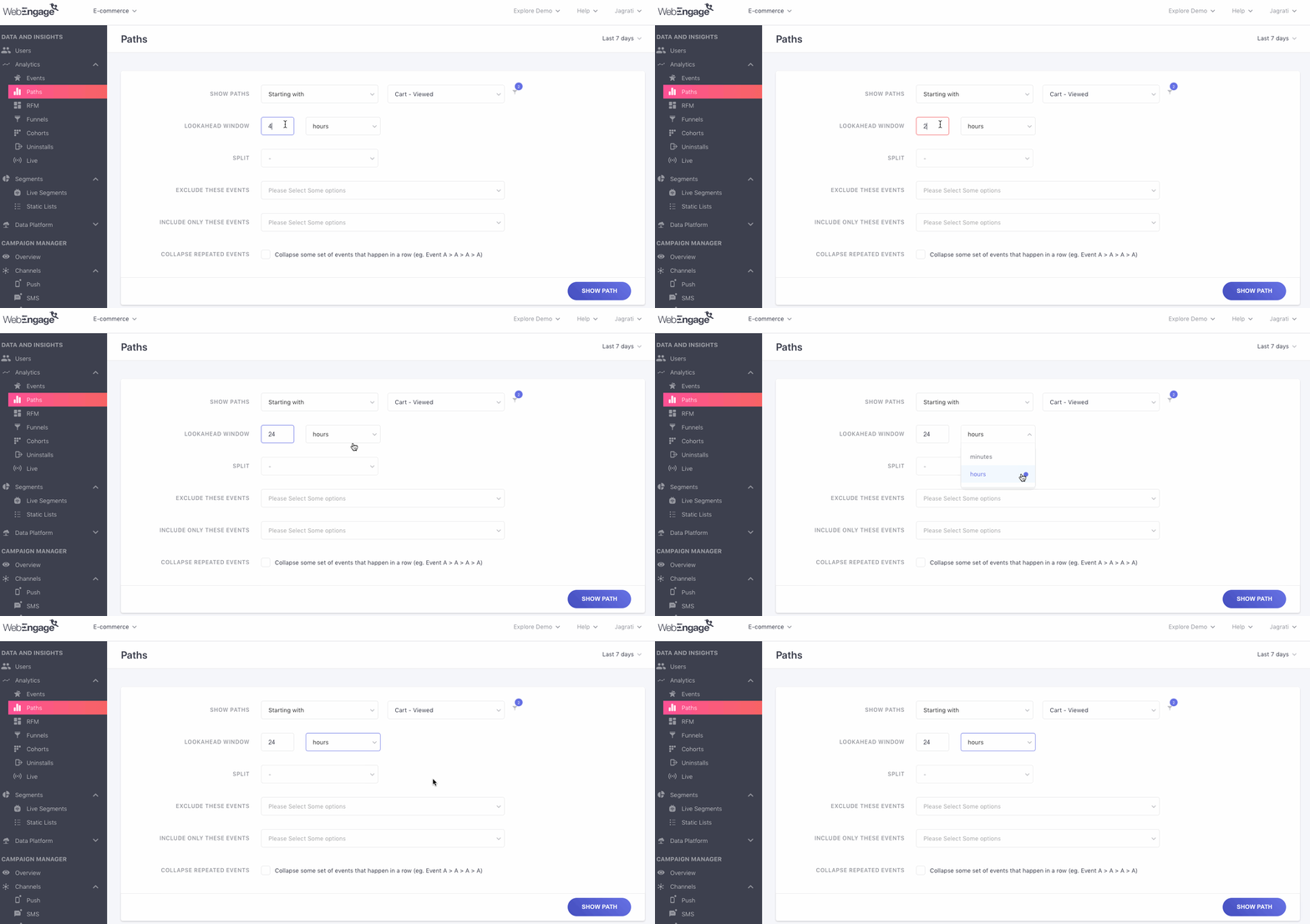
You can think of the lookahead window as an activity time frame that helps you determine exactly how long before/after performing the anchor Event would you like to analyze users' Paths.
Thus, the flows depicted in the Path visualizer are based on the sequential actions users take within the time frame defined here. This is independent of whether the actions were performed in an ongoing session or multiple sessions.
The Lookahead Window can be specified in Minutes or Hours. For example, we've chosen to analyze the Events performed by users up to 24 hours before they perform the anchor Event, Cart Viewed in the visual below.
Click to enlarge
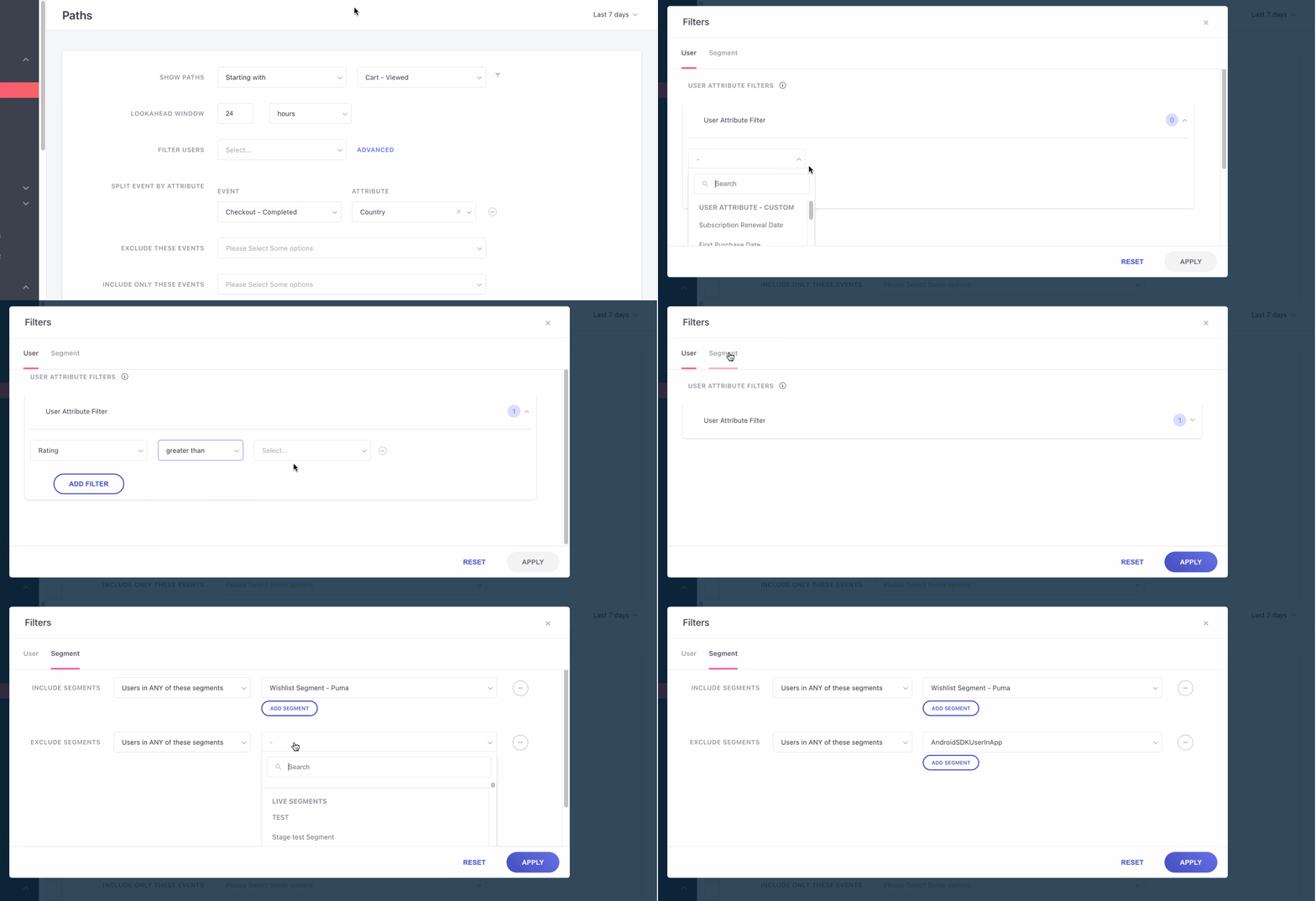
Step 4: (Optional): Advance filters for Segments or Lists
Advanced filters enhance the analysis by focusing on specific user groups. If you've invested time in creating segments or lists, you can now use these to conduct a detailed path analysis on them. This functionality allows you to leverage your predefined user groups to better understand how they interact with your application. By examining these interactions, you can gain insights into user behavior and improve your application’s design and functionality.
Step 5 (Optional): Split Events by Attributes
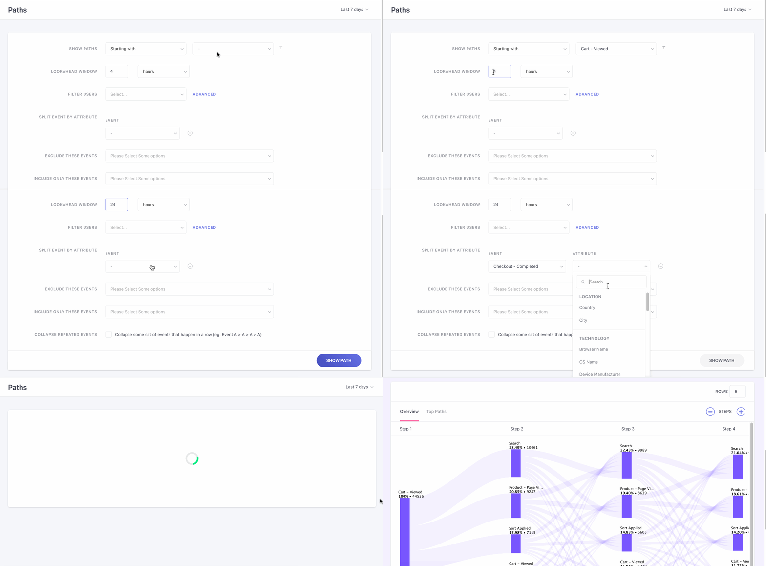
Splitting the events by attributes, allows you to examine the event distribution based on specific attributes, by understanding behavioral changes in purchases across various categories. Use the following steps to achieve this:
- Method 1: Use ‘split event by attribute’ and use the dropdown to choose the events you’d like to split, followed by the events in that path that you’d like to exclude and include (optional).
- Method 2: Choose the starting or ending position of a path and the path you’d like to generate, followed by the ‘look ahead’ window and click on ‘Show path’ button.
- Once the paths have been created, scroll down and right click on the path steps that you’d like to split.
- Click on ‘Split by attribute’, proceed by choosing the attribute.
Click to enlarge
For example, we've chosen to split the view by Country in the above visual. This means:
- All users who belong to a Country will be grouped under a common starting point.
- The flows depicted on the visualizer indicate the most common series of actions performed by users in each Country, before/after the Anchor Event, within the specified Lookahead Window.
The following event attributes can be selected here:
Location (City, Country)
Technology (Browser Name, OS Name, Device Manufacturer, Device Model, Carrier, App Version, App ID, Platform, SDK Version)
UTM (Channel, Campaign Name, Campaign Source, Campaign Medium)
Screen (Page URL, Screen Name)
Engagement (Campaign ID, Journey ID)
Custom (all the custom attributes attached to the custom event selected as the anchor event)
Step 6 (Optional): Exclude Events
Using this field, you can choose to omit a maximum of 10 Events from the Path. It enables you to declutter noisy data and focus only on what matters. As shown above. you can select from a list of all the Events tracked for your account.

Click to enlarge
For example, we've removed generic System Events like Session Started, User Login, and User Logout in the above visual. This helps us focus on crucial Events performed by users as they experience the Checkout Flow.
Step 7 (Optional): Include Events
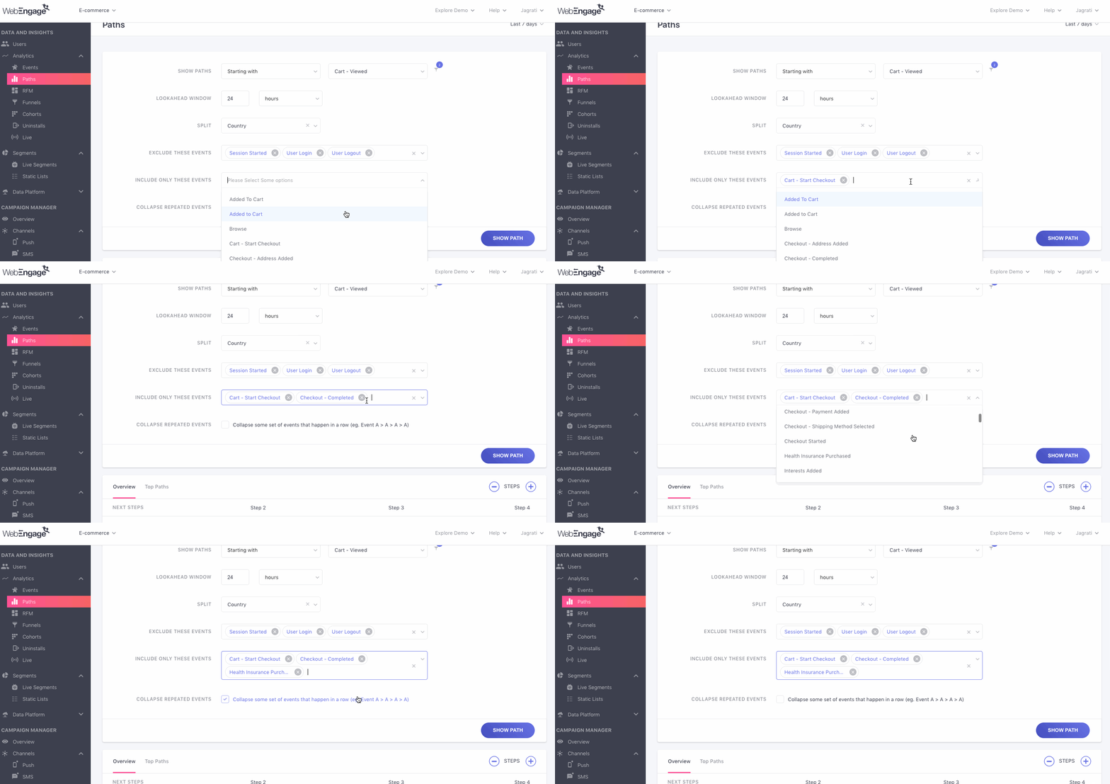
Using this field, you can choose to analyze the correlation between a maximum of 10 Events performed by users in your app and website.
Click the dropdown and select from a list of all the Events tracked for your account to analyze the various sequences in which users perform a specific set of actions.
Click to enlarge
Step 8 (Optional): Collapse Repeated Events
There are several actions that users repeatedly perform while interacting with your app/website. Enabling this field helps you eliminate redundancy by minimizing multiple occurrences of Events to one.
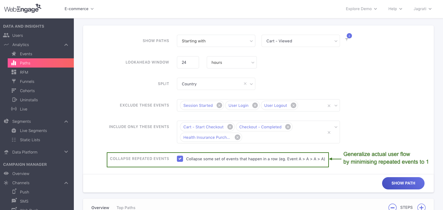
Click to enlarge
For example, most e-commerce app users would Browse through several products and sections before making a purchase. This means, their Path could look something like this:👇
Anchor Event > Step 2: Browse > Step 3: Browse > Step 4: Browse > Step 5: Sort Applied > Step 6: Browse > Step 7: Browse > Step 8: Product Viewed
Thus, you can gain sharper insights by hiding repeated events that are inconsequential to your analysis. In doing so, the flow will indicate the Event only the first time it occurs, the subsequent Step will depict the next (new) Event users perform, like this:👇
Anchor Event > Step 2: Browse > Step 3: Sort Applied > Step 4: Browse > Step 5: Product Viewed
Neat, isn't it?
Next, click Show Paths to begin analysis!
Step 9 (Optional): Add Rows
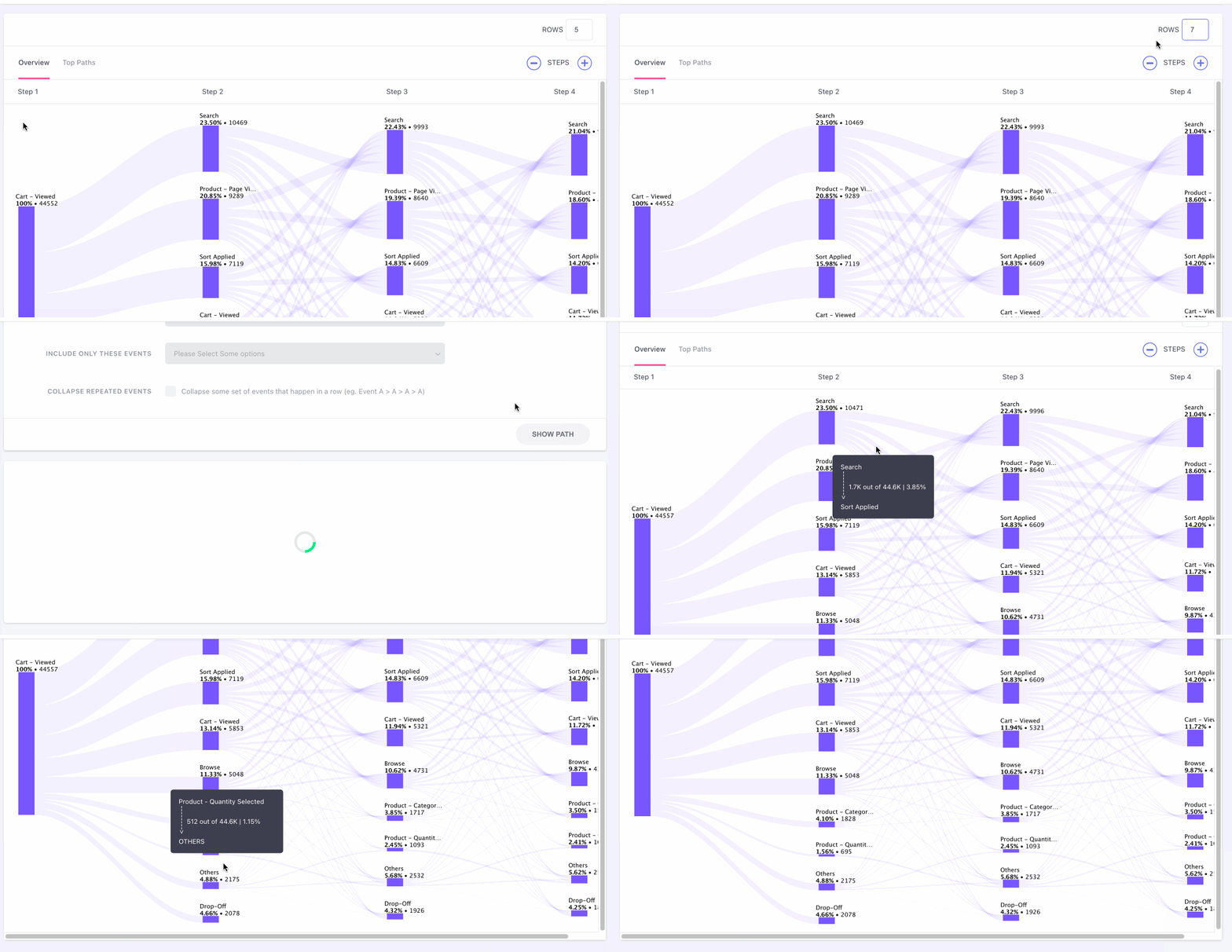
To discover uncommon paths taken by some of the users, it's necessary to zoom out by increasing the number of rows. Adding rows enables the discovery of niche paths taken by your users.
By default, you will still see only 5 events to start with, but have a maximum limit of 20 rows to the path.
Analyze Paths
Once you execute your use-case through the Query Tab, the most common Paths taken by users within the specified Lookahead Window, before/after the Anchor Event are plotted below it.

Click to enlarge
You can analyze these platform interactions in 2 formats, through the following sections:
Let's get you acquainted with each:
Overview
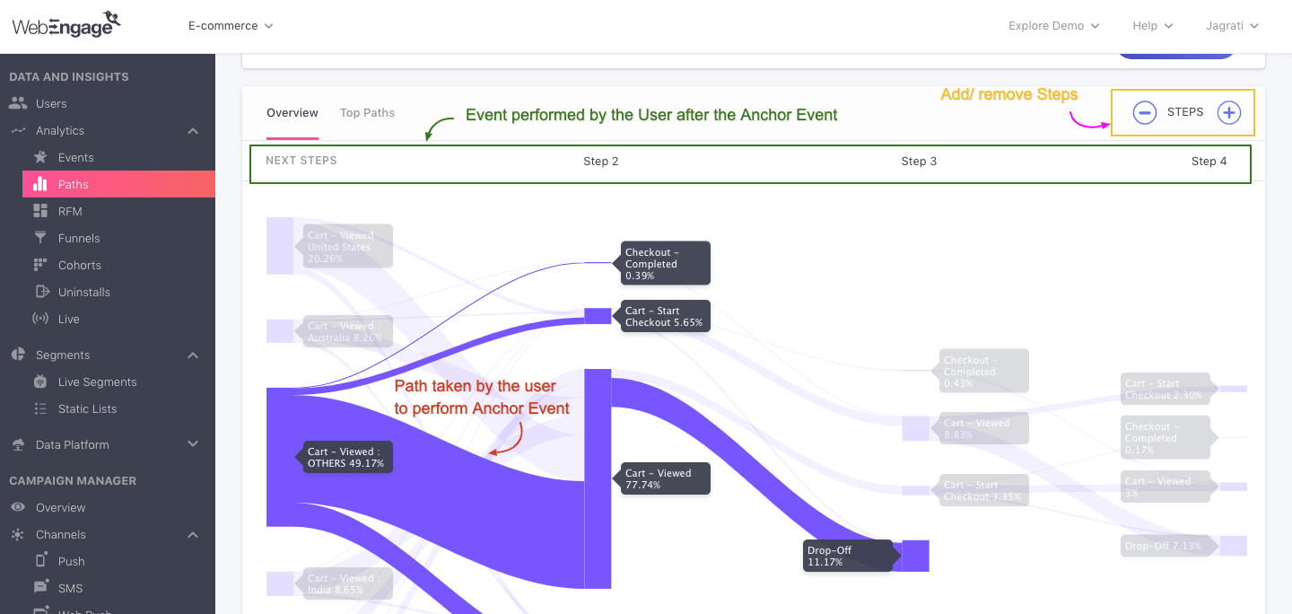
Includes a Paths visualizer or a Sankey diagram in which the width of the lines is proportional to the flow quantity, aka. the number of users that opted to experience a flow. The visualizer comes equipped with several features that enable you to:
Click to enlarge
- View specific Paths taken by users
- Focus on a specific Path connecting consecutive Events
- Add or remove Steps
- Remove specific Events
- View the Conversion Rate between each Step.
Steps
-
Events performed by users before/after the Anchor Event in your app/website are indicated as subsequent Steps in the Path visualizer.
-
By default, the visualizer plots Paths containing a maximum of 4 Steps where:
- Step 1 is the Anchor Event selected by you
- Step 2 is the Event performed immediately before/after it, and so on.
-
Each Step lists:
-
A maximum of 5 Events: You can interpret this as the top 5 Events users choose to perform in a specific moment in their lifecycle. Each Event indicates the percentage of users that performed it.
-
Drop-offs: Indicates the share of users that exited your platform in that specific moment. This is a crucial insight that can be leveraged to:
- Prolong platform engagement.
- Drive users towards a specific goal.
- Correct the existing UI flow of your platform to prevent drop-offs - and much more!
-
Others: Several different Events performed by a small share of users at a Step is indicated by the blanket term, Others. These statistically insignificant interactions have been hidden to ensure that you are presented with crisp insights.
-
Adding/ Removing a Step
Using the operator placed on the top right, you can choose to:
-
Reduce the number of Steps plotted for all the Paths. (click -)
-
Add up to a maximum of 12 Steps to widen the scope of analysis. (click +)
Removing an Event
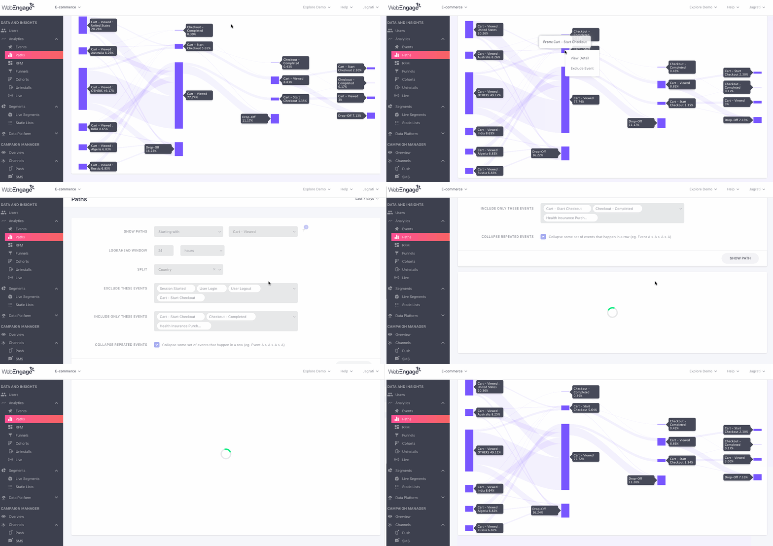
There are several instances where the Paths visualizer includes Events that are inconsequential to the problem statement you're analyzing. This is why we've made it extremely easy for you to exclude such actions from the scope of your analysis.
Click to enlarge
Here's how you can refine the data plotted across all the Paths by excluding several Events:
Step 1: Hover over an Event you'd like to exclude from the visualizer.
Step 2: Using your trackpad/mouse, right-click on the _Event _and select the option, Exclude Event.
- In doing so, the Event will be added to the Query Tab under the field, Exclude These Events.
Paths
Click to enlarge
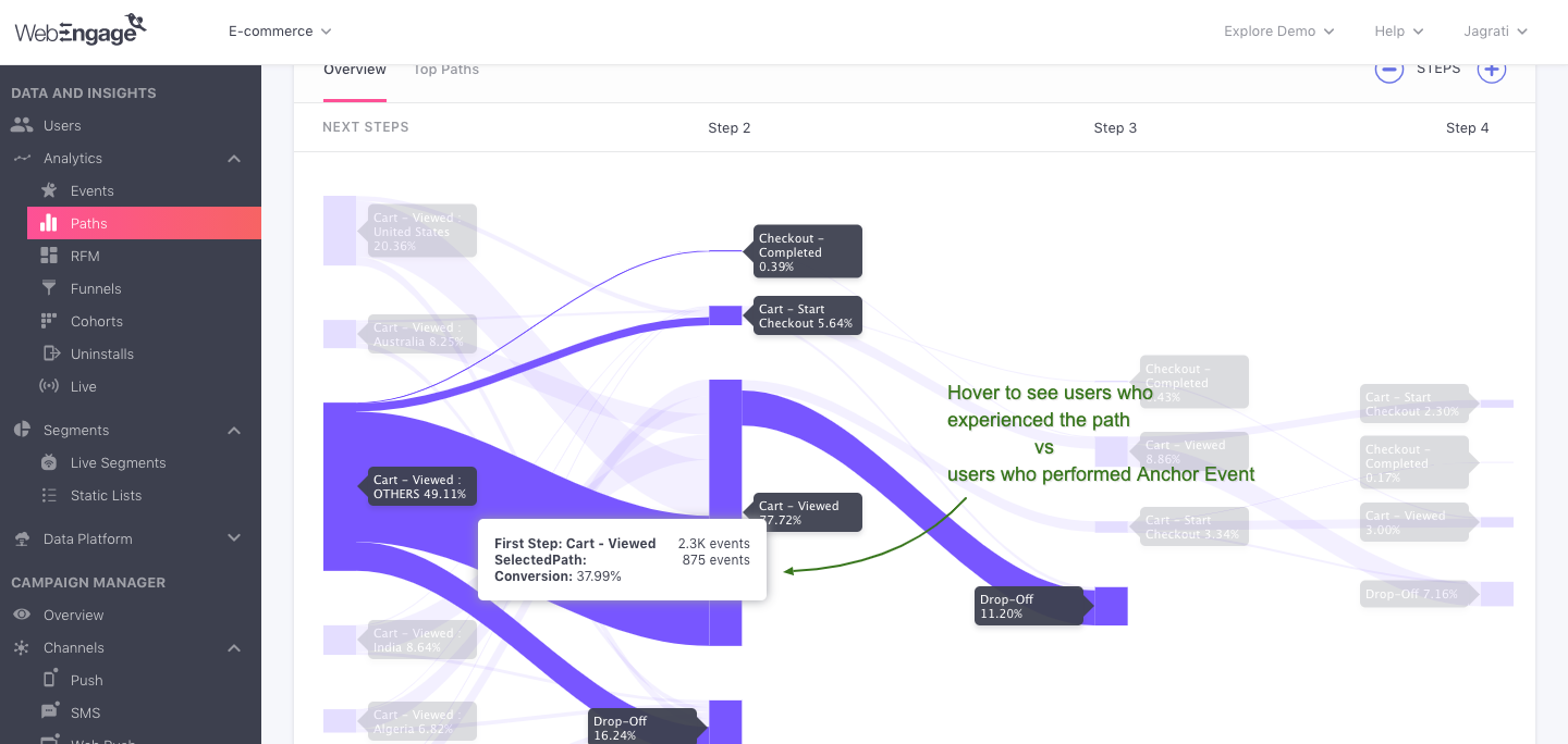
Each Event listed under a Step in the visualizer is connected by several Paths that indicate the exact route users took to interact with your app/website. The thickness of each Path is directly proportional to the number of users that experienced it.
Let's quickly walk you through all the details indicated for each Path:
First Step: Indicates the Anchor Event specified by you and the total number of times users have performed it within the selected time frame.
Selected Path: Indicates the total number of users that experienced the path selected by you within the selected time frame and Lookahead Window.
Conversion Rate: Indicates the share of users that experienced the Path selected by you, out of all the users that performed the Anchor Event.
Top Paths
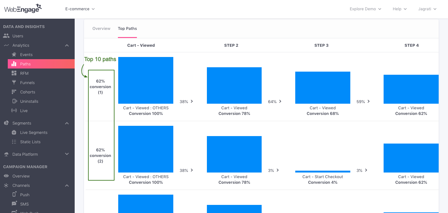
Summarises the top 10 Paths your users experienced before/after they performed the Anchor Event on your app/website along with a step-wise conversion rate.
We hope this helps you gain actionable insights into how users engage with your platform and identify drop-off areas that can be optimized by delivering personalized experiences. Please feel free to drop in a few lines at [email protected] if you have any further queries. We're always just an email away!
Updated about 1 year ago