Customizing Widget Appearance
You can configure Feedback Settings to:
-
Customize the widget's appearance as per your website's brand guidelines. (How to configure)
-
Whitelabel the widget to reinforce your brand identity. (How to configure)
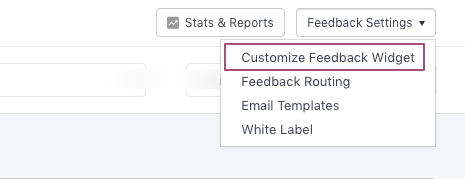
Click to enlarge
Here's how you can go about it:
Customize Widget Appearance
This section enables you to customize the feedback widget's appearance, categories, fields and acknowledgment message with great ease.
Let's walk you through each setting:
Button
Here, you can customize the Feedback Widget's appearance and behavior.
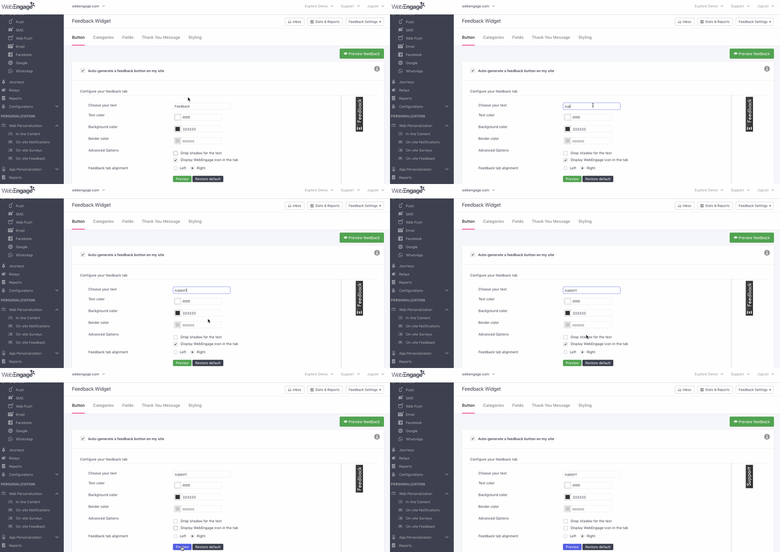
Configuring Feedback Button's Appearance
Click to enlarge
As shown above:
-
Step 1: Add a custom call-to-action against the field, Choose Your Text.
-
Step 2: Customize the text, background, and border color.
-
Step 3 (Optional): Deselect Display WebEngage icon in the tab to remove the logo.
-
Step 4: Depending on your site's layout, you can align the button to the left or right of a user's screen. (Feedback Tab Alignment)
You can view it by clicking the Preview Feedback button.
Related ReadThe Feedback Button & Form can be customized further by adding custom HTML/CSS code under the section, Styling.
Display Feedback Button in the Context of User Interactions
You can choose to display the Feedback button only when users click on a specific link or element. This can be done by enabling Show the feedback window upon the click of a link or an HTML element. Here's how you can set it up:

Click to enlarge
-
Step 1: Collaborate with your tech team to identify and tag the various elements and links, on the click of which, the feedback tab must be displayed. (How to Implement)
-
Step 2: Once you have a list of all the element IDs, add the relevant ones under this field (separated by a comma.)
- In doing so, we'll bind the feedback widget to these elements.
- Thus, whenever a user interacts with the specified element, we'll show them the feedback button as per your settings.
Related Read
- Click the checkbox, Enable feedback on mobile devices to engage mobile web visitors with a responsive version of the feedback button.

Click to enlarge
Categories
Collecting and managing feedback is a lot easier when it's categorized into specific buckets. This is why your feedback form comes preloaded with the following categories - Like, Question, Suggestion, Problem.
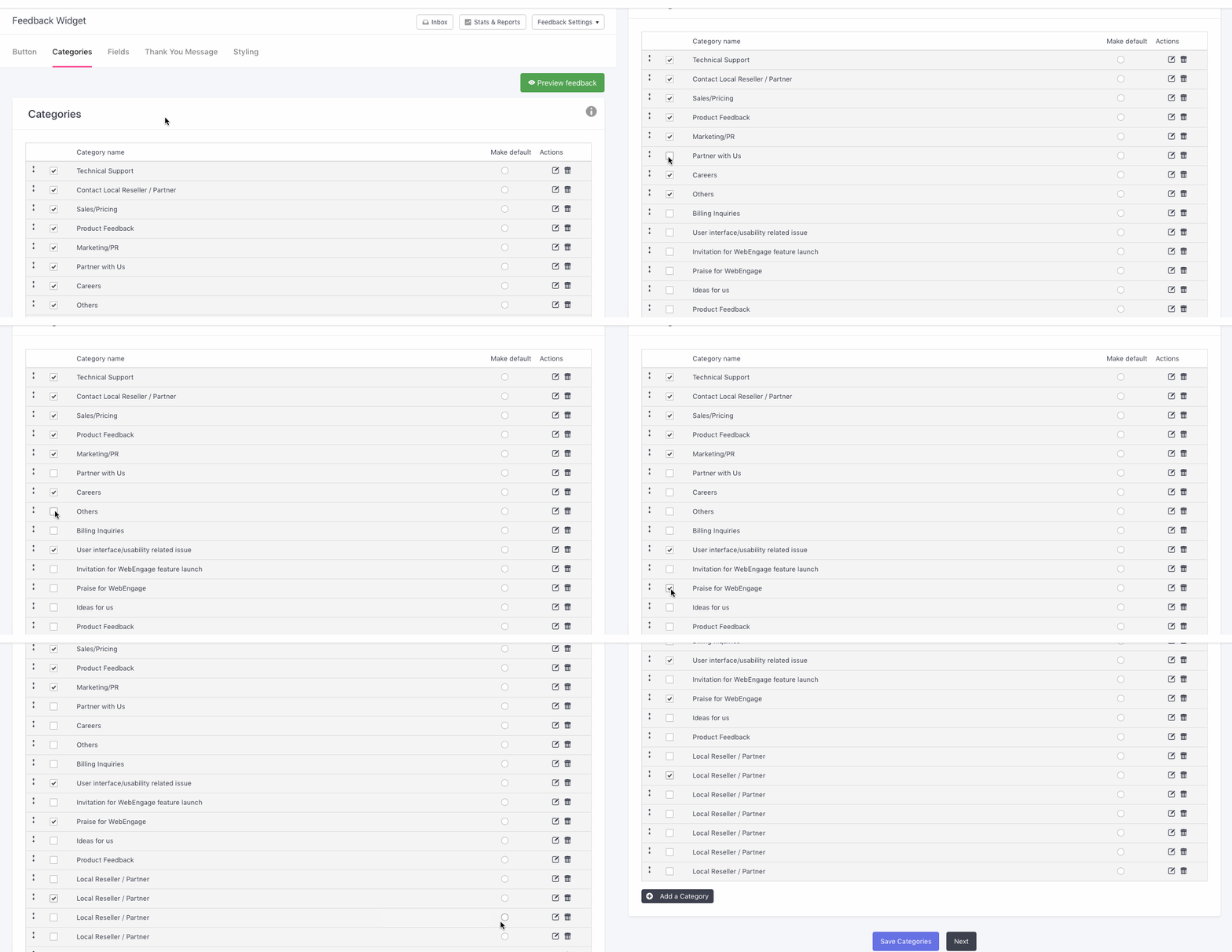
Depending on your business needs, you can create custom categories under which users can submit their responses. Here's how you can set it up:
Click to enlarge
Step 1: Click the Add Category button.
Step 2: Enter a name and click Save.
- Click the checkbox placed on the left to add the category to your feedback form.
Step 3 (Optional): You can also choose to make a category the default option by clicking the radio button on the right. Doing so will preselect the category in the form for a user.
Step 4 (Optional): You can customize the order in which the categories appear by dragging them into the desired order.
Pro Tip: Route Category-wise Feedback to Relevant TeamsWe highly recommend that you leverage categories to manage feedback responses. This can be done by routing a specific category to account admins that own up the domain.
- You can always choose to disable categories in your feedback form through the settings nested under, Fields.
Fields
Here, you can customize the Feedback Form as per your needs. By default, the following fields are included in it:
- Name
- Email Address
- Category (Includes thefeedback categories created here)
- Message
- Click to automatically attach a screenshot of the page (Enables users to attach a screenshot of the page on which they're submitting the feedback. Comes in handy in cases where users report an error/ bug or would like to provide a contextual reference.)
Skip to Adding New Form Fields
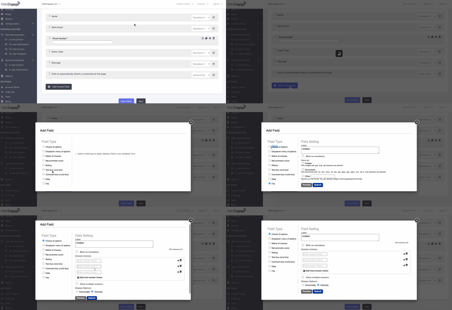
Here's how you can customize the form:
Click to enlarge
Step 1: Click the Edit icon placed on the right to modify a field.
Step 2: Click the dropdown to specify whether the field must be a Mandatory or Optional one. You can also choose to Hide a field. (This comes in handy when disablingCategories on your form).
Step 3 (Optional): Rearrange the order in which the fields appear by dragging them into a different position.
Adding New Fields
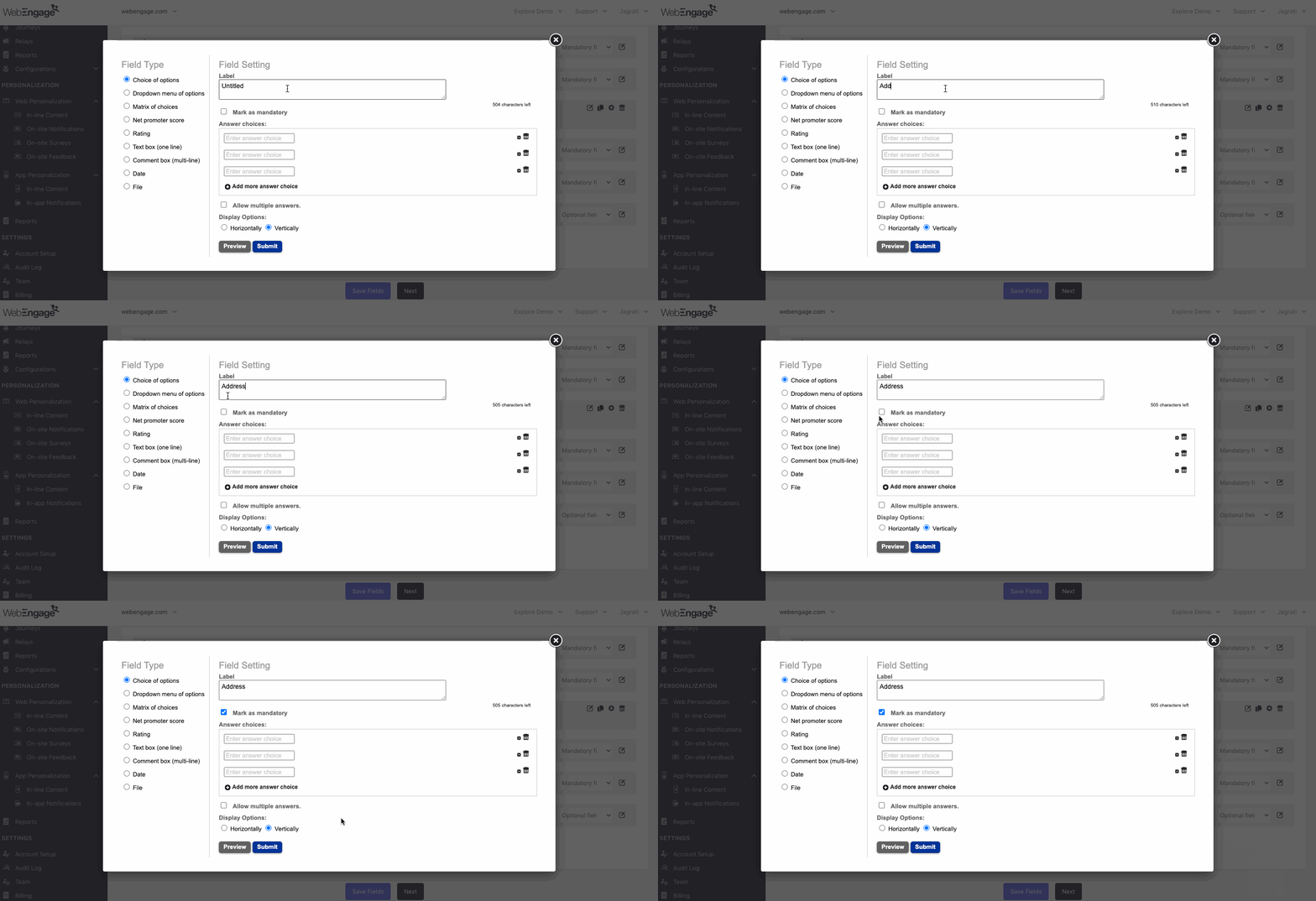
Click to enlarge
Step 1: Click Add Field to get started.
- In doing so, you will be prompted to select the type of field you'd like to add.
Step 2: Configure the selected Field Type
Steps of configuration vary for each field type. Let's get you acquainted with each one:
-
Choice of Options: Recommended if you'd like users to select an option to respond to a question or statement. The options can be customized and listed side-by-side (Horizontally) or in separate rows (Vertically).
-
Dropdown Menu of Options: Recommended if you'd like users to select an option to categorize their feedback, provide more context or respond to a question/statement.
-
Matrix of Choices: Recommended if you'd like users to respond to a question or statement by selecting a combination that indicates their preferences or needs.
-
Net Promoter Score: Recommended for collecting product/service feedback where users can rate you on a scale of 1 - 10 points.
-
Rating: Recommended for collecting product/service feedback where users can rate you on a scale of 1-5 stars.
-
Text Box (one-line): Recommended for collecting feedback in an open-ended format where users are urged to share their thoughts in brief.
-
Comment Box (Multi-line): Recommended for collecting extensive feedback in an open-ended format where users can share their thoughts as a paragraph.
-
Date: Recommended in cases where you'd like users to specify a date for a pickup, meeting, call, and so on. You can allow users to specify multiple dates, as per your use-case.
-
File: Enables users to upload an attachment to the form. The following formats are accepted:
- Image: .jpg / .png / .gif
- Document: .txt / .doc / .docx / .rtf / .pdf / .ppt / .pptx / .pps / .ppsx / .xml / .xls / .xlsx
- You can specify more formats against, Other, in case you expect users to upload a zip file, code snippet, and so on.
Thank You Message
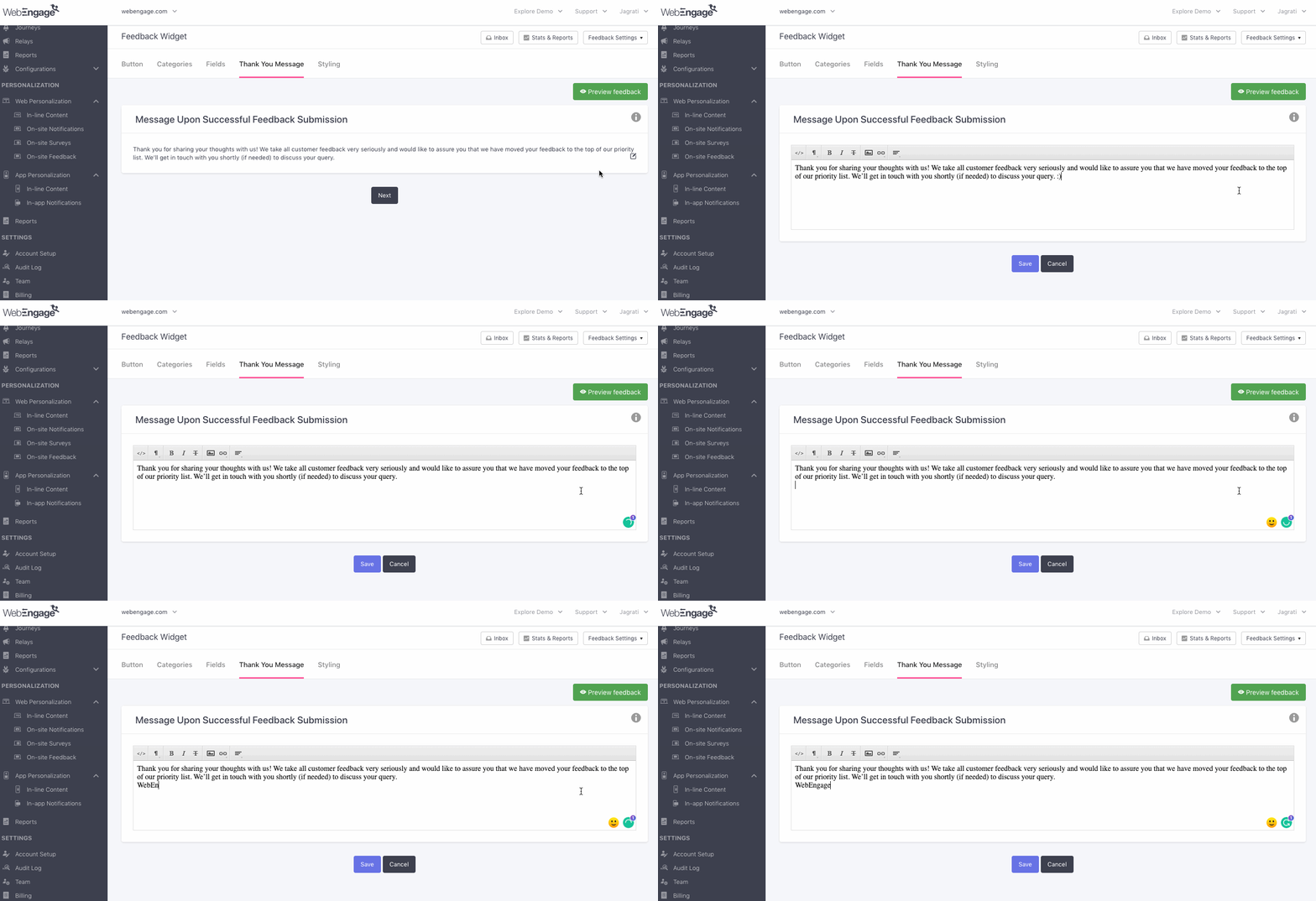
Here, you can customize the message that acknowledges feedback submission on your site. As shown below, add a warm, friendly message and click Save.
Click to enlarge
Styling
These are advanced settings that enable you to customize the feedback button and form's appearance as per your brand guidelines. You can collaborate with your tech team to implement custom HTML/ CSS changes.
Click to enlarge
Whitelabel Settings
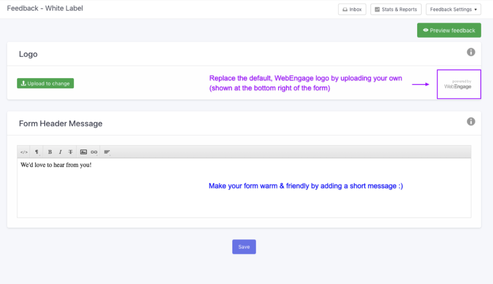
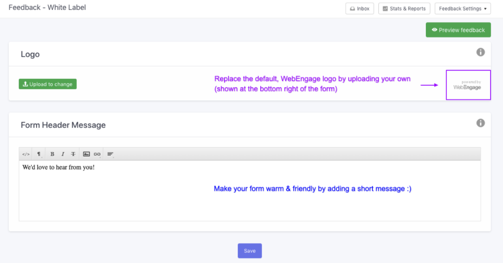
White-labeling enables you to enforce your brand identity on the feedback form. (You can remove WebEngage's logo from the Feedback button bydisabling it here.) Here's how you can go about it:
Click to enlarge
Step 1: Click on Feedback Settings placed on the top left of your Inbox and select White Label.
Step 2: Upload your logo (it'll be displayed on the feedback form).
- Please ensure that the logo is 71px (width) by 25px (height) and is in a .jpg / .jpeg / .png format.
Step 3 (Optional): You can choose to add a message or image to the top of the feedback form. We recommend it in cases where:
-
The form fields require some context.
-
You'd like to make the form warm and friendly by adding a light-hearted image!
We hope this has enabled you to customize the feedback collection and response management experience as per your users' best interests. Please feel free to drop in a few lines at [email protected] if you have any further queries. We're always just an email away!
Updated 6 months ago